Society of Visual Storytelling

    SVSLearn Forums

    • Register
    • Login
    • Search
    • Recent
    • Tags
    • Popular
    • Users
    • Groups
    • Search

    Bed A or Bed B?

    Contest
    5
    6
    102
    Loading More Posts
    • Oldest to Newest
    • Newest to Oldest
    • Most Votes
    Reply
    • Reply as topic
    Log in to reply
    This topic has been deleted. Only users with topic management privileges can see it.
    • Katherine
      Katherine last edited by

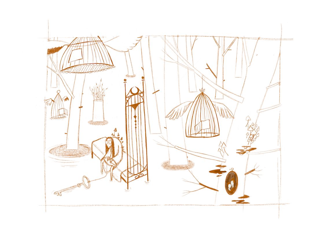
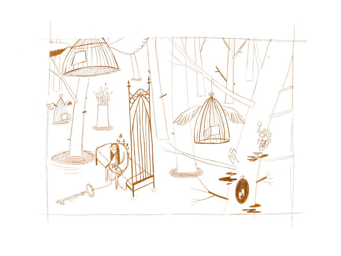
      I can't decide, Bed A or Bed B? It should read mothy and cage-like 🙂

      A
      Bed 5-internet.jpg

      B
      Bed 3-internet.jpg

      the site: katherinetyson.com
      instagram: instagram.com/katherinetysonart

      Nyrryl  Cadiz F Tristan Lapetz 3 Replies Last reply Reply Quote 1
      • KathrynAdebayo
        KathrynAdebayo last edited by

        I'd say, mothy: B, cage-like: A

        That's probably no help whatsoever. 🙂 It'll be interesting to hear what others say.

        1 Reply Last reply Reply Quote 0
        • Nyrryl  Cadiz
          Nyrryl Cadiz SVS OG @Katherine last edited by Nyrryl Cadiz

          @Katherine B feels more menacing.

          Edit: I meant A looks more menacing

          Portfolio: nyrrylcadiz.com
          Instagram: https://www.instagram.com/nyrryl_cadiz/

          1 Reply Last reply Reply Quote 0
          • F
            Frogpunzel @Katherine last edited by

            @Katherine Bed A matches her staff from your character design sheet, so that's cool. It also feels more of a focal point with the design on it. If you want it to stand out, I would choose that one. Bed B does feel more mothy though, the design feels like it flows and is a little more subtle.

            1 Reply Last reply Reply Quote 0
            • Katherine
              Katherine last edited by

              Thanks everyone! I think B takes it — A is drawing a bit too much attention, I think and I do think B is a bit more mothy so thank you everyone for your fresh eyes!

              the site: katherinetyson.com
              instagram: instagram.com/katherinetysonart

              1 Reply Last reply Reply Quote 0
              • Tristan Lapetz
                Tristan Lapetz @Katherine last edited by Tristan Lapetz

                @Katherine I'm drawn more to B and on looking further into it, I can only say it's probably because the more dangerous feeling triangular shape language or the way that the second design leads me to feel as though the headrest is taller in B.

                p.s. Wonderful job on making it look mothy! I love the incorporated circles!

                Happy creating,
                Tristan

                IG: https://www.instagram.com/t_lapetz/

                1 Reply Last reply Reply Quote 0
                • First post
                  Last post