Dog, Dog, Goose!
-
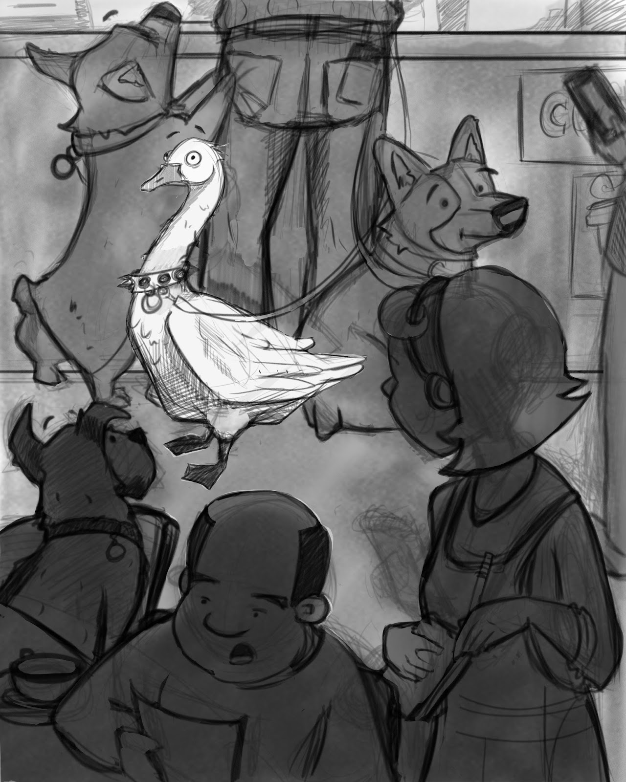
So, I planned out this composition in the thumbnail size and was really happy with it, but when I opened it up to critique, my two illustrator friends said it looked too crowded. I'm just worried that moving away from my thumbnail may have made it worse? I'm totally open to new ideas, and fresh opinions, so what do you think?
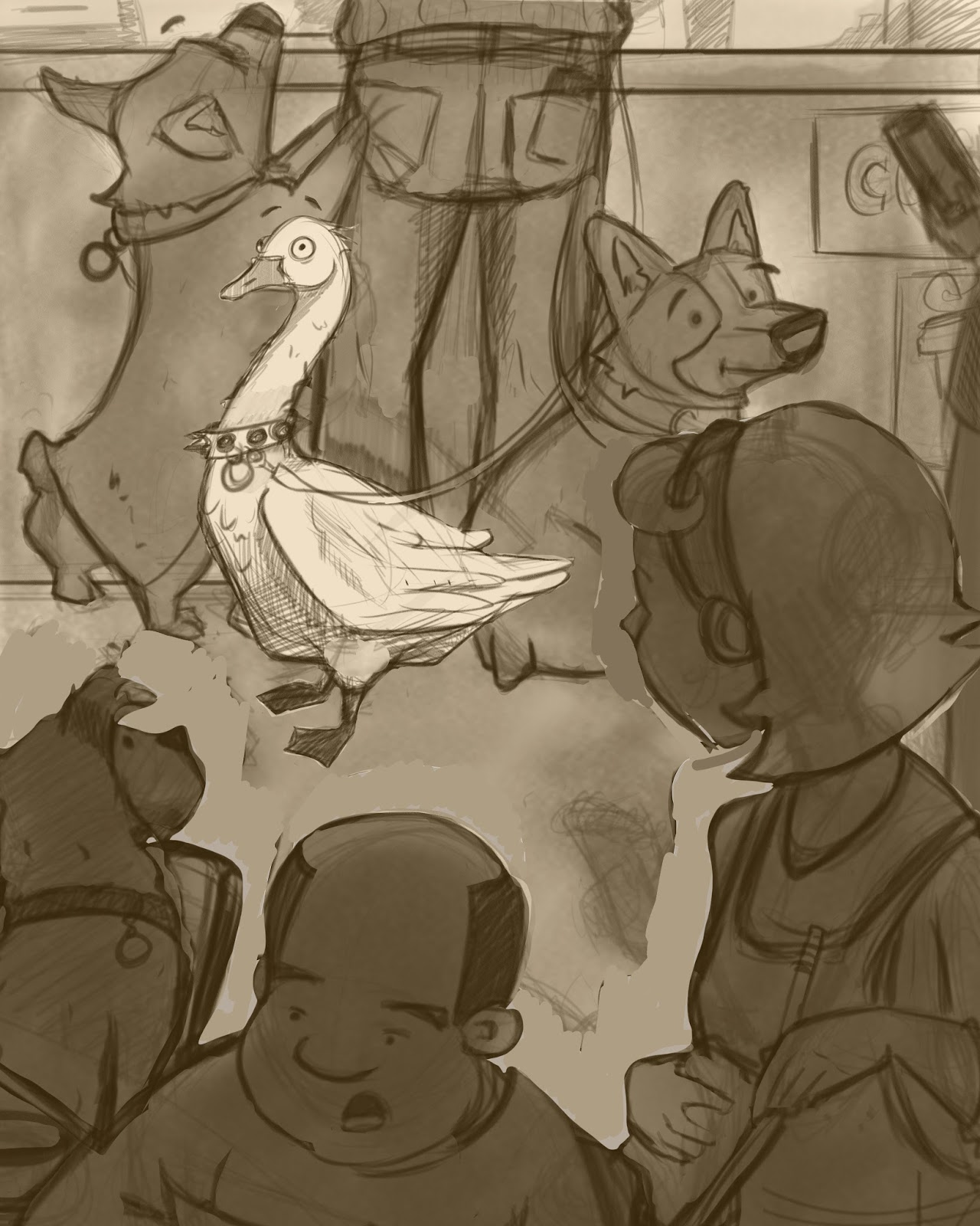
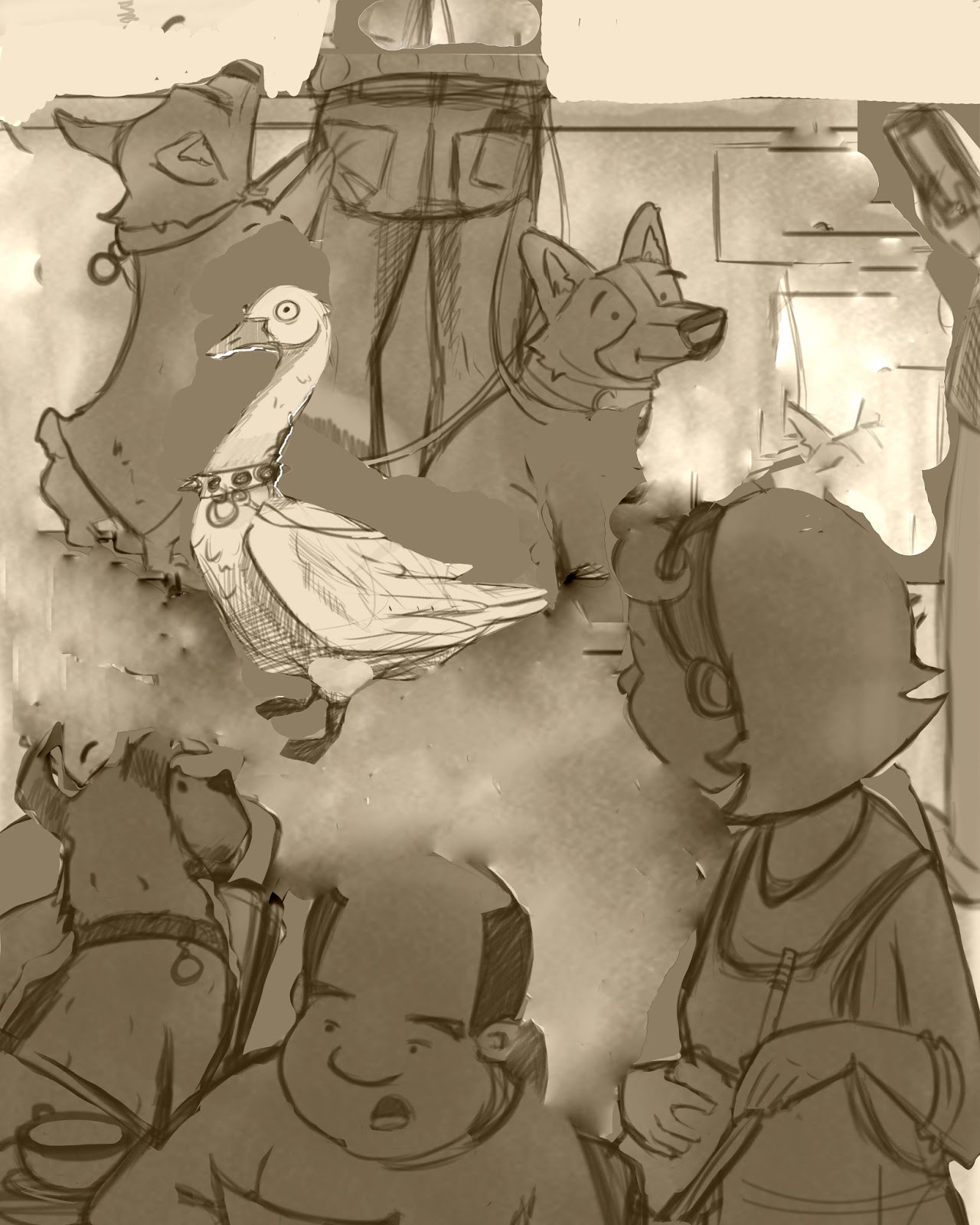
Here are three changes in the composition. The last being what we decided was working best.
First comp

Second comp

Third comp

My gut instinct is to keep going with my orgional Idea, but I don't know if that's just because I've "married" my composition. Thoughts?
-
I believe the back of the man's pants are too small in proportion to these small dogs, unless that is supposed to be a kid. The leash of the goose is touching on a tangent with the back of the dog, space that out... also watch the chin of the foreground dog and the chair, move the chair down. Otherwise I thought moving the woman in Comp 2 was right.
What if you change the pants of the man/child into a girl in a skirt. You don't need the parallel lines of the pants leading to the goose, since he is the only non-dog in the pic and kind of centralized by everyone surrounding it. Not sure if Comp 3 is working, but good luck to you, the style is really cool!
-
is that a "Corgi" on the left? Those dogs are cool.
-
I don't really have a developed eye when it comes to critiquing pieces unless something is blatantly off. I still have to learn a lot of art concepts of why some things work, why some things don't, and when it's better to not follow those rules (which is why I find 3rd Thursday so helpful...always impressed at how quickly the instructors are able to suggest fixes that improve the piece). I'm the type that will say a movie is good if it entertained me for two hours. So basically, if your piece was a movie, I'd say it was good.
But of course that doesn't offer you any sort of helpful advice, haha. What I will say is that when I receive a critique, there are times when I'll immediately see that it will improve my piece and then there are times when I'll be on the fence. When I'm on the fence, I'll usually go with my gut feeling knowing that it won't be the only fork in the road that I'll come across during the process of working on the particular image. As the image develops, some things will come up that will confirm whether or not I made a good decision earlier on. And if I didn't, then I'll just make changes accordingly (with the added benefit of confidently walking away from my earlier choice with little hesitation). I'm sure with more experience those forks in the road will be less common.
-
I really love the characterisation in your sketching! The goose is fantastic

Personally I agree with your other illustrator friends that the first one feels a little crowded...the goose is the focal point but he feels too close to the terrier-type dog in the foreground... 2 and 3 feel quite similar looking overall, (the goose is smaller in no.3..and overall it's less cropped?) ...but I prefer 2 because I like that the goose is a similar size to the dogs, it makes him/her look like one of them, and you also have a clear contrast in value between the goose, middle ground, and foreground..the 3rd one is more smudgy value-wise. But I don't mind it being less cropped, that's good too. All personal opinion though and will be good to see where this goes next!
-
I like the feel of the 2nd comp. Also I agree with bobby the 'owner' of the dogs and goose is a bit small in proportion. Love your ideas and style!
-
I really like the first one. I think the crowded feel makes it seem like a busy place. If that's what your intention was, then you achieved it.
-
Hey guys! So here's where I've landed in the personally happy area. I had to go with my gut and only make a few changes. I changed the legs, and the size of the frontal characters as opposed to the background ones. Thanks for the input! Here's my sketch now. I'll post color soon!

-
I hope you don't think I'm a big weirdo, but I saw this video on Facebook and instantly thought of your drawing! Hope you can see it...https://www.facebook.com/HSUSFarmAnimals/videos/1154936394551292/?fref=nf
-
@Carrie Not at all! It's so cute! thanks for sharing!

-
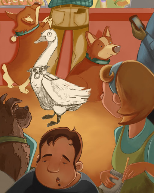
Just wanted to catch you guys up on where I am. Here it is with some color. I'd say I'm about half way through. Saving the goose for last since he's the most important. Feel free to lend your advice, but keep in mind that this is still a WIP.
My plans:-The terrier is a little too heavy in texture, planning to smooth him out a bit.
-Need to work on all the hands you see.
-Goose needs a paint-over
-Barista need to be more defined.
-etc., etc, etc, lolThanks so much to Will Terry for the quick Skype lesson on brushes. I'm really enjoying the results after making those adjustments to my brush shape and adjusting the flow. You helped me break through to see the light! haha! Thank you SO much!

-
This is really fantastic. You should be proud!
-
Just love this well done!!!!
-
@Christina-Taylor-Brown
Loved the color scheme. I'll be paying attention to the etc., etc, etc. and other improvements.
-
Beautiful colors so far, can't wait to see more!
-
I love this!!!
The only critique I can find is that the terrier looks like is about to fall off his chair... It's like he leaning back to try to find his balance or something. I think just fixing the perspective on the chair a little would fix that!
Other than that, great work! I love the color palette.
Would you mind sharing Will Terry's tips ? I struggle with brushes too...
Can't wait to see the final version of this one!
-
Thanks everyone! I feel like I'm done. I'm happy with it, and could end here, but if you'd like to give me your thoughts, go right ahead! Thank you again for your encouragement!

-
@NoWayMe of course! It finally clicked for me after Will showed me how to change the shape of the brush, and to work in small "dabs" (if you will) gradually building up to the lights. Try fiddling with the shape of your brushes, and you'll see what I'm talking about!
-
I love it!
-
I love it too! Only concern I have is the counter color looses the dogs, but of course that makes the goose stand out too.
