Help with lighting
-
Hello!
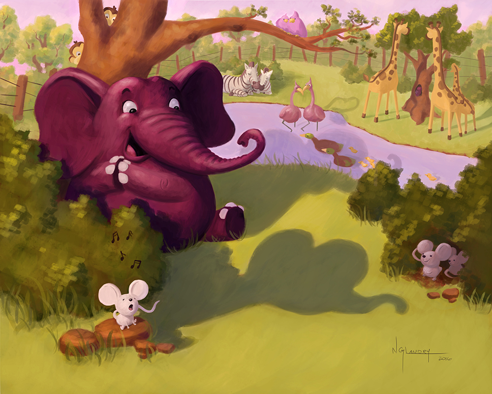
I know the deadline for 3rd Thursday was today and the piece is already submitted, but I still wanted to post it here to see if I could get help on lighting... I was aiming for a "end-of-afternoon/early sunset" mood, and I am half happy with it. There is something about the lighting that I think could definitely be improved.
Any idea ?
If you have any other critiques, go ahead as well. I am thinking of doing 5 other illustrations for this project and maybe publishing my story, so every bit of wisdom is greatly appreciated.
Thanks in advance!
noemiegionetlandry.squarespace.com
noemie_illustration on Instagram -
I got the impression that it was in the late afternoon that this was taking place, so I think it's about where it should be. I'm not sure what suggestions to make other than a really small one...which is to hit the end part of the tail of the singing mouse with a hint of light.
I really like the mouse's singing expression. And the elephant is delightful
")
-
Your purple elephant is the greatest! hehe, he's just so cool! It does read late afternoon to me as well. Late afternoon, but not dusk. I think if you want to push it further you could warm up the highlights on the left sides, but i think it is fine
-
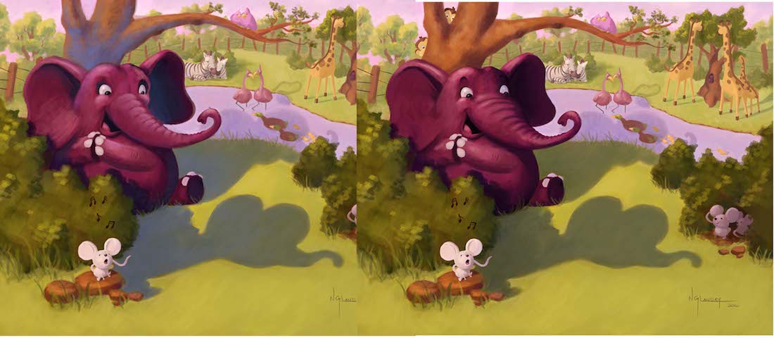
@NoWayMe I hesitate to call this a paint over - but i was trying to describe how i thought the trunk of the elephant might change and decided it would be easier to draw what i was thinking - also added a bunch of purples and blues to the shadow to see how it would look - anyways this is really about the anatomy of the trunk - hope you don't mind the draw over
-
Thanks @shinjifujioka and @Lynn-Larson!
And thanks @Kevin-Longueil for the paintover! I was thinking of pushing the blue in the shadows more, I will give it a try!
I feel like the background is too... I don't know, pastel-colored? not enough contrast ? However I don't want to push the contrast too much and distract from my focal point... any thoughts on that ?!
Thanks so much for helping! I know I ask a lot of questions, but I am really excited about this project so help is much appreciated!
noemiegionetlandry.squarespace.com
noemie_illustration on Instagram -
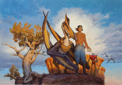
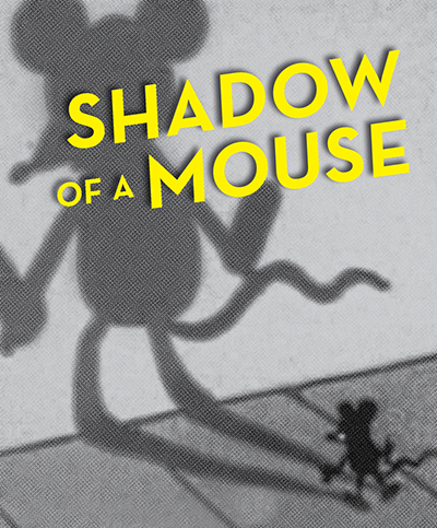
@NoWayMe I looked up James Gurney and golden hour and he had a nice blurb on his blog under the image below (isn't the tree awesome?) about the quality of light and the relative bluishness of the shadows at this time of day - here is the link below - this may not be what you are looking for though - what I did on my paint over looks very flat and a bit lifeless I think....except for that little bit on the elephants belly.....that looks like it's working
- I have so much to learn about color - James Gurney has a great way with explaining things though .......... about the contrast - have you converted this to black and white to see where the values are - I bet if you did you might see where you would like to make changes in contrast or not - i'm sure you've tried this - anyways looking forward to seeing your future images with this story! http://gurneyjourney.blogspot.com/2008/01/golden-hour.html
-
Thanks again @Kevin-Longueil! I really appreciate! I will look his work for sure!
For now I am putting this painting aside for a couple of days and I will put a couple hours on it this week-end with fresh eyes! I'll post the result here!
Thanks
noemiegionetlandry.squarespace.com
noemie_illustration on Instagram -
I like the idea: a classic cartoons gag.
Despite the issues I will mention, I think your concept is a great one to learn a lot. After all, is an image about perception, the very core phenomenon behind visual storytelling art.
Seems that you have the sun as the main light source (the rest of the lighting is generated by bounced light). If so, the shadows of the characters are not representing such situation. As you can see in the image, you have two light sources in different positions, one for the mouse and another for the elephant. The result is strange for someone whith hours of lighting phenomena observation, like well trained illustrators.
In spite of to force or twist features (in order to remark the messsage) is one of my favourite tools in visual story telling, I think your image is manipulating features (the shadows) without helping to get the message. Most adults will get the idea behind the image but it's not the best solution for what you're apparently trying to do. There are several possible approach in the illustrators toolbox that can help to improve the message.
I think you must redesign the compossition taking in account that the shadows in your image are crucial. Also, you need a more deeper tonal and local color study in order to improve the perception of the focal point (or points).
As a possible clue: the classic gag of the "deceptive shadow" of a little character is based on distance.
I hope that makes sense.
-
Hi @sergio,
Thank you for taking the time to comment.However, I am not sure I understand what you mean. Do you have other idea of compositions that would convey my story better ?
I am globally satisfied with this illustration and there is a lot of thing I like about it. Even though I would like to improve it, I am not sure I want to start over with a whole new composition...
If others have an opinion I would love to hear it!
Thanks!
noemiegionetlandry.squarespace.com
noemie_illustration on Instagram -
Yep, your image has a lot of beauty aspects and shows nice skills. I love the characters and the painting in general. There are different layers and everyone is appealing. So, my comment can be understood as a pointless critique. You can be sure that my opinion is sincere and is intended to help.
The problem I see is what you want to transmit to children is not being achieved in the best way. Visual language and written language work similarly. As we grow we acquire more and more knowledge about language, meanings, signifiers... That's why literature for children has different levels of complexity, on writing as well as on illustrating.
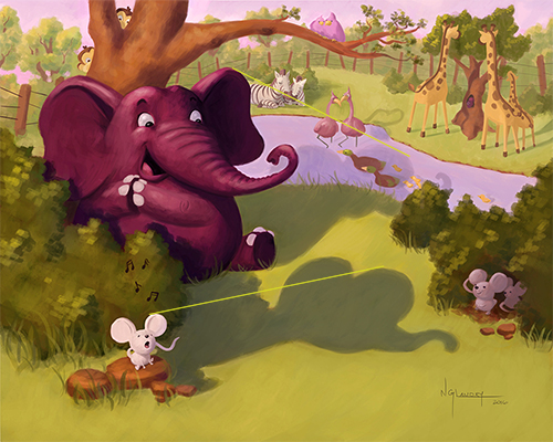
In spite of the levels of reading, in your image, the main characters in the situation you are describing are the shadows. Is the projected shadow of the mouse what is generating the confusion, because its very similar to the shadow of an elephant. So, the mouse shadow, first, and the elephant reaction, second, are the main "message carriers. In my opinion, your image is not using the best illustrator strategies to remark that.
The complexity of your image tells to me that it's not designed for preliterate kids, and due to the style of the characters It seems to me that you are addressing the tale to 3 to 5 years old (please, let me know if I'm wrong). Due to the age, and taking in account one of the principles of illustration for children (the illustrations "should attract attention and facilitate understanding" of history). It is also true for older kids. So, I think your image it's too complex. Even in cartoons for older kids the visual message is "simplified" and completely/obviusly focused on what helps to quickly understand the message. Same thing about parents: image must help parents to "translate" the image to their kids.
If you are addressing your illustration to older kids, with an average level of formal literacy, the text could facilitate the reading of the image. Here is the point: to me, if the image is absolutely text dependant for its decodification, there is a problem.
Here is an exagerated example: note that the illustration and the text has the exact same message.
To me, an Illustration for kids must have the same level of clarity than a key scene in a good animated movie. Very clean and clear focal point(s), easy and quick understanding, strong visual aids to help to understand the story...
So, I love a lot your characters, the color scheme and even the composition, but as a message carrier, to me, is not as good as it could be.
Of course, is an opinion, and I'm specialized in the critique of visual content for adults. Anyway, the rules I did mention before are a must even for mature people. No matter of the complexity of the message, it must be clean and clear, quick and easy to understand, function as visual aids to help to understand the story...
Let me know if you agree or disagree. Debates are great tools. After all, visual arts = communication. To me, other people opinions always matter.
-
Thank you @sergio!
I understand what you mean now, and I see how my image might be too complex for the public my story is directed towards. Didn't realized that before... If I decide to go ahead and illustrate the rest of the story I will have to revisit this image and try to find a clearer/simpler way to convey the story.I appreciate you taking the time to elaborate!
Noémie