What do I need to fix?
-
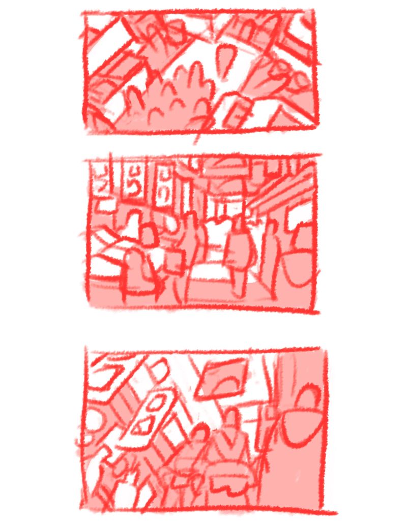
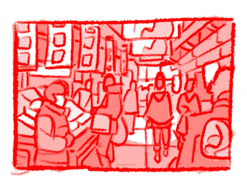
Hey everyone! I'm currently working on this short project you see here. The idea was there is this character walking through a busy market. I wanted to convey a sense of being overwhelmed with too many options. I think the third thumbnail conveys that the best. However, I like how the second looks more, so that is the one I brought to a more finished state. What do you guys think? What do i need to fix? Thank you!
-
@phoenix-yip i think the last one really communicates your idea. I like its composition.
-
@chrisaakins thanks!
-
@phoenix-yip i think the 3rd one gives me more of that overwhelming feeling but the last one looks great too
-
@phoenix-yip I agree, POV looking up conveys the emotion of feeling overwhelmed the best

-
i like the third one but it only makes sense to me if it's the view from a small/short person, child or animal. the last one you did gives me feeling of crowded and busy. if some the signs names repeat then i might get that overwhelmed feeling.ie: fish fish fish...jewelry jewelry etc.
-
@chrisaakins sorrry, did you mean the last one as in the one i took to a finish or last as in the third thumb? Thanks again for your feed back!
-
@phoenix-yip Yes. The one you took to the finish looks good. I think it was the same as number 2? I think seeing all the choices in a panned out view makes it more busy which is the feeling you want.
-
@chrisaakins ok thanks!
-
While I definitely think the third thumbnail conveys best the feeling of being overwhelmed, it seems like the eye-line is too low unless of course your character is a smaller one in the two to three foot tall range. If that isn't the case, I really like the last thumbnail and think that the signs coming down from above and protruding in from the sides are very effective at giving that sense of being overwhelmed. The fella on the right helps that theme too! Makes the viewer feel even more crowded. Nice work thumbnailing!