Discussion! Do the design of these guys work? March Feedback request
-
Hello guys!
In the light of march critique arena, I am trying to figure out what is the general appeal of my character designs to people who excercice art like this community.I mean people who know, not general public.
One of my designs made it to the 16, and the others didn't.
I don't necessary have a problem with that, as I attend the monthly challenge as a personal challenge,world building excercice, possible portfolio pieces and as a way to see a lot of awesome artwork from the other members of the community.
Thing is.
I am genuinly curious as to WHY the appeal of one piece is stronger than the others.
What "clicks" in one character that does not in others?
For example, @Braden-Hallett last design the kid with the wooden sword , was the most appealing in my mind. What do you think made the judges choose his kid demonJust share your opinion if you feel like it!
Feel free to share your entries if you want to ask a question too about the arena too!
Have an awesome day!
Giorgos.


-
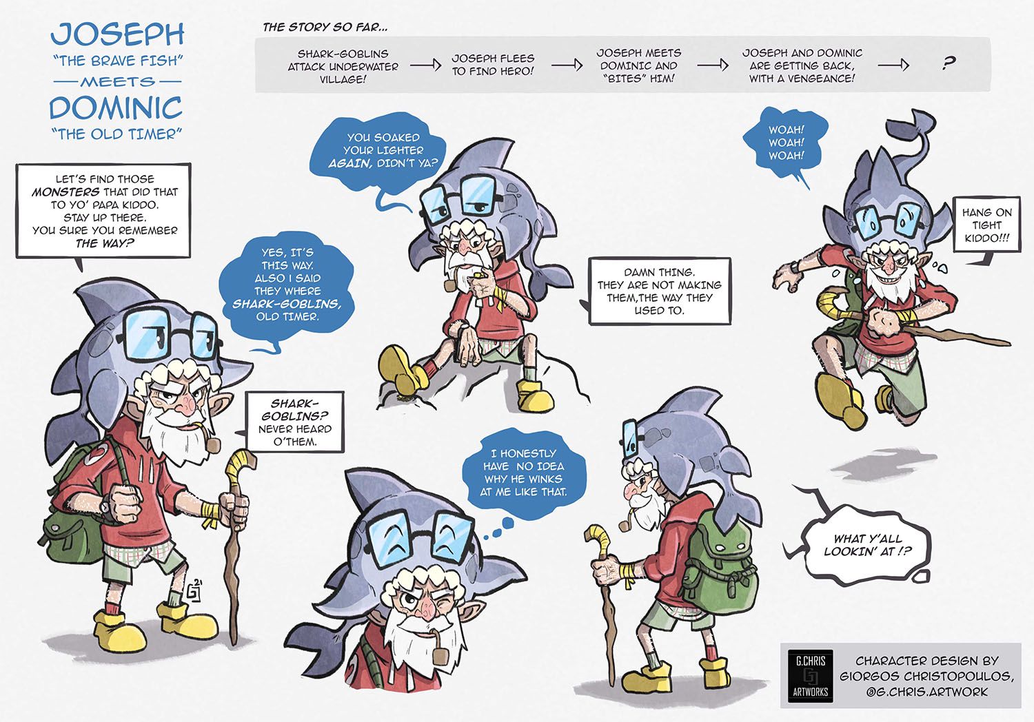
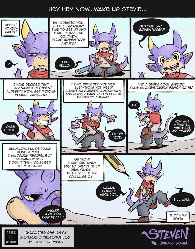
Not really an answer to your question, but I think the shark design was the closest to a character sheet, the other ones look more like a page from a comic, so maybe that’s way they weren’t picked. My personal favourite was Steven, btw.

-
@mag I see what you mean. I can't help but put speech bubbles at my character sheets. So they get a comic book feeling. Also Stevie got a special place in my heart.

-
Generally the drawings and poses are really good, there is a lot of movement. One thing that came to mind while looking at characters was that they all feel a bit busy, meaning that there is a lot going on in the actual character design which makes it a bit difficult to know what is the most important part, where do you want the attention to go?
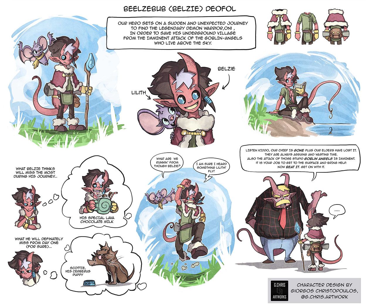
The character that I liked the best is the guy with horns, glasses, a red tie and black shirt. He is simple and he feels like he could be a real person. So maybe some of the characters could do with a bit of editing and simplifying? Like Belzie for example, there is hair and a gray bit of hear, a ponytail, a tail, a bag, big shoes (that draw attention away from the face), glove, bracelet, a flying buddy, a cape with fur, a sleeping bag, a wand with decorations. There are so many things to look at that I am not sure what this character is really about. In general it is good to have a focal point, like the face and the upper part of the body.
I hope this helps. Great drawings, especially the hands.
-
@Georgios-Christopoulos said in Discussion! Do the design of these guys work? March Feedback request:
For example, @Braden-Hallett last design the kid with the wooden sword , was the most appealing in my mind. What do you think made the judges choose his kid demon
Honestly enough every single critique arena there are lots. LOTS of entries that don't make it that I thought would win.
Part of it is that they're trying to balance a bunch of different styles, takes, and rendering techniques to showcase as many different methods as possible.
Most of it, though, is because at the end of the day this whole thing is very VERY subjective. You can only look at illustrations objectively (this one doesn't have good composition, this one's values are muddy, this one has silhouettes that can't be read, this one is FULL of confusing tangents, etc) for so long until your choice comes down to "I like this one" or "not for me".
This is true if there's ONE judge. When you have two judges that have wildly different tastes (you'll notice there was at least one entry that Will said "yes" to and Jake said "no" to) then things tend even MORE toward their personal preference at the moment which is perhaps influenced by the colour of the room they're in, the ambient temperature of their studio in the hot sun, or THOSE DAMN KIDS ON MY LAWN AGAIN.
And this is fine!
Long story short, beyond some very VERY basic judge preferences (Jake likes robots and action, Will likes stout and cute, and Lee, much like the cats he seems to like, is utterly mercurial and is impossible to predict and so you should just try and throw him a curveball) there is no point in trying to predict how much the judges will prefer one design over another.
Storytelling on the other hand is a different matter!
However, when it comes to the audience voting, THEN the design of the character will sometimes comes into play.
Alright... I'm gonna write another post about this.
-
I think Steven the Wingless Dragon was the one they highlighted as having a good chance of making the 16, but your setup – while it had all of the poses – was too comic booky (I'm making that a word now) and not a character sheet with everything going on. It's probably that Steven just had too much going on around him, even though he was probably my favorite design of yours.
And I think Joseph might have gone farther if it was clear he was the main character. I think a lot of people saw the old man as the main character since Joseph could be mistaken as a "shark hat" on a quick look. Thus, people were judging old man vs the competition rather than your shark vs the competition.
-
So they did say the second one was too much of a comic book so they didn’t choose it, so really it’s between 1 and 3.
Personally - I find the old man with the shark more unique and interesting than a demon boy. I feel like I’ve seen a lot of anime like demon boys but I’ve never seen an old man with a shark hat/friend. So for me - story wise - it is much more interesting and has more depth.
Also I definitely thought the shark was just a hat because I didn’t read the text lol something to think about for the future!
-
@hakepe That is actually a very good point,regarding the heavy details.Focal point even in the charater details it is then!I agree on that!
Also, I used to HATE drawing hands,not so long ago.They still haunt me!@Braden-Hallett Hey this is a light reply!!Hah. All kidding aside, I think you are right. In the end, you cannot appeal to every single person simultaneously.
Though my genuine curiocity is how really simple and famous art styles appeal to the majority of people (like Asterix, Garfield, Looney tunes, Peanuts,you get my point..)
It can't be that it is all storytelling. Also I don't think that it is personal preference in their situation.
I think that there is more like, likeability and appeal builts momentum to more appeal.
So, let's say I like an artist's early pieces..As time passes by, I "learn" to like the majority of his work. You can say I might be getting a bit biased.
And don t get me wrong, there is nothing wrong with what I said.
I am just trying to understand a bit of human nature,regarding appeal.
I ll continue drawing NOT CUTE fellas!@Kevintreaccar yes they did say that.and I agree.I half anticipated that he wouldn't be chosen, when I drew Stevie. I just wanted to try a different approach since he was my second design.
As for Dominic and Joseph, I relied too much on the bubbles. The shark was the main guy
@carlianne Yes,apparently I relied to much on the text to define the character story.The Shark was the traveller and he had already found his goblin-help

Thanks for the feedback and the discussion guys!
Sorry if my english are a bit...weird?
I m just a Greek fella