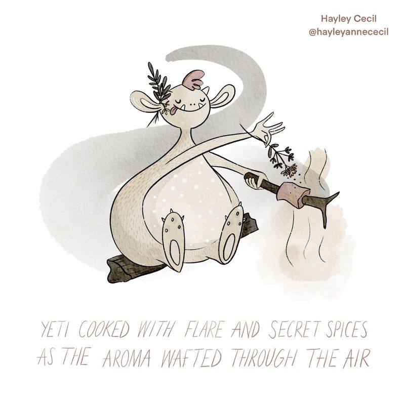
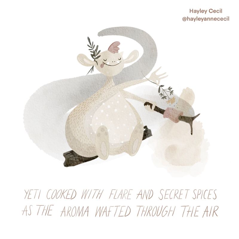
Society of Visual Storytelling

    SVSLearn Forums

    • Register
    • Login
    • Search
    • Recent
    • Tags
    • Popular
    • Users
    • Groups
    • Search

    Lines or no lines?

    Contest
    12
    24
    1289
    Loading More Posts
    • Oldest to Newest
    • Newest to Oldest
    • Most Votes
    Reply
    • Reply as topic
    Log in to reply
    This topic has been deleted. Only users with topic management privileges can see it.
    • hayleyannececil
      hayleyannececil last edited by hayleyannececil

      Hi all. Which do you prefer? Lines or no lines? The no lines I think I prefer but feels lacking as I’m used to drawing with lines and trying to veer away from it...!345445B6-2F0E-481D-8009-B4A314F88A02.jpeg 5ED9FB68-2E97-45C5-9CC3-6204D61AEE5C.jpeg

      https://www.instagram.com/hayleyannececil

      Laurel Aylesworth 0 NessIllustration Melissa_Bailey Tiffany Thomas 4 Replies Last reply Reply Quote 6
      • Laurel Aylesworth 0
        Laurel Aylesworth 0 @hayleyannececil last edited by Laurel Aylesworth 0

        @hayleyannececil Maybe with line but more subtle? The no line one is blending in with the background without it.

        1 Reply Last reply Reply Quote 0
        • NessIllustration
          NessIllustration Pro @hayleyannececil last edited by

          @hayleyannececil I like the no lines!

          vanessastoilova.com
          instagram.com/vanessa.stoilova/

          Check out my Youtube channel for tips on how to start your career in illustration! www.youtube.com/c/ArtBusinesswithNess

          1 Reply Last reply Reply Quote 0
          • Naters.Art
            Naters.Art last edited by

            I like the lines but they're too stark. You could lower the opacity of the black or change the line color to a dark brown.

            my Sketch Blog
            https://www.instagram.com/naters.art/

            1 Reply Last reply Reply Quote 1
            • hayleyannececil
              hayleyannececil last edited by

              Thank you all. Going to have a bit more of a play with shadow vs more subtle lines!

              https://www.instagram.com/hayleyannececil

              1 Reply Last reply Reply Quote 0
              • Melissa_Bailey
                Melissa_Bailey @hayleyannececil last edited by Melissa_Bailey

                @hayleyannececil -- first off, your yeti is adorable! Love how you're saying so much with so little.

                There's something charming about the "no lines" version. However, the values are so similar, details get lost and the neck fades into that darkest part of the swash.

                Being a fellow line lover, there's also something nice about the lines, as they define the shapes and bring the character forward. But I agree with @Laurel-Aylesworth-0, perhaps instead of having stark black lines, you lighten them or color them?

                Really sweet piece, and I love how you're playing with shapes in the composition!

                illustrator - author - smiley person
                mbaileyart.com
                instagram.com/mbaileyart/

                1 Reply Last reply Reply Quote 2
                • hayleyannececil
                  hayleyannececil last edited by

                  Thank you @Melissa-Bailey-0 yes I was trying for a minimalist approach 😆

                  https://www.instagram.com/hayleyannececil

                  1 Reply Last reply Reply Quote 1
                  • hayleyannececil
                    hayleyannececil last edited by

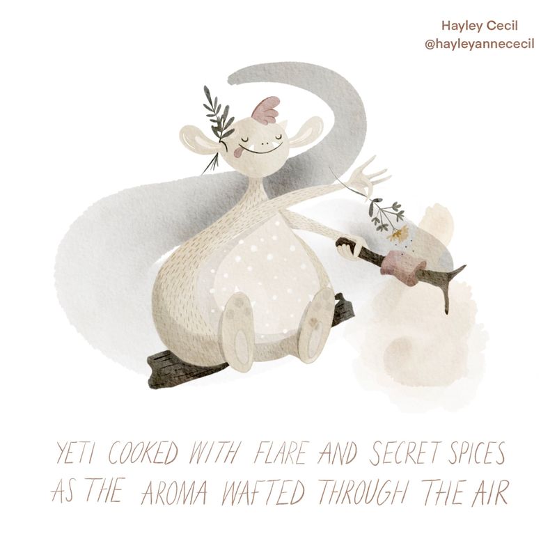
                    So I’ve tried to add some more shadows to define it a bit more (hopefull there is a difference!) and next I’m going to try with more subtle line artF7C003E1-85F7-4D34-B6EB-1A71A6B76537.jpeg

                    https://www.instagram.com/hayleyannececil

                    Melissa_Bailey Tiffany Thomas 2 Replies Last reply Reply Quote 8
                    • Melissa_Bailey
                      Melissa_Bailey @hayleyannececil last edited by

                      @hayleyannececil yes, those subtle changes did help a lot with readability. ❤️

                      illustrator - author - smiley person
                      mbaileyart.com
                      instagram.com/mbaileyart/

                      1 Reply Last reply Reply Quote 1
                      • Julia
                        Julia last edited by

                        For me, no line but more contrast!
                        The image is very cute 👍

                        https://www.instagram.com/julia.nsw/

                        1 Reply Last reply Reply Quote 0
                        • Tiffany Thomas
                          Tiffany Thomas @hayleyannececil last edited by

                          @hayleyannececil I love them both, really nice design and composition! I think the softness & texture of this character lends itself better to the "no lines" version but there are some areas where the values of the colors are so close that you loose a but of the depth, like where the neck meets the grey smoke. I think if you just deepen that neck shadow a tiny bit it might help balance it out a bit. Soooo good though, I totally want to hang out with this Yeti!!!

                          1 Reply Last reply Reply Quote 1
                          • Tiffany Thomas
                            Tiffany Thomas @hayleyannececil last edited by

                            @hayleyannececil Haha, just saw this version. Apparently I should read through the whole thread before replying. I like the changes, it definitely gives more depth!

                            hayleyannececil 1 Reply Last reply Reply Quote 0
                            • hayleyannececil
                              hayleyannececil @Tiffany Thomas last edited by

                              @Tiffany-Thomas haha thank you! If I have time I’ll try one with lighter lines and see what it looks like vs this one, I’ve just always drawn with lines so it’s hard for me!

                              https://www.instagram.com/hayleyannececil

                              1 Reply Last reply Reply Quote 0
                              • chrisaakins
                                chrisaakins last edited by

                                @hayleyannececil I understand the desire for no lines but also loving lines. What I sometimes do to compromise is I make a selection of my shape and on the clipping mask, just barely brush the edges with a dark analogous color to define the shape without an obvious line.

                                Chris Akins
                                www.chrisakinsart.com
                                www.instagram.com/chrisakinsart/

                                hayleyannececil 1 Reply Last reply Reply Quote 0
                                • R
                                  Richard Matthews last edited by

                                  @hayleyannececil when I first saw the lines I was like "oh definitely lines" but I prefer the no lines! haha. Great work! It looks so soft without the lines.

                                  hayleyannececil 1 Reply Last reply Reply Quote 0
                                  • hayleyannececil
                                    hayleyannececil @Richard Matthews last edited by

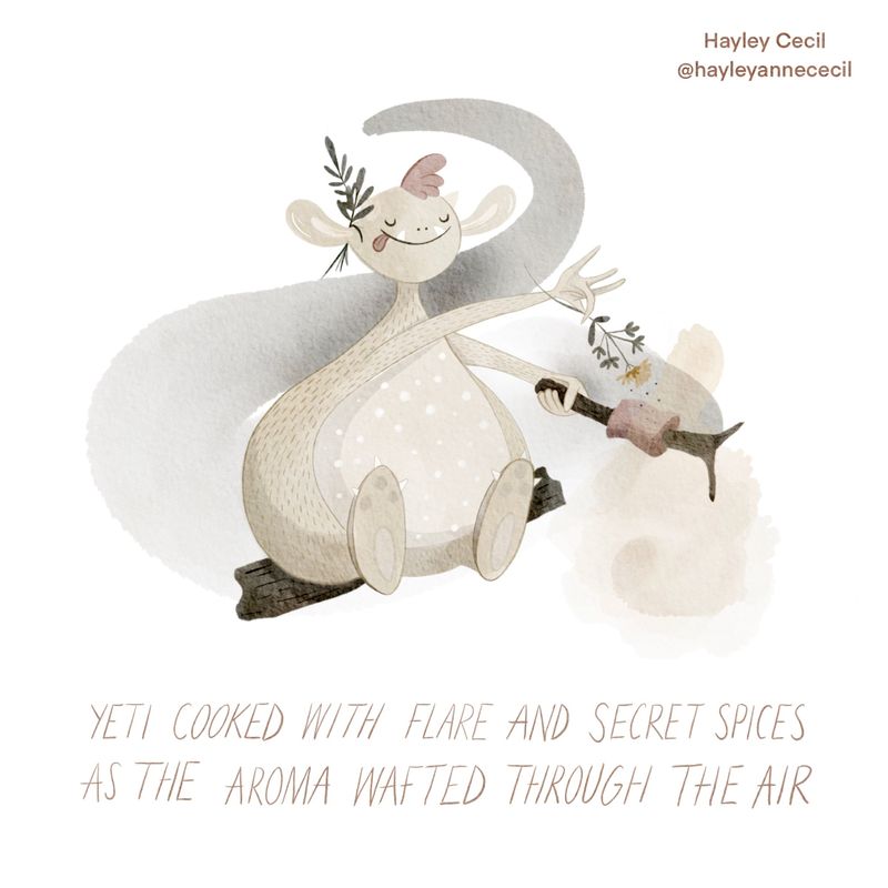
                                    @Richard-Matthews hahaha! It’s a struggle, I’ve now done a soft line version, going to post the 2 new ones below! Think I still prefer no lines!

                                    https://www.instagram.com/hayleyannececil

                                    1 Reply Last reply Reply Quote 0
                                    • hayleyannececil
                                      hayleyannececil @chrisaakins last edited by

                                      @chrisaakins ohhh good tip! Thank you ☺️

                                      https://www.instagram.com/hayleyannececil

                                      1 Reply Last reply Reply Quote 0
                                      • hayleyannececil
                                        hayleyannececil last edited by hayleyannececil

                                        Ok...soooo I THINK I prefer no lines in the end! Here’s both options together :)! Edit, ignore the dark blob on foot, thought I rubbed that out 🤦🏻‍♀️

                                        959BB859-B577-4FE2-9ADE-0E993BA1FC7C.jpeg F5883E05-4E28-433B-A71A-237B5655645C.jpeg

                                        https://www.instagram.com/hayleyannececil

                                        joosterwijk miranda-hoover Melissa_Bailey 3 Replies Last reply Reply Quote 4
                                        • joosterwijk
                                          joosterwijk @hayleyannececil last edited by

                                          @hayleyannececil Beautiful! I love the softness of it. Still I prefer the ones with lines, it ads a little bit more readability to it. Maybe you can tone them down even more, for instance on the left foot (also the tangent there makes it a bit less clear).
                                          Very nice work!

                                          https://joosterwijk.nl/
                                          https://www.instagram.com/joosterwijk.illustration/

                                          1 Reply Last reply Reply Quote 1
                                          • R
                                            Richard Matthews last edited by

                                            You don't have to change the words but I love making things rhyme so thought I would add "The Yeti cooked with flare and secret spices. With aroma in the air to keep it nice". No pressure at all :). I still prefer the no lines, great work!

                                            1 Reply Last reply Reply Quote 0
                                            • First post
                                              Last post