Portfolio Review: What can I improve!?
-
Hey Fam! I am so happy to rearrange my website for what I think is the better. What do you guys think? is it accessible? Is it user friendly? Is my art style children's book worthy? Please let me know! What can I improve?
My website: PortfolioThank you so much guys!
-
@Kori-Jensen I think your website looks great and very appropriate for children’s book illustration.
In your about me section you mention illustrating children’s books, Do you have any published works you could reference to show your experience and track record as an illustrator?
-
Do you mean as proof that I have done these projects? the books are not published but are printed and copy written. Do they have to be published to be valid experience?
-
@Kori-Jensen No they don’t need to be published to qualify as experience. The way it was worded on your website I thought you had published work and was suggesting you add the titles.
-
@erinrew Great suggestion! I'll totally add them Thank you!
-
@Kori-Jensen
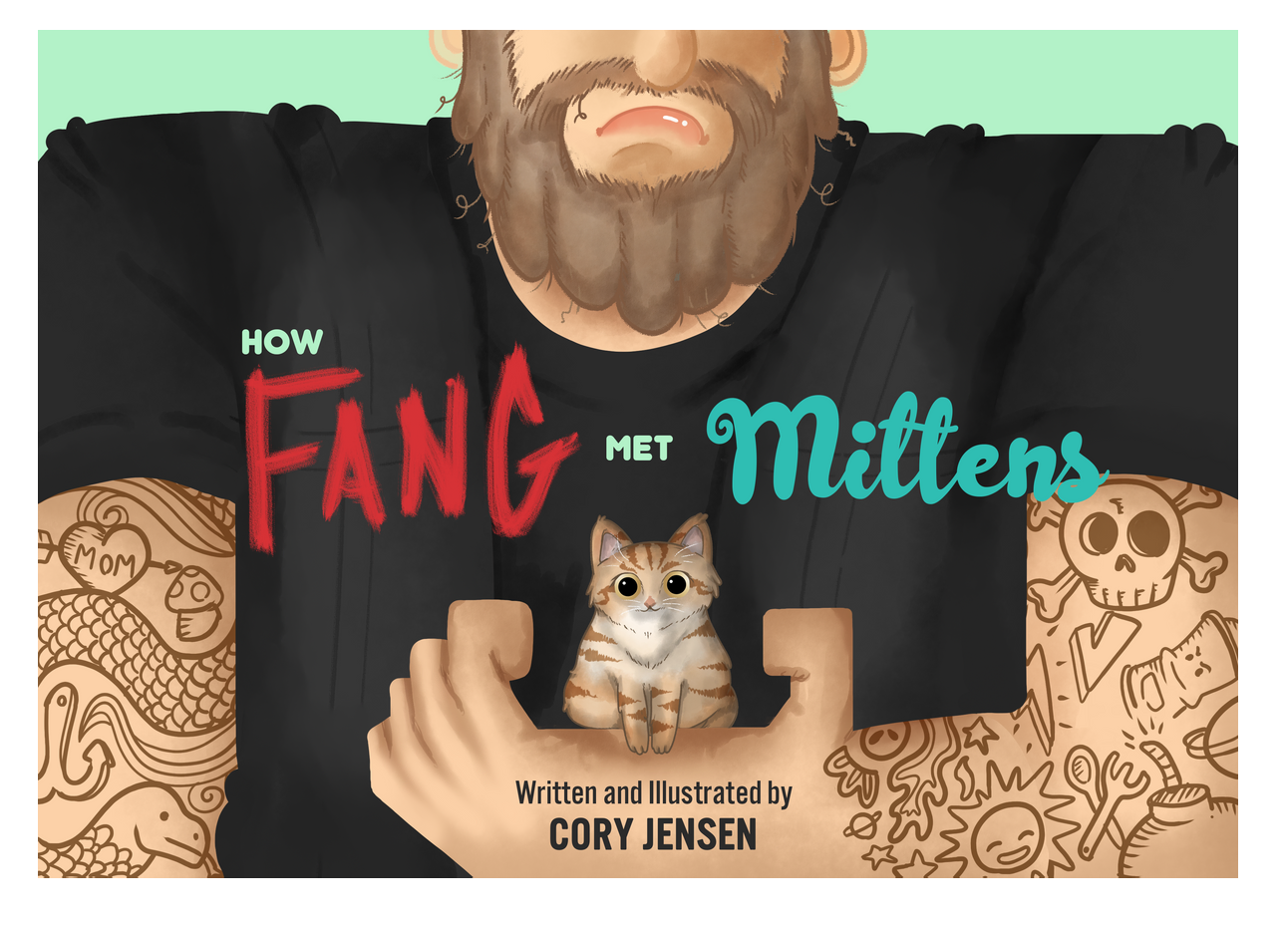
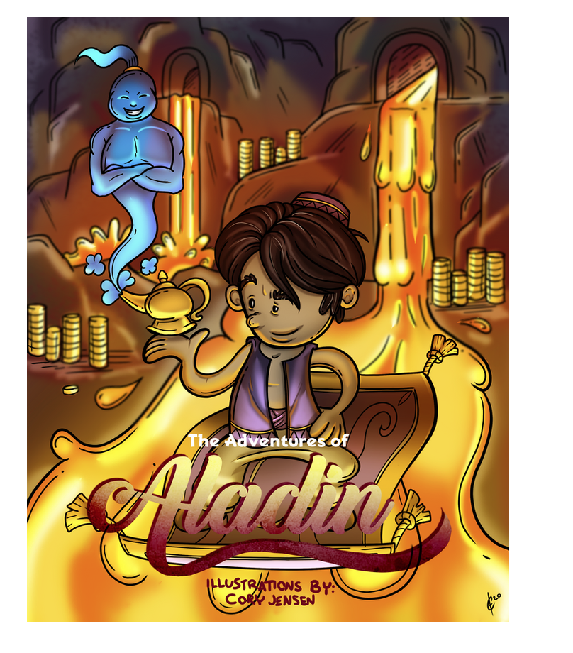
I LOVE this one:
You have some strong work! I think the area I would recommend for improvement is cohesiveness in your style.
If I were an art director and I wanted to hire you I wouldn't be totally sure what I was going to get. For example, this style feels very different from the one above.

I also prefer being able to see more of your work at once, I didn't realize I had to scroll to the right to see your other images but that might be a personal preference.
-
@carlianne Thank you so much for your help. And I am so glad you enjoyed that book cover. You're right the styles don't align cohesively, but I feel like thee loose lines in the Aladdin cover was very free and flowing. Whereas the Fang and mittens one is a lot more defined as a style. I am still looking for my style and its in need of some serious thought.
-
Just a heads up- the images took a bit to load on my end. I don’t have the best internet connection but thought I’d let you know regardless. Otherwise, looks great! I like ‘dude-l”. It made me chuckle.
-
@carlianne -- totally agree.
@Kori-Jensen -- according to art directors' comments in recent webinars I've watched from SCBWI, most don't mind if you work in two different styles, but they want to see them organized, perhaps splitting a portfolio into different sections. They also recommend leading with your strongest piece and ending with another of your strongest pieces.
For me, your portfolio would read better if it was organized. For example, place the Ninja pieces together so that they appear as consecutive or narrative art from the same book.
Otherwise, nice work! Love the expressions you give your characters and LOVE the Fang and Mittens piece -- I'd lead with that one! Do you have other pieces from that book? I'd love to see more of that one!
-
@Kori-Jensen There is a podcast about finding your style, and the course where you do the dream portfolio I HIGHLY recommend it. I was in a similar place about a year ago and it took a bit but I feel like my style is now cohesive, even though I'm sure it'll still continue to change.
-
@Melissa-Bailey-0 Thank you so much. I have been thinking a lot about my portfolio and this helps a lot. I am in the middle of grasping my own art style and i definitely need to improve on it's cohesive nature. As for the fang and mittens cover, I have not made any images yet. It's in the concept stage right now, but thank you for your interest ;).
-
@carlianne It's good to know I am not in this boat alone. Where can I find this podcast may I ask?
-
@Kori-Jensen hi! I think you should also change your portfolio grid into something like instagram instead of having them all in one row. Right now, you can’t really see a lot of the images save for the narrow strips. I had to click on an image just to view the view the whole thing and continuously click on the ‘next’ arrow to view the others.
Ideally you would want to make it as little work for your audience to view your work.
If, let’s say, you arrange your images in multiple rows with at least 2 images on each row, that will leave enough space to show your pics without your viewers clicking on the illustration except when a piece really catches their attention and would want to know more/ look at the details more.
-
@Nyrryl-Cadiz Thank you thats a very good point. You need to make it very easy for your audience to use the portfolio.
-
@Kori-Jensen He mentions it here: https://www.youtube.com/watch?v=ZtaQEOTskMM about an hour in.
But there is also a dream portfolio class where he goes into more detail.
-
Nice work! I didn't see the previous website format, but I think this one flows well and looks strongly presented and streamlined.
-
@carlianne Thank you so much!
-
@Valerie-Light Thank you! I am so glad you like it
 I think I need to work on my art style. An artist's work is never done