Yeti House Feedback
-
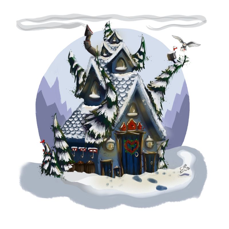
I know this isn't the optimal stage to get feedback at, but I'm trying to get braver about asking for feedback, so forgive me! I welcome general advice, and I have a few questions:
1-How do you add "light" without making the colour behind it go weird? I feel like the yellow is turning the blue of the house kind of green. But maybe I'm overthinking it?
2-I was trying to make the items we need to include stand out. So I have the mailbox, chimney, and some foliage hitting the circle background on some tangents. Good or bad? I know we try to avoid tangents...but I kind of like it. Should I tweak it?Any other obvious tweaks to make that I'm missing?
Thanks for any thoughts!
-
Well what time of day is it? Are the lights on necessary? Or maybe add a second thinner layer o glow? What program are you using?
-
Also I love that your mailbox is up in the tree and it has owl deliveries

-
@Asyas_illos Affinity. I liked the idea of having a cozy glow, so I guess it would be dusk or night. But the background is light so the house shows up...So many things to balance! lol. Thankfully we're here to learn
") .
.The lights are on different layers, so I can tone them down or take them right out.
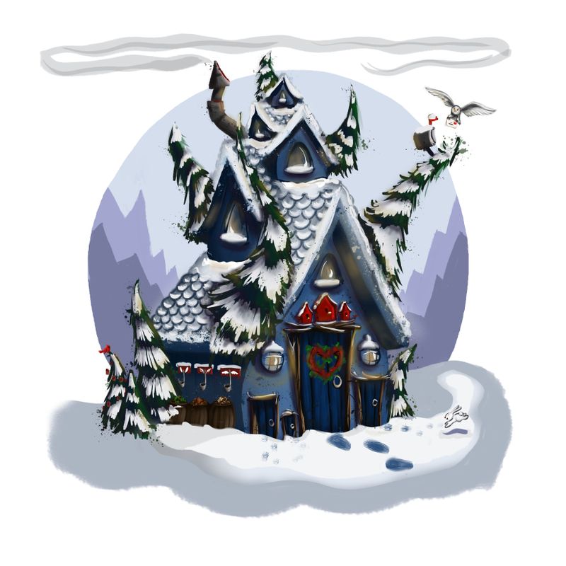
Toned down:
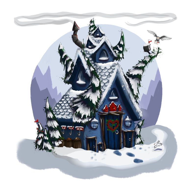
No lights:
Cayleen Blackmore
cayleencreates.com
https://www.instagram.com/cayleencreates/ -
@Cayleen maybe try giving them a more orange glow? It would complement the blue a little more I think, but I do like the lights on version better
-
@Asyas_illos I have a lot to learn about lighting myself, But I think a darker atmosphere would also make this stand out more, but overall a great image!
-
@Cayleen said in Yeti House Feedback:
down:
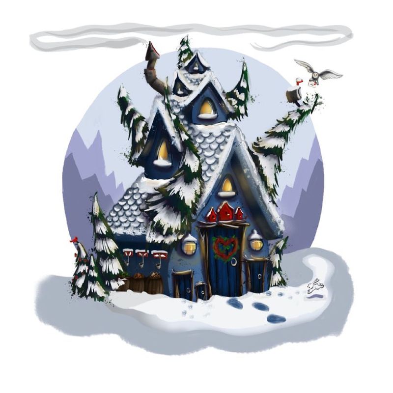
I like the warm lights, maybe push the warm with more yellow and a little orange? I tried adding it so you can see what I mean. Hopefully that is okay.
K.Flagg
-
@K-Flagg Fantastic, thank you!
-
Very cute, Love the owl post!
The tree coming out of the roof in the front reads a little strange and I really can’t tell what the three ladle looking things are or what the barrels contain, but that is mostly due to resolution issues.
Also, I like the warmer lights that @K-Flagg recommended. It makes the home look very inviting.
erinrew.com
Twitter: @rew_erin
Facebook: @erinrewauthor
instagram.com/erin_rew_author_illustrator -
This will match your Yeti design really well! I also love the mail box in the tree with the owl!
-
@erinrew Thank you! Yeah, that tree bugs me too. It feels a little naked/unbalanced without it, though. I’ll play around with it. Thanks!