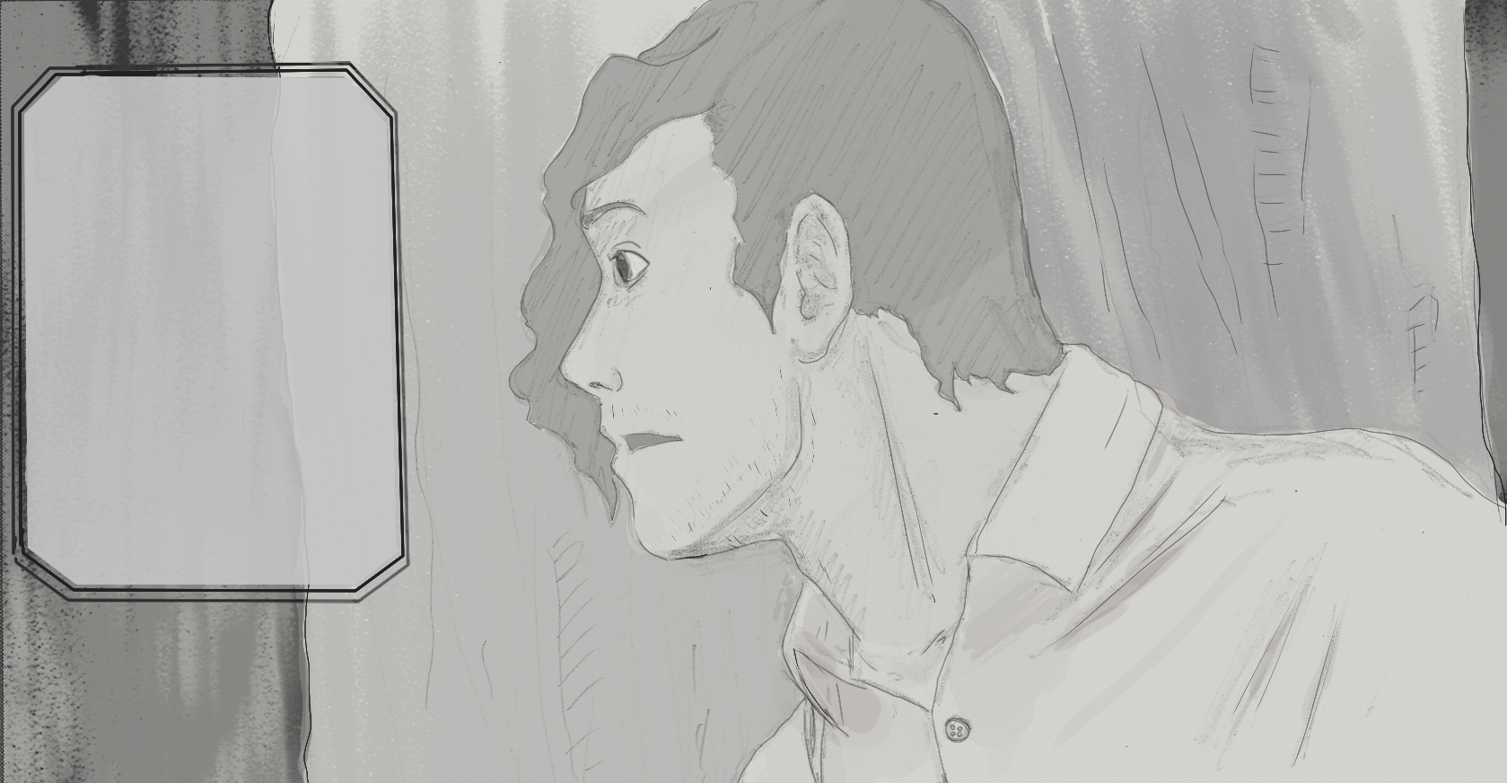
Do I need to increase the contrast on this image?
-
Hey guys! So I'm in the process of digitally editing my scanned drawings for an upcoming comic I am releasing. I'm currently attempting to define the finished style and also develop my digital art skills. This image isn't perfect, there are still some kinks to iron out, but my question is this: Do y'all think this needs more contrast or do you think it reads well enough as it is? I personally like this image as the style I'm going for, but I wanted some outside opinions (even though I'd like to already be settled on it haha). Thanks!
-
I would definitely suggest more contrast. If you squint at the image and the whole thing blurs together, it needs more contrast.
Pretty good drawing though! -
This post is deleted! -
@Elisa-Miko-Price Thanks! Do you have any specific suggestions on how or where to enhance it? My first thought was to make the hair darker to differentiate it from the tree, but then it makes his face look really pale. Or does it need to be adjusted on all the tones?
-
So I did a draw over for you on what I would do if this comic stays greyscale. I don’t know a lot about this scene or this character, but this is what I did to create more contrast.
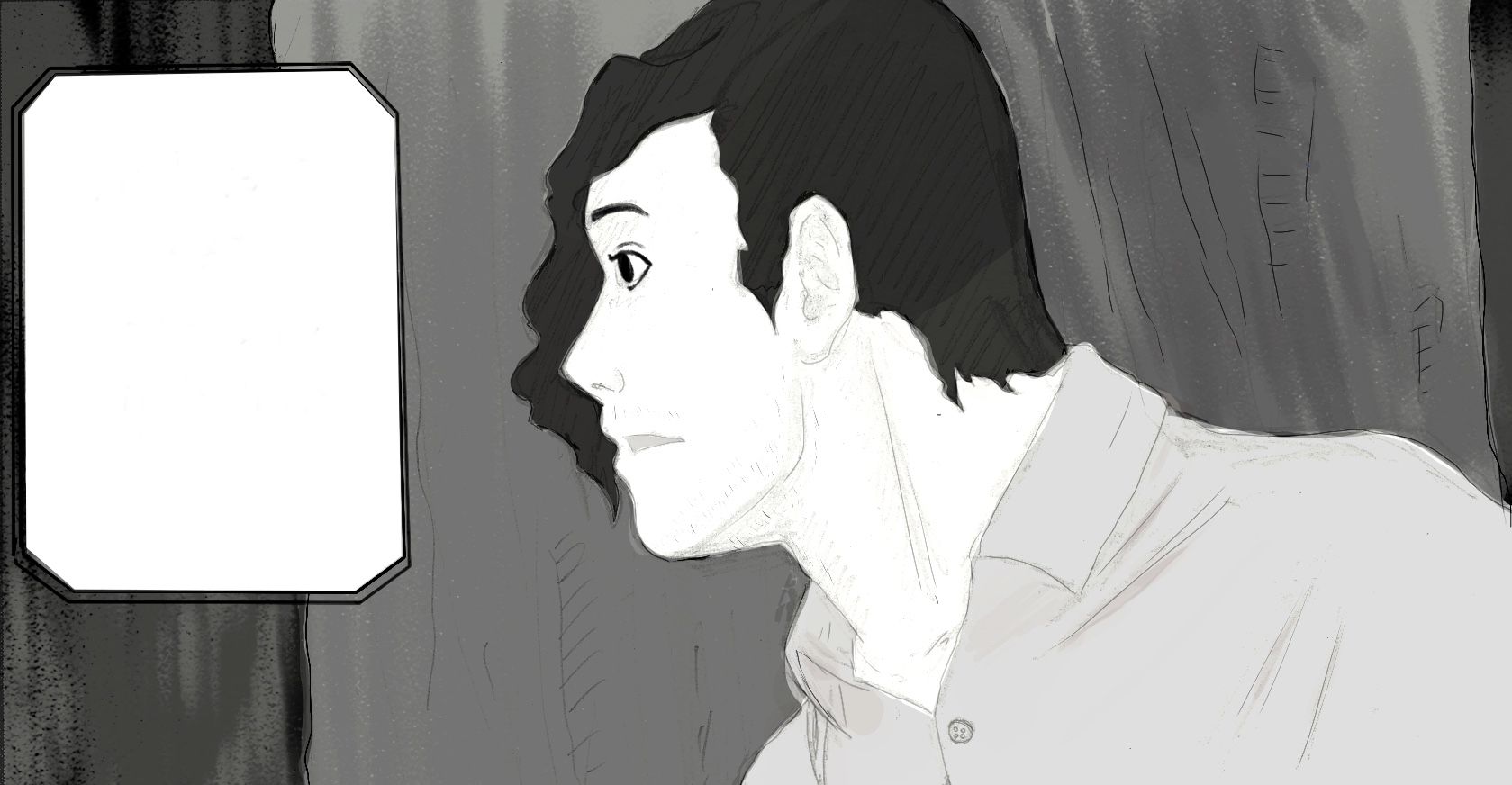
It looks like your doing this traditionally and then scanning it in, am I correct? If so, I would watch a YouTube video about adjusting the value levels on your program before you add any value, to make sure that your lines can be as dark as possible. I hope this helps!!
-
@jmoglesby i think it depends on the story and what feeling do you want to obtain. Personally i like it. Its soft and catches the eye. Maybe just to make sure, you could darken the eye pupil a little bit?
-
@jmoglesby or make not....i like it the way it is:-)