How would you color this
-
Hey all! First Merry Christmas
 second I am struggling it’s this building I am working on so drew out the building but now I’m try to put color on it and I’m just not sure I like how it’s going
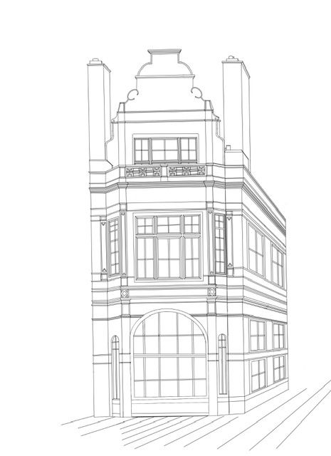
Here is the color I started
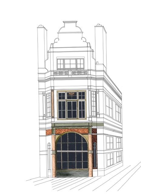
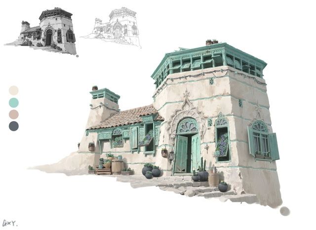
Also when I originally started this project I was inspired by this piece I just loved its simple colors and it seemed so clean but I’m not getting that feeling with mine
-
Using the white and green piece, perhaps start with one colour for the whole building, then add a second colour to some parts of the building where it would “make sense”. Then add more colours from there if you want to

-
@ambiirae I'd suggest filling the whole building with just flat colors first. The details should be the last step of the illustration process.
This approach will avoid wasting your time in rendering individual sections with texture and light and then realising that it's not working together as a whole.Just put in rough blocks of colors for bigger areas like the walls/windows/pillars/trims on separate layers etc. and then you can also vary the hue saturation of each layer to see which combination works best.
-
@ambiirae Before you start the color.. first decide on what is the feel you are going for.. like is it more like the white buildings with blue doors kinda look of Greece or more Corporate kinda look... I would create a pinterest of the color palettes I like.. and then block the colors like how @Neha-Rawat had mentioned.. deciding on colors is a lot difficult for me.. and I find it more helpful when I 1st plan.. hope this helps
-
I agree with what’s been add some flat colors to give it some value and tone then build off of that I like colors you chose stick with it

-
I think that part of what you liked about the color of the piece you showed is that the colors are all fairly muted and almost analogous. Try sticking to just 1 pop of color and then use neutral tones for the rest and see how you like it

-
Thank you all for your suggestions
 I have some time to my self today so I’m gunna give it another shot I’ll try to post an update later on
 -
@ambiirae Everyone has good feedback already -tips I'll pick up too. First two things I noted though were: 1. they did a value study which helped them focus on what areas they wanted to be more prominent and 2. they have chosen 4 base colours and having already determined their values I think it made it easier to add colour.
Excited!
-
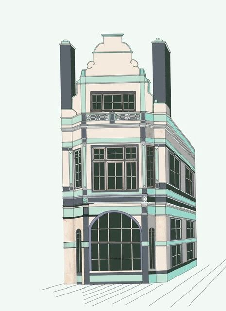
So based on the color palette that inspired me I’ve started laying out some flat colors. How does this feel?
-
@ambiirae Looking amazing!
-
@ambiirae looking great!
-
@ambiirae The colors look great.
I just noticed something and I'm mentioning it because this looks like a perspective assignment.
I was having a bit of an illusion now that there is a background edge for reference so I verified it. The vertical lines of the building are diverging upwards. I'm guessing this wasn't intentional?
I've marked out the horizon line and the vertical for reference.
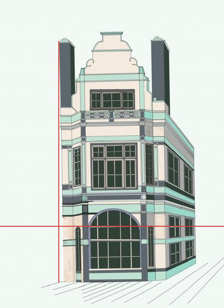
Since the viewer is still closer to the ground, the verticals should either be perpendicular to the ground (2 point perspective) or converging upwards (3 point perspective) similar to the sample piece you've posted.
If you're working in Photoshop, I suppose it should be a simple fix using the Free Transformation.