Help with values/focal point
-
Hi guys,
I'm in need of a little bit of help.
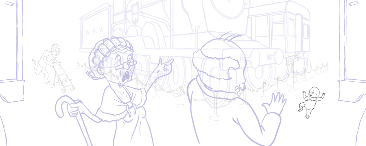
I'm currently working on a double page spread of a toddler who has escaped and is running through a train museum. I've been reading Framed Ink and wanted to use the Animating the Scene technique (where each character holds the position that the character ahead of them was holding barely the second before) whether of not this is achieved is debatable.

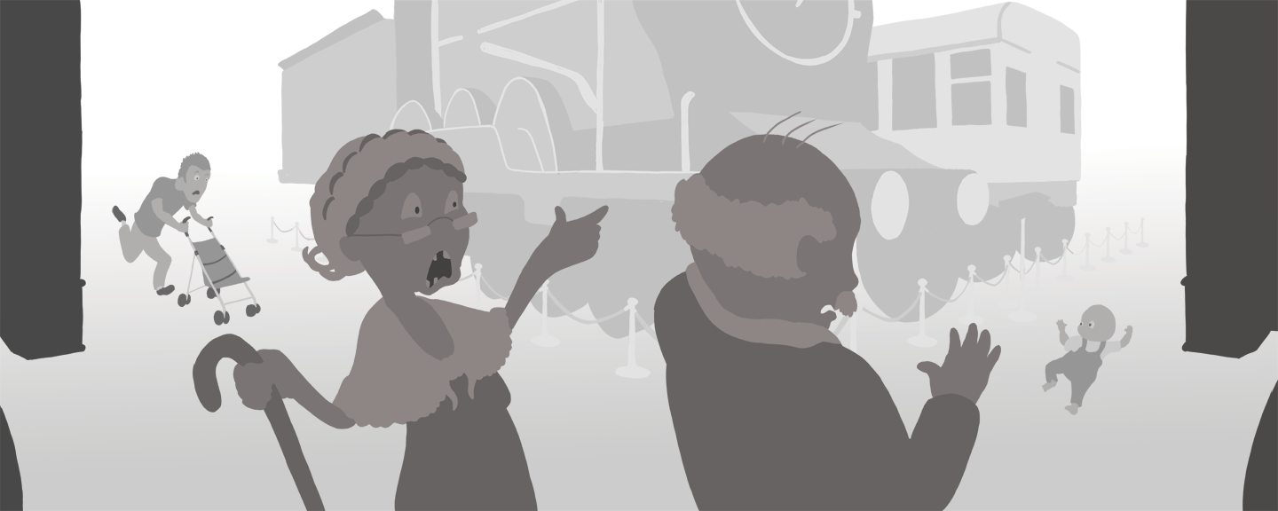
The issue I'm actually having is with the values. I'm wanting the dad with the pram to be the focal point on the left page and the running toddler as the focal point on the right page. Currently I feel the values are pulling the eye towards the old people in the foreground. Should I make them smaller in the scene and push them further back spacialy while pushing their value to be closer to that of the dad and toddler? Funny how typing out the problem you're having can help you come up with a solution to try.

Another thing I was considering trying is using colour temperature to highlight the focal points but wanted to try and solve the problem with values first.
If any of you have any insight I'd be very happy to hear it.
Thanks,
Daniel -
Intrigued by your question and always a fan of resolving most of an image in the tonal stage. Here's my two cents on how to adjust this image to focus on father/toddler:

Made a bunch of large and small changes. Use those which make the most sense to you. And I think your next step of applying color will further reinforce your intention for this piece.
-
@davidhohn you've knocked it out of the park. Thank you so much. That has broken through a wall I've been stuck on all day haha.
-
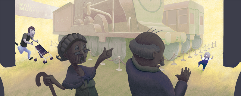
Ok so I've worked and reworked this a couple of times now with a bit of a break over Christmas. I struggle with colours so tried to separate my background palette into warm and my foreground palette into cold. I applied the cold palette to the focal point characters too to help pop them into focus. Everything was very unsaturated for a while and it took a fair bit of playing with adjustment layers to get to where it is now.
I don't want to get to the point where I may be over rendering. Are there any changes or additions you guys would suggest? Is it really ugly?

-
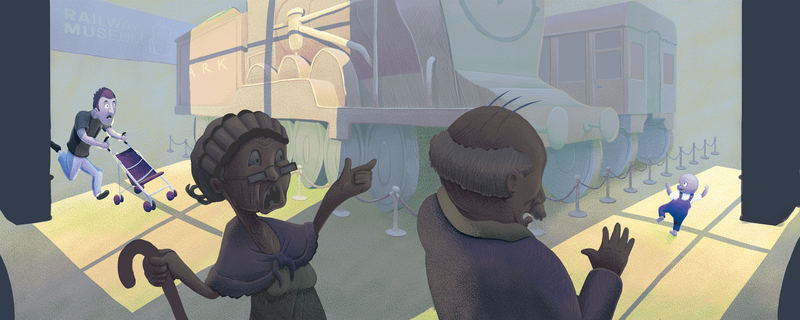
I'm a bit happier with it after going back and reworking the warms and cools into patches of light.

-
@skillydan really intriguing piece and really difficult to pull off! Well drawn and rendered, but there are a few things that are drawing my focus away from the characters.
-
The two very dark pillars/walls/rectangles at either end of the spread. Since they’re so stark, a very similar value to the main characters, and placed directly beside the two main characters, my eyes keep being drawn off the page.
-
The two silhouetted characters in the foreground are also really drawing my attention away from the dad and toddler. Perhaps this is a lighting issue? The windowpane lighting you added greatly helps with that — is there a way to dial that up even more so that the main characters are clearly spotlighted? Since your main characters are intended to be the focal point of the piece but they’re the smallest elements in the composition, perhaps playing with lighting will help move them front and center.
This is, of course, only the way I’m seeing it. This is your piece, and it’s telling such a compelling story. Well done!
-
-
@Melissa-Bailey-0 Thank you for your feedback. Sorry it has taken so long to check back and respond (back to work after Christmas and all that).
You're right about it being difficult to pull off. Although, I naively thought that the perspective while drawing the train was going to be the hardest part.
That's a good point about the shapes at the side. They are supposed to read as the edges of carriages/trains in the foreground but if they're confusing or don't add anything to the image then I may remove them all together.
The characters in the foreground also seem to have caused more problems than they have fixed. Maybe lowering their saturation while pumping up the saturation in the focal points could help.
Again, thanks for the feedback. I really appreciate it.
-
@skillydan you're so welcome! (I took a few days off in between the holidays so I totally understand.) You've come up with a really good solution -- lowering the saturation, and possibly even the value of the foreground characters will probably do the trick. You may also want to consider darkening the dad's pants as well, as they're very close in value to the background. Just a thought. Really looking forward to seeing what you do with this piece. Please share the final illustration!
-
Just throwing this out there, but how about some red on the character/s you want to spotlight? Just a dab oughta do it.