Feedback for potential portfolio piece?
-
Hi everyone,
I'm brand new to SVSLearn and to illustration in general. I'm trying to put together a portfolio geared towards the children's book industry and thought a good place to start would be to submit to the monthly contest. Alas, I didn't receive a critique (but congrats to all the winners!); I'm wondering if anyone here on the forum would be willing to provide feedback on this piece? I would love to know where to go from here (or if it is even salvageable).
Also, I would be happy to return the favor to the best of my newbie abilities (feel free to post your image below your comment if you want feedback).
Thanks in advance!
 -
@rachelwilson I love it, thought this one will be from the sweet 16, I am new here so maybe I won’t give you a good feedback.
-
@shereen-said Oh my goodness, thank you! And I'm new too haha so feel free to share any ideas.
-
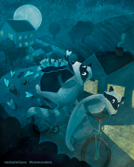
@rachelwilson I love your style and this is really cute and well drawn!
 I think the colors and values/lighting aren't emphasizing the important parts of the illustration as much as they could though. The racoons don't stand out too much against the color of the background (except the eye area which is really well done, but their bodies are getting lost a bit). Also in terms of the composition I think it's a little bit crowded. There's so space anywhere for the eye to rest a bit, and the important details also get a bit lost because there are elements everywhere. I think I would remove at least half the hearts on the road and the lit up windows directly behind the racoons to create some breathing space in the image. Overall though, a lovely piece on so many levels!
 -
@NessIllustration Thank you so much for your feedback! I agree completely with your critique - this gives me great specific things to apply and play with. I feel better about where to go from here
") Thank you again!
Thank you again!