Seeking Critique on a concept piece
-
Hi Forum!
I’m working on a piece for my AP art project/short film (you can view more about that on the forum under HELP please ). This is just a mock up of the final. The pieces hanging up in the background will all be drawn illustrations , and the ones behind are master copies. As far as light and shadow. I'm not sure if the shadows and light should be the yellow and purple tint or if I should take the darker / warmer versions of each object's original color. All advice is welcome,
Thank you!!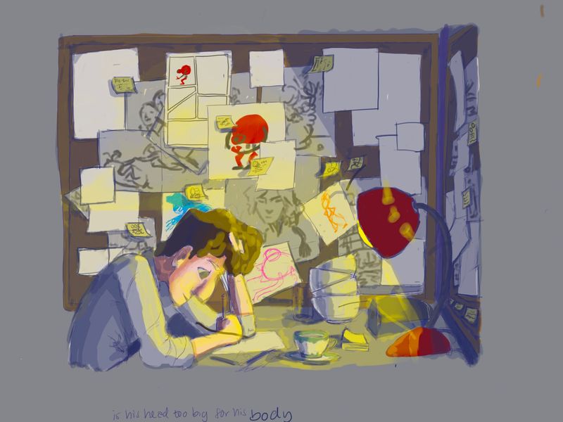
-
@Jules The little bit I can just point out is that the really vibrant light blue in the back behind his head draws my eye their almost immediately because the value is much lighter. On the note of the yellow light I thought the light was streaming down from the ceiling and not coming from the lamp. The angle looks off. I find the yellow harsh and the purple more a cool blue version so overall I find the work on the colder side. Naturally I think we are drawn to warmer scenes but I think if you want your story to evoke a certain feeling and cooler works for you then do that. I like the scene with all those piled up cups and that he likes tea.
")
Instagram: www.instagram.com/heatherboyd.illustration/
Website: https://heatherboydillustration.ca
Shop: https://www.inprnt.com/search/products?q=HeatherBoydIllustration
Ko-Fi: https://ko-fi.com/heatherboydillustrationBe blessed,
-
Good to know about the blue. I want to make the illustrations noticeable, but not more prominent than him. What feeling do the cool colors give you? I'm wondering if maybe I should make the purple more purple to fix the cool tones?
-
@Heather-Boyd Thanks so much for your feedback!
-
@Jules cool emphasizes long hours for me but the yellow colour is almost too yellow, maybe play with more a white yellow esp. if you keep with the cool blue/purple. And maybe even push the "cool" for a red (warm vs cool reds).
No problem,
-
Hi Jules. Couple of things come to mind for me. Some of this mightn’t apply depending on what you’re going for with style, but for what it’s worth:
- The way you’ve drawn the lamp, it should project a cone of light, and only on the foreground. For now it looks like the angle is too wide.
- Everything outside of that cone will only receive reflected light, so they’ll appear desaturated and low contrast. If you’d like to draw attention to the illustrations in the background, it may be best to do that with warm local colours. Or, you could bring the lamp forward a bit and point it away from the camera, so the back wall receives direct warm light.
- Also, that lamp light: it’s a very saturated RGB yellow right now. And just blending on Normal mode? I’d bump it towards red a bit, tone the saturation WAY down, and use either Screen or Colour Dodge. It should probably be one of the last things you do, after getting the rest of your values right.
- The warm/cool light effect only makes sense if there’s a secondary source of ambient blue light. You could do that with moonlight through an unseen window, but the value it gives will be much darker and desaturated than what you’ve got.
- Skin behaves very differently to matte surfaces because of its translucency - I think you won’t see any cool hues in the shadows on it.
Hope that’s helpful!
-
@blamillo said in Seeking Critique on a concept piece:
Hi Jules. Couple of things come to mind for me. Some of this mightn’t apply depending on what you’re going for with style, but for what it’s worth:
- The way you’ve drawn the lamp, it should project a cone of light, and only on the foreground. For now it looks like the angle is too wide.
- Everything outside of that cone will only receive reflected light, so they’ll appear desaturated and low contrast. If you’d like to draw attention to the illustrations in the background, it may be best to do that with warm local colours. Or, you could bring the lamp forward a bit and point it away from the camera, so the back wall receives direct warm light.
- Also, that lamp light: it’s a very saturated RGB yellow right now. And just blending on Normal mode? I’d bump it towards red a bit, tone the saturation WAY down, and use either Screen or Colour Dodge. It should probably be one of the last things you do, after getting the rest of your values right.
- The warm/cool light effect only makes sense if there’s a secondary source of ambient blue light. You could do that with moonlight through an unseen window, but the value it gives will be much darker and desaturated than what you’ve got.
- Skin behaves very differently to matte surfaces because of its translucency - I think you won’t see any cool hues in the shadows on it.
Hope that’s helpful!
@blamillo This is perfect!! Thanks so much for taking time to give me feedback
 . I’ve been a little lost on what to do when it comes to the light, shadow, and lamp angle