Critique needed for this coffee shop gift
-
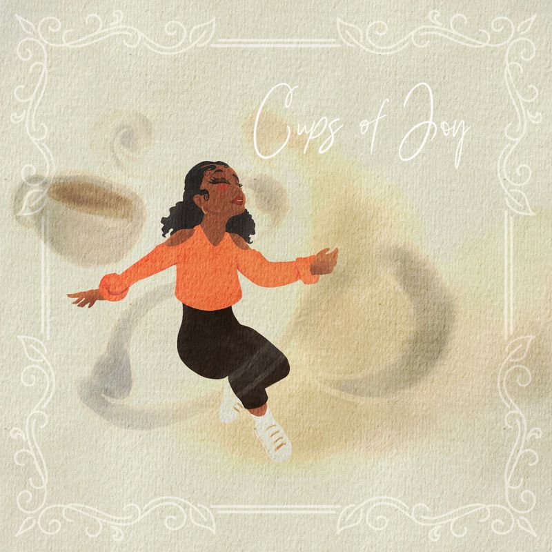
I was given the opportunity to display my art in a coffee shop (cups of joy). No fees or anything. So I wanted to make a framed print to give to them. My next step is to pick your brain so I can make some adjustments.
Thank you in advanced!

Much love and God bless!
-
Hi @dafoota Congrats on the opportunity to display your art, that’s pretty exciting!
 This is a nice artwork, I really like the warm tones, your character design and your choice to give a watercolour effect with the paper texture
  However, I’m not sure if the image clearly depicts ‘Cups of Joy’. She looks like she is floating in a moment of bliss but that sentiment is a bit detached from the cup behind her. I also find the smudges distracting - is it the aroma of coffee? Perhaps give it a source with a cup beneath/beside her and make the edges more defined so it looks more intentional - at first I thought they were coffee ring stain effects. Anatomically her right thigh looks too short as is her left lower leg. It’s a tricky pose - I would take a couple of reference photos of someone modelling the pose mid-air while jumping on a trampoline for this one
-
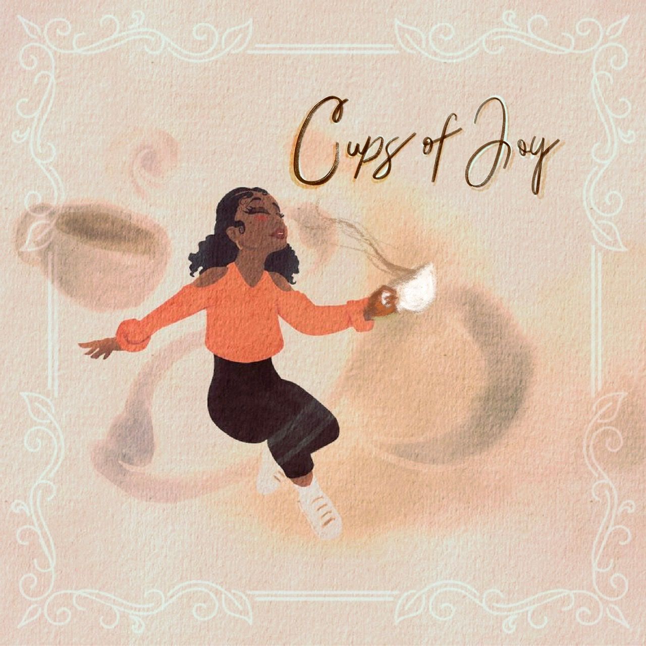
Hi @dafoota, pretty cool!
I agree with @Lovsey regarding the coffee stains/aroma, it’s tough to make out.
Also, I how about you put a cup of coffee in her left hand with aroma going to her nose?
Finally, I suggest you go with a dark brown color for the font on the white background to make it pop!
Look forward to seeing the finished piece.
Congratulations on the opportunity!
I hope you don’t mind, but I did a quick draw over to illustrate my comments.
-
@Jeremy-Ross Wow. That is wonderful! I’ll see what I can do.