Halloween Feast Rough and Value Study
-
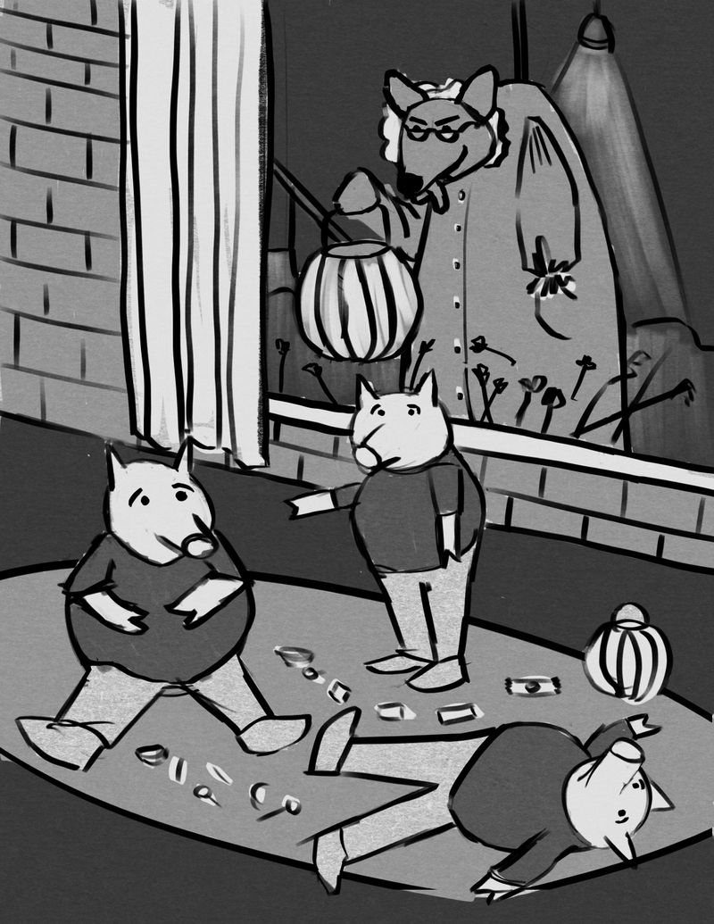
Hey, folks, I could use some advice... I'm working on my entry for the Halloween Feast prompt, and I settled upon a concept I like: a mashup of The Three Little Pigs with the Big Bad Wolf costumed as Grandma. I already know I want to make the pigs have more individual character to differentiate them from each other, and of course add more texture and shading for form, etc, as well as indicate much much more candy. I may go back in and add something to the brick wall or even making the entire piece a vignette. I also intend to add some back lighting on the wolf and maybe a sheen over the window a bit to suggest glass.
But what I'm wondering is if the values that I've chosen work. I'm trying to simplify them to a range of 4 dominant ones right now, knowing that there will be finessing and adjusting as the rendering stage happens. I've tried to avoid using black-black and white-white. I still have to go in and refine the drawing itself as this is just a simple quick rough.
But do the generalized values work? Is the composition clear? Thanks in advance for any constructive criticism you may offer.

-
First of all, I think the concept you came up with is a great one! It's a clever mashup of the holiday and fairy tales!
(One quick question I have before I mention the values: I get that the pigs are eating candy, but I'm a little confused as to why the middle pig is pointing (though it's probably going to be made clearer in your furthering of the piece))
I think the values work for what you've got here. I do worry, though, that the wolf/grandma's face won't be seen as easily because of how light the pumpkin basket she's holding is. It was smart to make the wig she has on a light value, but the effect of it outlining her face is lost because of how bright the basket is; I'd tone down the value of the pumpkin and/or shrink it's size (it being smaller might show how she's not here to ask for candy).
You mentioned that you would make the pigs have more character to differentiate themselves from one another. Perhaps you could give them all relating but different costumes? Having the theme played off of the number three? Like the three musketeers for example (I wouldn't use this, since all the garb might distract from the rest of the piece, but something that's centralized around three)
One suggestion about the brick wall, I think the story of the piece could be made even more clear if there was a door next to the window (I'd get rid of the blinds if they detract from the door, if you so choose to insert one), as then the viewer would know for a fact that the wolf is coming to the house the pigs are in.
Lastly, I think it makes sense that you aren't using black-black and white-white for the majority of the work, as I would suggest using them to give contrast, here, if there is no other option.
You've got a solid idea and a great starting point! I'm interested in seeing where this goes!
-
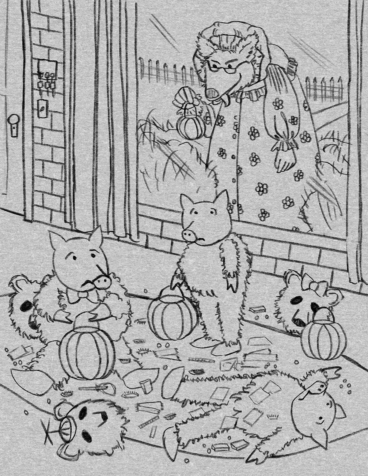
@Coreyartus I agree with @Jonathan-Malski about the pumpkin. I think that made me read the image as she was inside and they were outside. The bricks normally are on the outside of the house so that’s what my mind went to first.
I think adding more inside details may help to make it read more clearly. Also, if you keep the inside warm and the outside cool it would make their location clear too. Good luck! Cute idea. -
Thank-you @Jonathan-Malski and @kimmypie !! I really needed outside eyes, and this feedback was great!! I truly appreciate it!! I am going to work on the things you've mentioned and make another iteration with more drawing detail.
My intent with the look of the three pigs was to indicate brick, wood and straw, but now I'm thinking maybe they do indeed need to be in a threesome costume set... I'm wondering if dressing them like the Three Bears might just confuse things. That would mash up three fairy tales. Hm.
Such useful observations!! Thanks so much!
-
Still not a finished drawing, but I incorporated some of the suggestions.

-
Got a lot of work done on this today. I'm going to step away from it for a couple days and come back to it with fresh eyes.

-
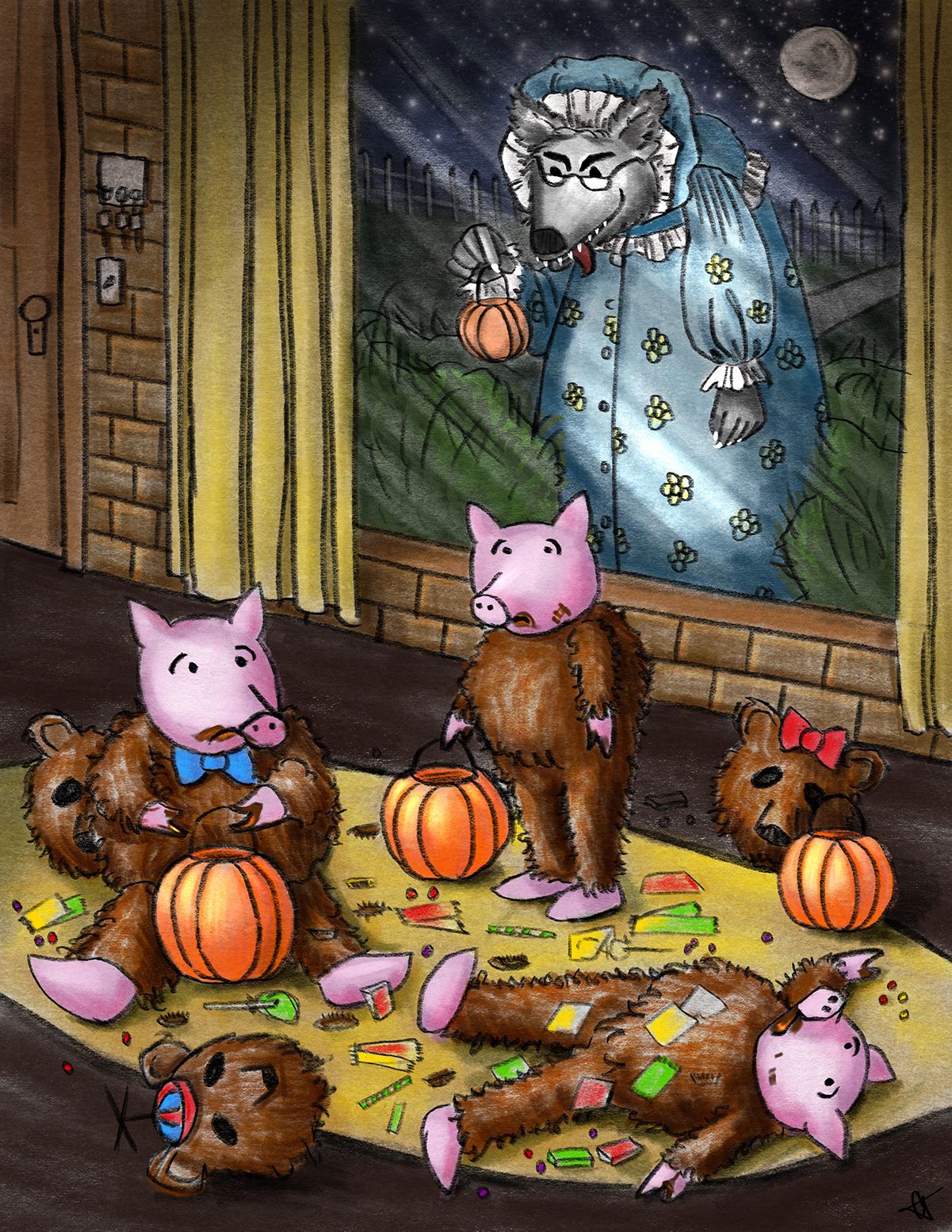
Nice colors!
I think the concept of the wood, sticks, ands bricks works for the pigs' costumes (I was also originally thinking the same thing) but I don't know if it's possible to symbolize/show those materials in a clear way as a costume (unless you interpret them as jobs and therefore, outfits based on those jobs). The three bears most certainly works.
I like the touches of the chocolate smudges on the pigs' faces, but I would say that, on the pig lying on his back, the smudges kind of blend in with the costume color, so I would lessen the chocolate smudges just a little, but the rest look great!
I love the imminent stare the wolf has! It really adds to the feel/emotion of the piece and the incautiousness of the pigs!
(Perhaps you could make the standing pig hold a candy bar/about to eat another piece of candy? It looked off to me when he was pointing his arm/hand, and what you've got here looks better, but I think he needs to be doing something while standing. Whether you want to add a candy bar at all, insert one into his current arm/hand position, or redraw the hand/arm with him about to eat some candy (maybe similar to the arm position in the first iteration, just with candy?) is up to you)
Also, I think there might be a few pieces of candy that were not colored (next to the stand pigs' helmet/mask).
Great progress, though!
-
@Jonathan-Malski Great catches!! Yes!! Those suggestions are easy fixes!! Thank-you thank-you thank-you!!