Halloween feast wip
-
I don’t usually have the time to spend a heap on my entries but I am quarantining in bed with a fever, no sense of smell, a cough and a bit of a sinking feeling!
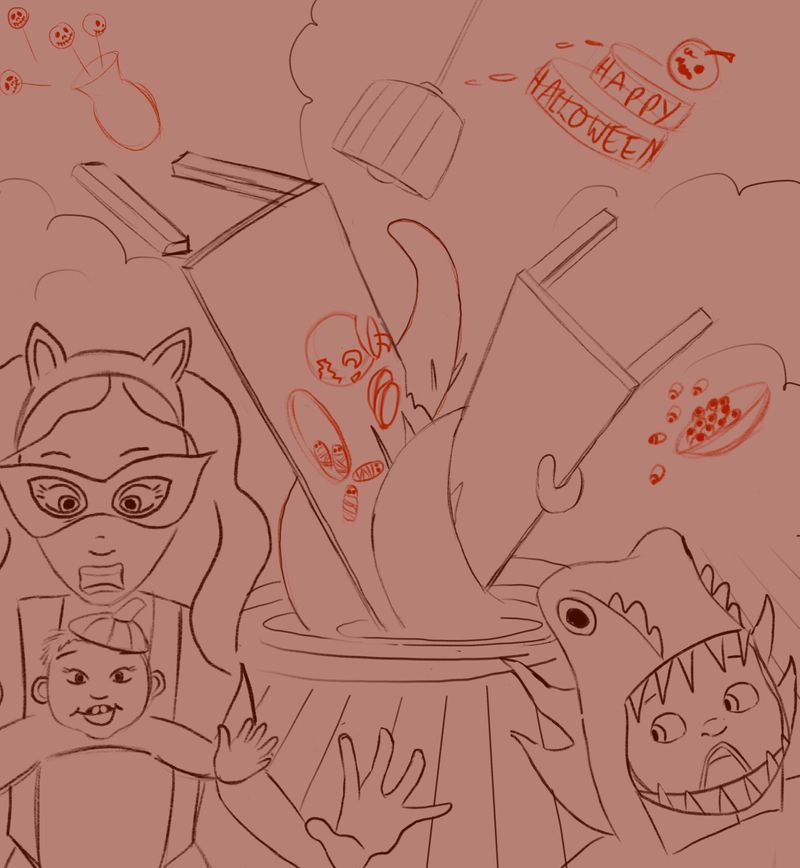 Any feedback really appreciated! I sort of wanted to add a couple more figures into the image running away and some more food stuffs but I am struggling to add more without it becoming harder to read. Sorry the colours are all over the place, it’s how I rough things out.
 -
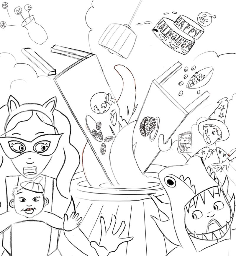
Update - tried to add in a bit more story with my kid inadvertently summoning the kraken!
-
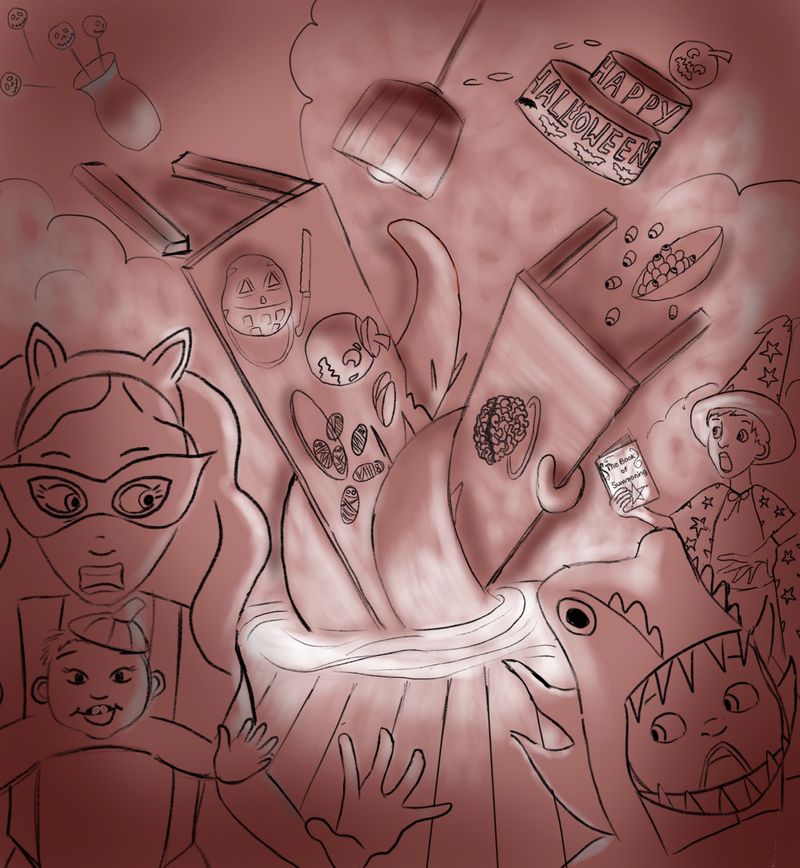
Thinking in a (very) rough way about how the lighting might work...
-
@mamadraw Adding the kid summoning does add to the story!
-
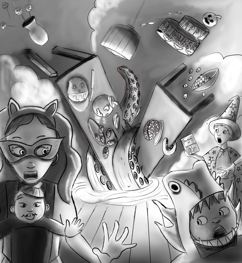
Thanks @Leah-Boulet - good to know that adds something. I’m now at the “I hate everything about this and also myself” stage of the creative process! A slightly more nuanced value study, if anyone sees anything I could improve upon do say! I’m thinking of adding more food stuffs and maybe some flowers to make it more feast-y?
-
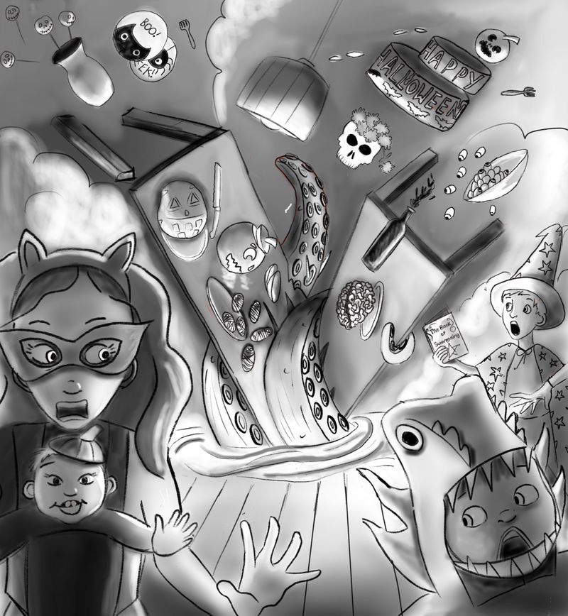
Woke up (fever has broken - yay) added in a few more bits...think I might start painting it now?
-
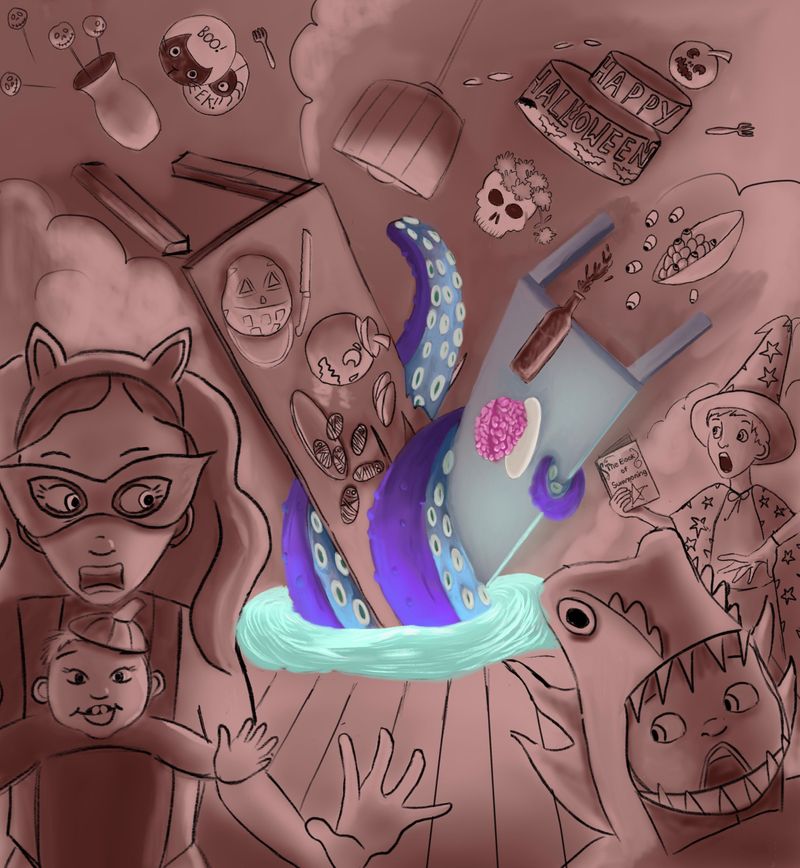
I’ve started painting. I am realising that I enjoy painting organic things vastly more than non organic things...or in this case, a table. Give me a tentacle over a table any day of the week. I should use some of this enforced downtime to do uni work now. If you see anything I’m doing horribly wrong do say. Otherwise I think I’ll just keep posting this up as I go in case anyone finds it useful.
-
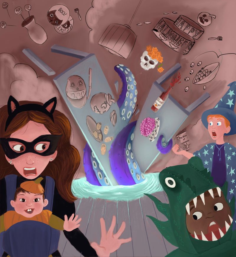
I wanted the conjuring kid to be in colours that reflected the tentacle monster but now I am worried it pushes him too far to the back. Maybe I should put him in something warmer? I did make him a bit bigger but I’m not sure it is enough.
-
Hi @mamadraw, I hope you’re feeling a lot better by now.. and I’m glad you were able to make the best out of your illness and get in some drawing time!
 This is a nice looking piece and a really cool idea for the prompt. I especially like your character designs and the value study you did has a very effective spooky glow that suits the story so well!
As feedback, I do see a few small composition changes that I hope could help, but take them or leave them

You alluded to it yourself, the crop feels too tight and it is especially affecting the wizard boy and his positioning In the picture (he feels too close to the threat, he is too heavily overlapped by the other child, there is a tangent with book and table). Also, to answer your present query: the current colouring of his costume competes with the monster/focal point as the tones are too similar, I would go with deeper tones for the boy to push him into shadow if you plan to add the same emanating glow from your value study.
The main focal point is the Kraken but the table is also a prominent feature and it’s not that interesting to look at (all I can focus on are the objects on it defying gravity). You could make the Kraken bigger, tentacles obscuring the table more and have more tentacles reaching out towards us/the foreground characters or you could amplify the story with added risk if it had a hold of chair with a person on it instead... or, more simply, obliterating a cake/pumpkin on the table with one squeeze of a tentacle.
The hole in the floor didn’t read to me immediately, I thought it was coming out of a caldron or an apple dunking barrel because of the angle of the floorboards and the neat rounded opening.
This is an action scene but your characters all seem quite still, especially the woman in the foreground - if she was exiting on a diagonal line more like the child beside her or had a curved line of action in her posture it would enhance motion.
It would also be good to see shadows of people running the other way in the haze behind the action to give depth and the illusion of a bigger gathering being interrupted., at the moment the smoke wall looks a lot like an actual wall. -
Thank you so much @Lovsey! I really appreciate the feedback! Some of the things you mention I had been playing round with myself but hadn’t quite found the right way to implement (widening the crop, darkening the boy) and you’re so right that there isn’t enough threat presented by the kraken and the table dominates when the tentacles/the threat they represent should be more immediate - I will definitely think on how to address that. Good catch on the hole being too regular - another thing I had realised was “off” but couldn’t pin down the why. You’ve given me a lot to think about and work on and I honestly can’t tell you how much it helps!
-
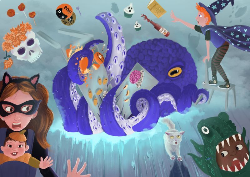
I think I have now gone a bit art blind from looking at this one so I think I need to step back for a few days! Looking forward to looking at what everyone else has been up to! As always any opinions really very welcome! (Not sure why but the quality of the image is low on the main thread but if you click it you go through to a higher quality version - or at least that is how it shows on my iPad)
-
Also, trying out some different background colours - pink??
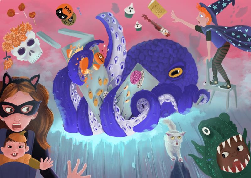
-
Or something a little darker?
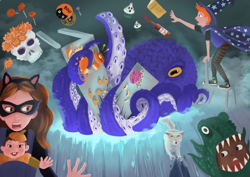
-
@mamadraw I'm liking this darker background more. It seems to give better contrast from the foreground and the background

-
@Jacy13 I see that too, I think it is what I will work with adding in some final touches! Thank you for the feedback, much appreciated!
-
@mamadraw Nice work, I’ve been wondering how you’ve been going with this and it’s looking great! Loving the greater impact of the bigger monster. I prefer the darker background but I also like the contrasting warmth of the pink so I can’t choose between them

-
I like the changes you made! I think it works better as a wider canvas and I also think the dark background works better.
-
Maybe add some more harsher blue lighting on the Octopus creature to make it pop off the dark background a little more
-
@K-Flagg Thank you! Yes, I’ve got some lighting to add still and I’ll definitely look at putting more around the octopus. I sort of imagine it shooting up around it but after a couple of goes already I’m finding it a really delicate operation hitting that fine line between just right and too much! I am working in Procreate atm but I think I need to switch it over to photoshop for this final stretch and get some more nuanced gradients going!
-
@Lovsey Thank you, and thanks again for your feedback, it really gave me some areas for improvement to run with and made all the difference!