October Contest WIP Thread
-
I'm so excited for this months' contest! This will be the first that I participate in

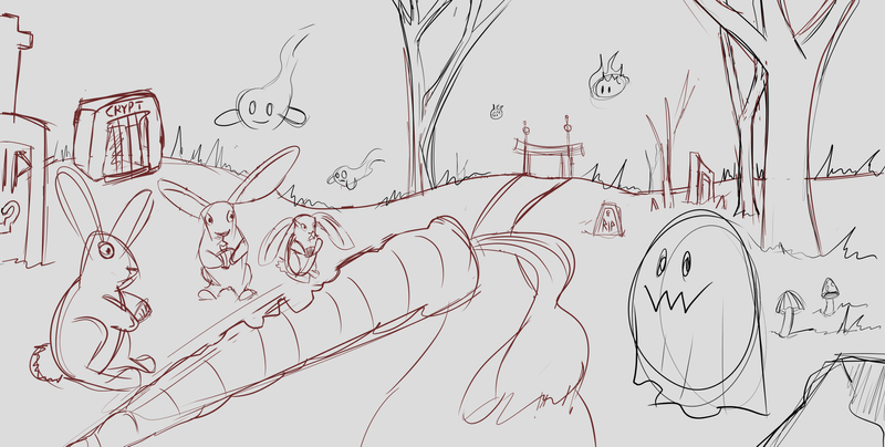
Here is my (really) rough sketch/idea for the piece. Please feel free to give me feedback throughout the process! I'm always trying to keep an eye out for tangents and compositional problems.
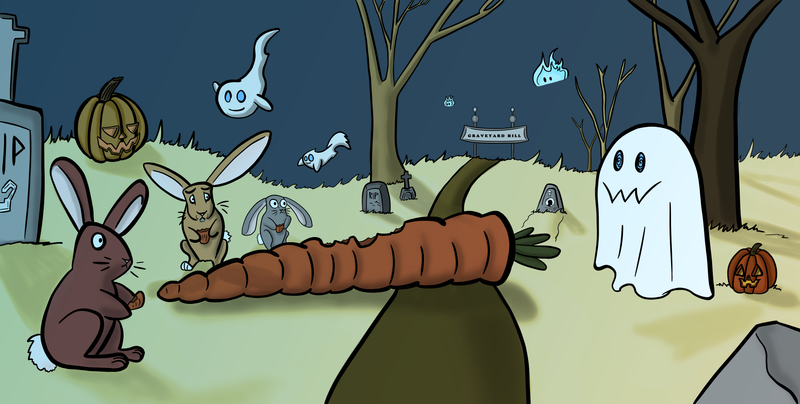
Oh Halloween night, three bunnies wandered into the old graveyard. To their surprise; they found a giant carrot to feast on. Everything was great until spooky ghosts started to show up!

-
Hi Jacy. Your rough draft has lots of interest. The one thing I am wondering about is the direction of the carrot. It seemed to pull my eyes off the page to the left. Maybe if it was pointing to the right, it would help the flow of the eye around the page? Looking forward to seeing the finished picture!
-
@Leah-Boulet Thank you for the feedback! I totally see what you're talking about. I will make adjustments to the carrot first thing

-
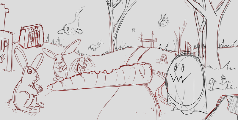
@Leah-Boulet Hello! I just attempted to fix the carrot problem. It feels better to me, but I'm not sure if it could use further adjustment. What do you think?
-
@Jacy13 The carrot does feel better! I don't know if it needs further adjustment. I'm still pretty new at it all. From what I've learned, I know it is important to have a focal point and make sure the eye flows around the page towards that point. I'm assuming the front rabbit is the focal point? When you add color and values that will help to focus the eye as well. Keep going!!! :)))
-
@Leah-Boulet Thank you so much, your feedback really helps
 Much appreciated!
 -
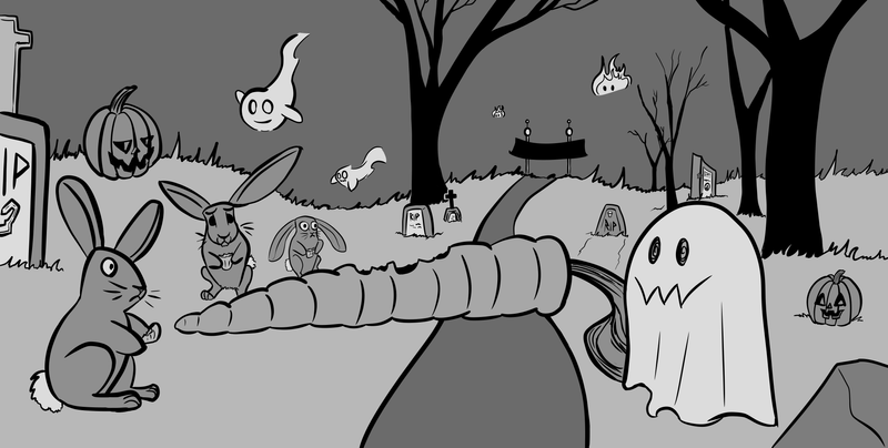
Hello everyone! I've tightened up my sketch and moved into getting a value scheme down. I would appreciate feedback as to the values. What can be improved? This is actually the first time I've done this with an illustration (besides Lee's light and shadow class) and I tried to keep the image to four or five values tops. Also, any general advice for going from value study to color would be much appreciated as well!
 Thanks for looking!
-
@Jacy13 first off im very excited to see this finished I think its gunna look great and you did a good job keeping just a few values to start off with. But a couple things that are throwing me off.. Normally values range from dark to light so the trees should get lighter as they go back to show separation and there seems to be a tangent between the bottom of the front ghost and the carrot leaves that puts them on the same level... Im not very good at this my self but just a few things I noticed
 hopefully others can give you some good feed back. Otherwise I think your doing great!
 -
@ambiirae Thank you so much for the feedback! This really helps. I don't know why I didn't think of that with the trees! Totally skipped my mind, lol. I think I might have been too focused on using a limited value range that I forgot that things get lighter as they go into the distance. And great catch with the tangent going on with the ghost! I will be going back and trying my best to fix things up
 Thanks again!
 -
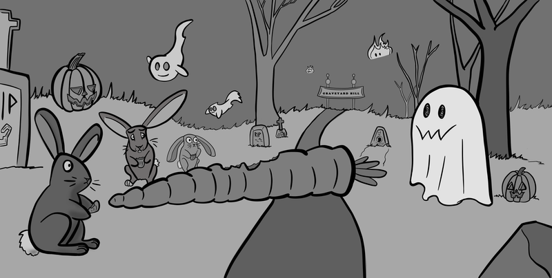
Alrighty, I finished my line work, fixed a couple things, and had another go at putting in my local values. I'm thinking this is looking much better. Next, I'm going to put in the light and shadow; before I color

-
I feel like I'm getting close to finishing it! Here it is colored. Let me know if there's anything I should add to it, or if you have any additional advice of any kind! I appreciate your time

-
@Jacy13 Maybe push the lighting more to your main ghost by putting the other characters in more shadow. Also the other two ghosts in the back don't have any shadow (even a smaller fainter suggestion maybe), oh and the carrots missing it's green leaf shadow -it just ends at the round on the right.
-
@Heather-Boyd Thank you so much for the feedback! Those are definitely things that need to be taken care of. Will get that done asap
