Dragonfly last minute help
-
Hi all,
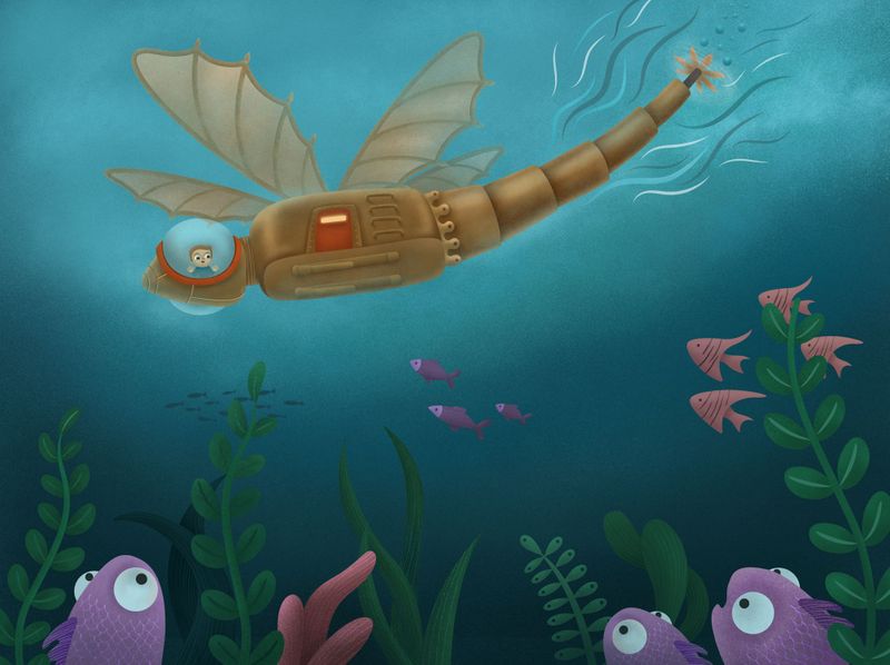
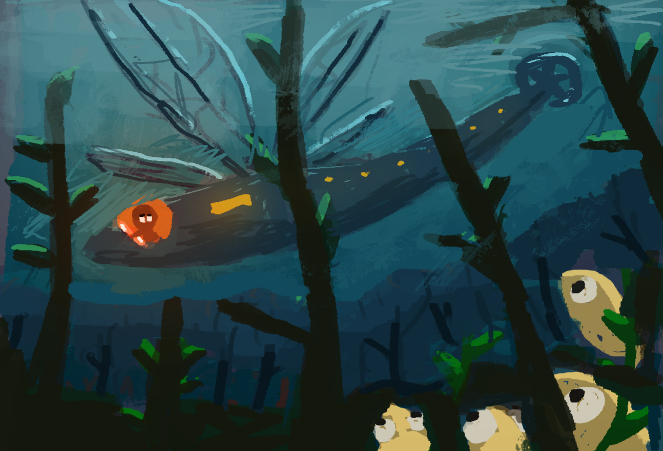
I'd really appreciate some feedback on the below if you have some time. Any major problems with this image that you see? The fish at the bottom are probably too cartoony in comparison to the rest of the image, looking at it now. Any other suggestions? I tried to do something quicker this month than the last two because I didn't want to be finishing it off on the final day as usual and not having time to get feedback

Thanks in advance!
-
Lovely submarine idea! I would say perhaps play with the placement and size of the submarine since right now it’s centered. Also I’m curious as to why the dragonfly submarine doesn’t have wings- unless it’s a nymph. It would be interesting to see wings act as fins.
-
@carrieannebrown I really like your underwater fish style and the colours and textures of the underwater world. I think the boy is a bit big to occupy the sub. And I agree with @Jade-Vaughan about the wings because if I didn't know about the "dragonfly" contest I would not have nec got dragonfly. I also don't understand the fish in silhouette behind. I find I get uncomfortably stuck there. I think you did that as another way to focus our attentions. Maybe if you placed those fish along side in a rough shape like the wings of the dragonfly but I am not sure.
-
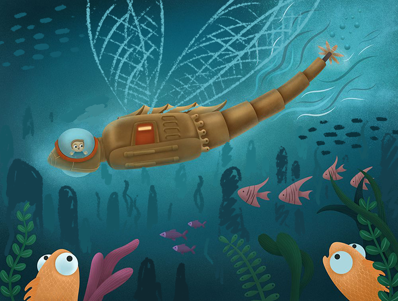
Hi Carrie-Anne! What a cool and unique idea! Love your submarine design! I agree with the others that it needs some wings. Maybe it could have nets to catch some cool fish? I also think it could use a little more depth. I drew up a really rough and messy sketch as an example. Maybe you can add more types of underwater creatures and corals so the boy can really be wowed by his underwater adventure! Been loving all your work, especially your Wizard of Oz design! Really impressive!
-
@aprilshin @Jade-Vaughan @Heather-Boyd thanks so much for your help! In regards to the wings, they are tucked flat at the top as in discussion with my partner we decided that they wouldn't work in water but maybe that doesn't matter as none of it is particularly realistic. I'm planning to do another image to go with it that is a sort of diagram from the boy that shows the wings as sails when on the surface and the legs used when on land. Thanks, April, the draw over is really helpful

-
I think your issue with the fish is that the lighting doesnt match with the rest of the scene. If you decide to light a scene from one angle and other elements don't follow the same style then it will seem off.
I think @aprilshin made some great suggestions about the issues with it not appear so dragonfly like and adding more background elements to the scene. It definitely appears more lively!
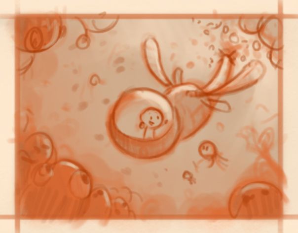
I think you have a solid concept though and rather than do a paintover, I thought it might be worth looking again at your initial sketch and how that can be improved. having the fish in the foreground works well, but the submarine is very flat as it a side view and therefore will feel very static. You also need to think about what is your focal point and how you can use composition and lighting to emphasis that area.
I did a quick sketch of how you might be able to set the scene to be more energetic and focused (it's not the " right" way, but it's a "way"). I've switched the view to a 3/4 view and used the fish to help frame the scene. Adding more fish makes it feel like a more exciting place and also helps to place more focus on the boy as they are all looking at him. I hope this example helps with any future paintings
-
@carrieannebrown Oooo that is such a cool idea!! I would love to see this dragonfly vehicle in all its forms!
 And @Gary-Wilkinson killing it with the great suggestions as per usual!
-
@Gary-Wilkinson thank a lot for your suggestions, I'll consider that next time. I quite like the flat look though tbh, I like artists like Julia Sarda and Stuart Kolakovic who flatten the elements
-
@carrieannebrown Hi Carrie-Anne, you have very nice drawing and concept there. I had an issue understanding the view on the picture, thought, i am looking from up on the ship, that is on the water (partly because of the lighter value around the ship) (and then the fish didnt match obviously
 ). Maybe as suggested in previous posts, the picture could benefit from more consistent perspective. The light source, values and silhoulette-shapes should be more consistent as well (it is nice on the fish and plants, but getting lost a little on the ship) Even very flat style with pushed perspective (like Julia Sardá) will work better with that. Thick underwater atmosheric perspective will also help to show depth.
Like the fish very much!Some scribble to show what i ment in a long post
 .
.
-
@marek-halko thanks a lot, that looks great.
-
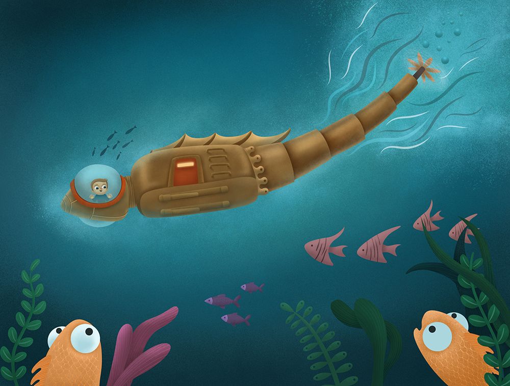
So I didn't have time to make all suggested changes but I think it's slightly improved. Thanks a lot for all your help. If there are any small changes you think need to be made let me know, otherwise, I think it's done. Finished is better than perfect, as Jake says.
