Would love a fresh pair of eyes here.
-
Hello all,
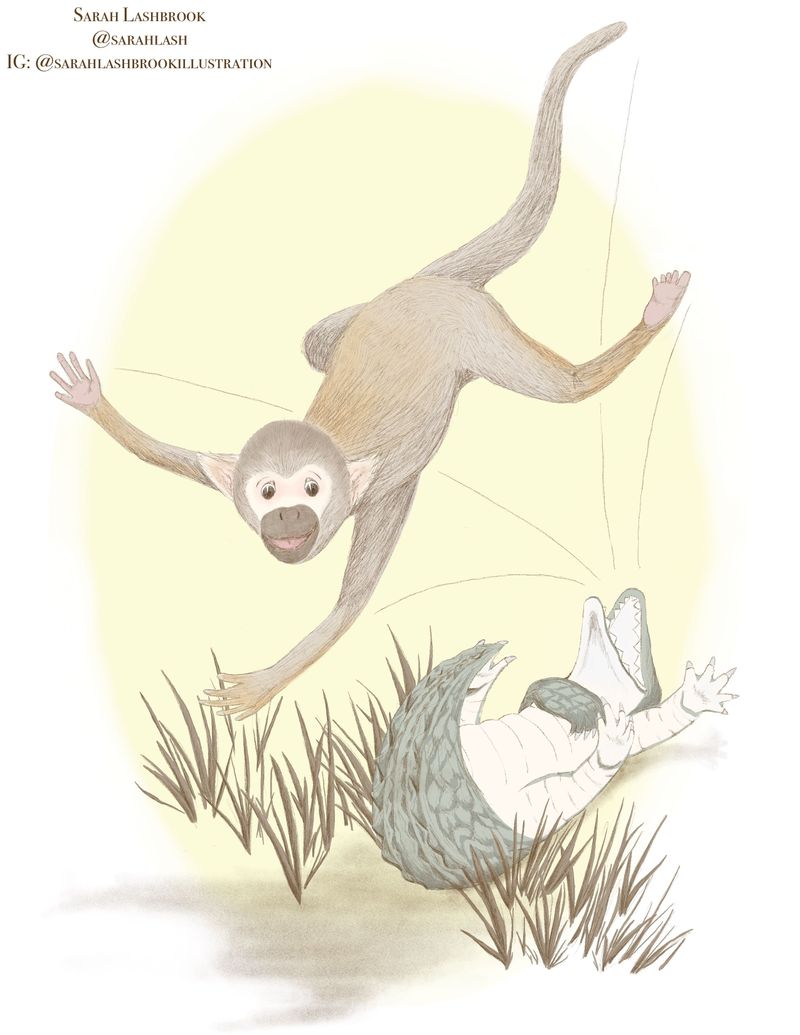
I am very shy about asking, but I really need a different pair of eyes for my June submission. I very impulsively posted it in the contest thread, but the longer I looked at it, the more I hated it. Not the alligator - I love the way he turned out. But the monkey. Something seemed very off to me. So today I took it down and now I’m attempting to rework it. Here’s the original:

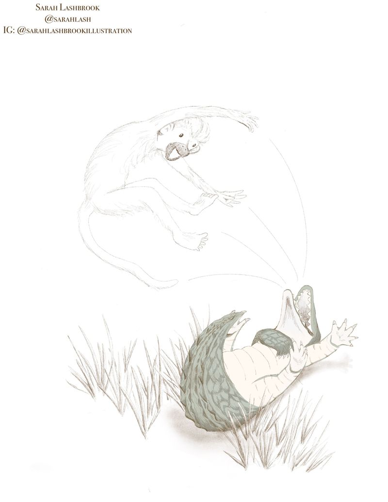
And here’s what I’ve done so far to change things up:

I’d love comments about these specific things:
Is it okay to do a spot illustration, or will the judges be looking for more of a complete scene? Just wondering if it’s necessary to add more of a background.
Color. My idea for this month was to use more muted tones, but now I’m wondering if I should get rid of most of the color all together? Perhaps color the animals and draw in a more simple, sketchy background.
Composition. I really wanted the monkey to look like he’s flying uncontrollably away from Clyde. Does this work? Is this positioning better than the original, do you think?
Aaand, the monkey. Does he look less creepy?
 Hopefully, more endearing.
I would so appreciate any feedback you guys have to offer. Constructive criticism is much appreciated
 . Thanks everyone!
 -
Hi, Sarah! Here are my thoughts on a few of your questions:
I don't think there are any "rules" about whether a full-page image or a spot image is preferred. This particular prompt suggests a wide range of possible options, so I personally think you should do what works for you and your portfolio. Keep in mind the vast majority of entries will probably be full-page illustrations like they usually are. Dunno if that helps at all... hehe...
Regarding composition. Right now, to me, it looks like Bongo is flying forward toward the viewer over the top of the length of Clyde's body and tail, which recede behind him into the background. I wonder if you had Bongo flying upward out of Clyde's mouth instead of up and forward, the two might appear more on the same plane? It would mean Bongo would need to become smaller in relation to Clyde. Just a thought.
In my opinion, the choice to thrust Bongo forward into a plane that is closer to the viewer is slightly confusing because there aren't enough visual clues to help the viewer understand that's what's happening. I wonder if that's why you have put in directional lines to help suggest his trajectory forward, and why you're wondering about a background? Inserting a background that adds another plane and more depth to the illustration might help Bongo seem like he's coming forward more because we see the contrast of scale possibly?
Another way of doing it might be to have parts of Bongo's body overlapping parts of Clyde's or the grasses, so it looks like he's in front of Clyde and between the viewer and the alligator's plane?
The monkey does indeed have more humanistic character! Well done! I think in the first rendering the angle of what appear to be his eyebrows suggested he had more of a happy surprised look, but the second one gives him a more jovial appearance.
-
@Coreyartus This us so helpful! Looking at it again, I definitely see what you mean about Bongo’s position in relation to Clyde being confusing. I’ll play around with either changing up the size of the animals, or adding background elements to show more depth. Thanks so much for such detailed feedback!
-
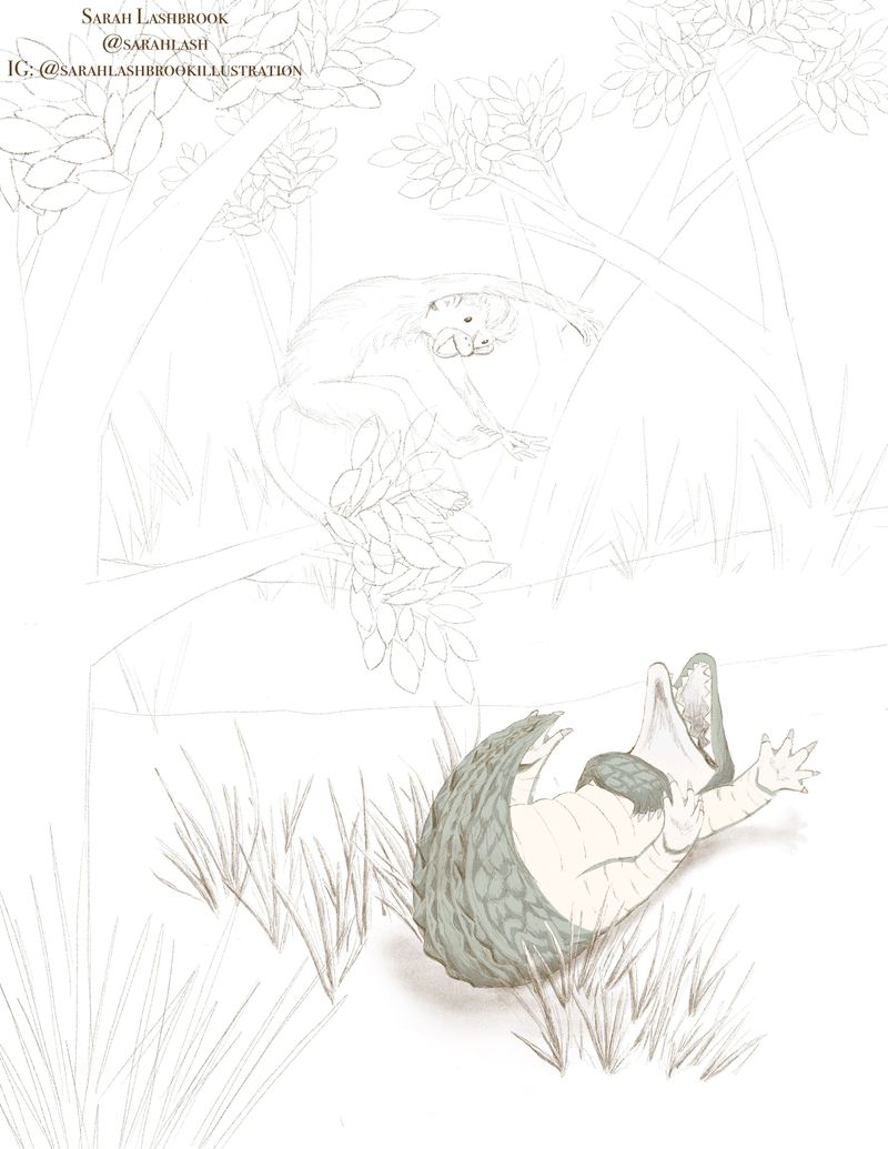
All right, I’ve changed the size of Bongo so that he and Clyde are one the same plane, and sketched in a background to create depth. What do you guys think? Any glaring issues before I move on?

-
I'd keep an eye out for tangents!! I see a few on the alligator. Like where his tail meets with his foot.
-
@Frost-Drive Okay, thanks! I’ll work on that and look for others.