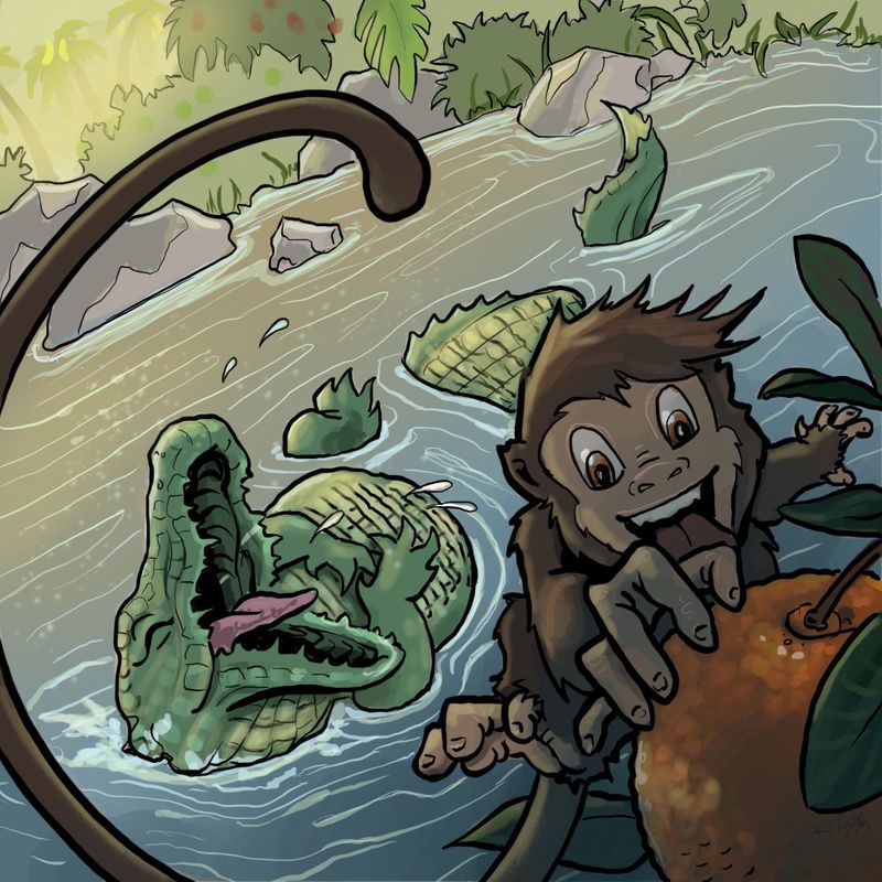
June Prompt Bongo WIP
-
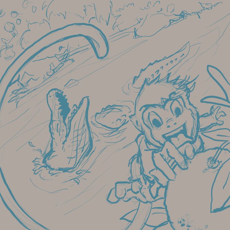
I wasn’t sure if I was going to make time for this months contest, but after the critique arena today I got all motivated. I wanted a dramatic composition. Is there anything that stands out or is not working in this rough sketch that you can see?
-
Wow! Great composition! Super dynamic! I love the slanting horizon line, the tail cropping off and coming back in and the whole depth feel.
My only concern is with the monkey's body right now. Maybe it's not clear because this is a rough sketch. Either the far hand is too tiny or the feet are a little big. Also, the monkey is missing ears maybe?
Looking forward to seeing this develop! -
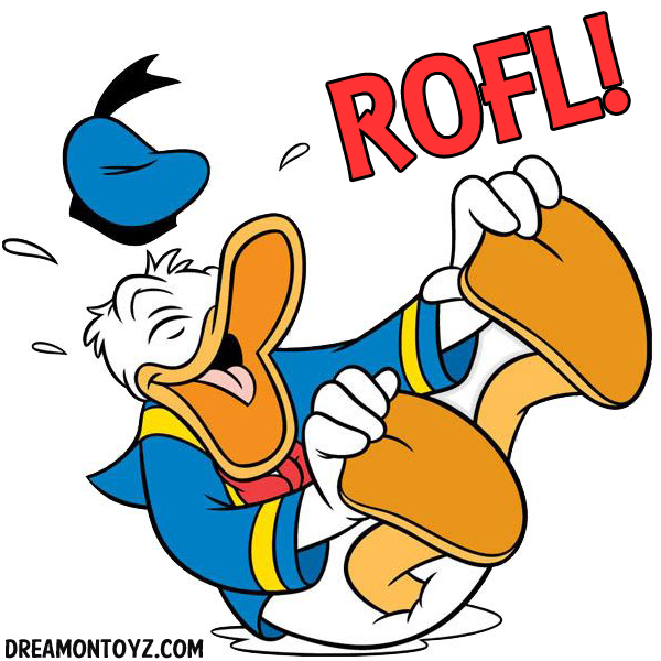
I can totally feel the energy from this piece! I love the diagonal layout as well. As for feedback, it wasn't entirely clear to me that Bongo was leaping out from Clyde's mouth until I questioned why Clyde seemed so happy, lol. I think you can go a lot bolder with Clyde's laughing gesture, maybe something like below. I think having his mouth open wider will also sell that Bongo lept out from it. It's a great composition otherwise, and Bongo's expression is spot on!
-
@K-Flagg This is great!
-
@Neha-Rawat thank you! You are correct, I definitely need to clean up his body angle. It does seem unclear.
-
@aprilshin Haha I love the example of Donald. Very good point I will totally fix that

-
Very nice @K-Flagg, look forward to seeing the finished piece! I particularly like how the tale guides the eye to the prize! Did you use Golden Ratio technique?
-
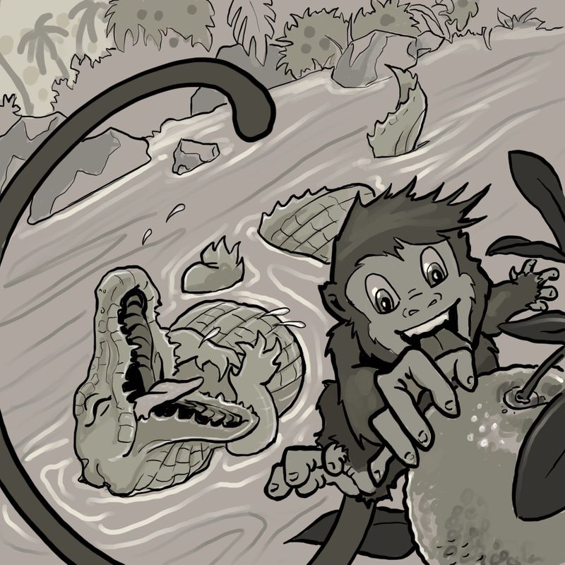
Okay so.... I cleaned up the sketch a bit and tried to add more humor in Clyde’s expression. I feel like the monkey’s body is still a little hard to read but I think when I color it it will make more sense. I usually work in more of a comic or cartoon style format, I was going to change it up but I tried that last month and it’s the reason my goldfish didn’t make top 16

I tried to soften up my May entry but Will said it looked like I had 2 styles going on so it was inconsistent. I think I should just stick with my comic style instead of trying to change my style up. what do you guys think?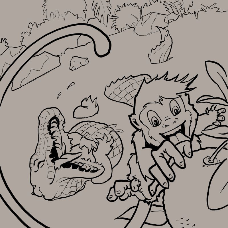
-
I did a value study to get a better idea. Of what the finished piece should look like
-
Looking good @K-Flagg!
-
@K-Flagg Good progress! Some suggestions:
-
The monkey's far hand has all fingers looking the same. Maybe redraw them so that the thumb looks different and separate from the other 4 fingers?
-
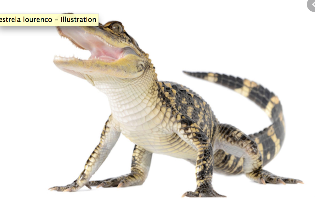
For the alligator's ventral side, the horizontal lines are continuous and the vertical ones are segmented (see ref pic). You've made it the other way around which makes it look like it's back instead of it's tummy.
-
-
The composition looks great! I love the effect his tail is creating. Getting nitpicky: the structure of Bongo's forward hand seems a bit off--maybe it's too symmetrical? Also, maybe try moving Clyde to the north-west a bit; it seems a bit heavy in the south-east corner (more balanced in your original sketch). I'd play with it a bit, but other than those, the piece looks very nice.
-
Thank you for all of the great ideas, I fixed a few things and did the colors. Here is my finished piece. Thanks for all of the help.

