Isolation WIP – I mean, aren't they all anymore?
-
@Jeremy-Ross Alrighty...a vote on the board. Thanks!
-
I like B too.
-
My gut is drawn towards B, too!
-
Spent some time doodling tonight while watching TV. Fortunately it was B and I didn’t even know that was leading in the poll! I can really have some fun with this one, thanks for weighing in.
-
@Aaron_T this concept is super great! I really love it!
-
I kind of like the original angle for B a little better, especially if the cats eyes are just above the table and it’s reaching over the edge to knock over the chess piece. But the posture in your last version expresses more emotion of the man, so both are good choices
-
@Aaron_T you are moving in the right direction with that last sketch. Great emotion on the man, you can tell how bored/sad he is.
-
Just got done listening to one of the podcasts where the guys were talking about pushing through the thumbnail exercise. I’ve found that me personally, I need a little more detail just so I can see what’s going on in the image. For example, A in the top left of this image I can barely see what’s there, but these more-fleshed out doodles give me enough context to see what’s happening.
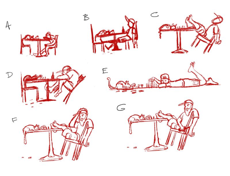
Since I have some time yet this month (and it’s not like we’re going anywhere, right?) I think I’ll keep playing around with these designs and post incrementally. Thanks for chiming in on them so far!
-
@Aaron_T I like d and e.
")
-
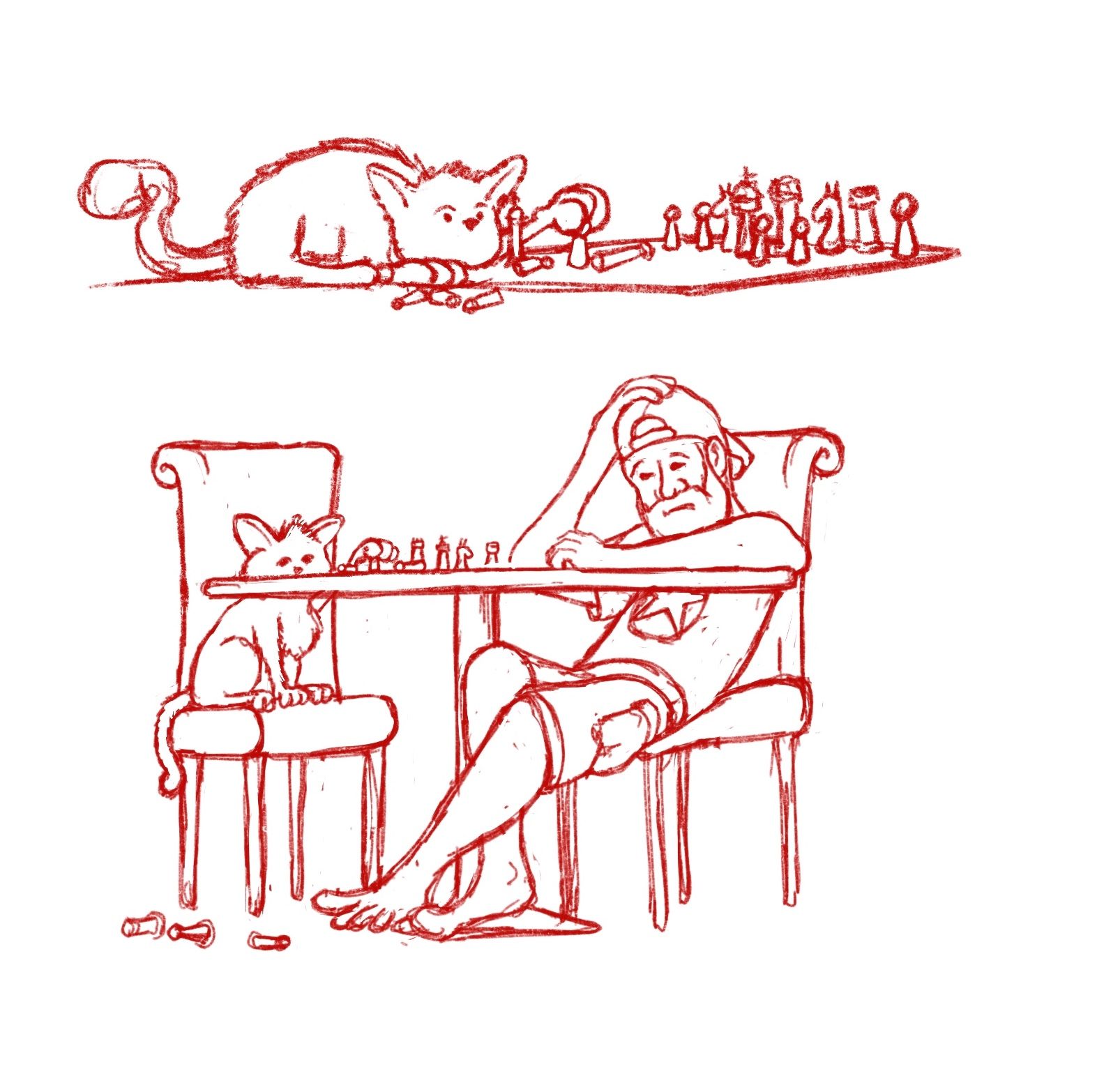
E is a fun one! How bored would you have to be to lay on the floor and play chess with your cat

-
@Heather-Boyd I like the shape of the design in that one too...much more dynamic than some of the others that are just variations of slouch, even though I'm drawing heavily on personal experience here

And @Kat I agree, I might go down this road a little more just to see if I can keep it interesting. Thanks for the feedback!
-
Playing around with the elements in these two options today while on a conference call. While I like the really narrow format of the on-the-floor version, I feel like if it wasn't tightly cropped it would be too long, so I couldn't get the detail I wanted into it. But...I think its really funny. The one with the guy leaning back in his chair in a previous sketch was interesting (and may still try to flesh that one out) at this point he's so over it leaning back in his chair takes too much effort
") Just trying to not make him look depressed...its a fine line between super-bored and sad!
Just trying to not make him look depressed...its a fine line between super-bored and sad!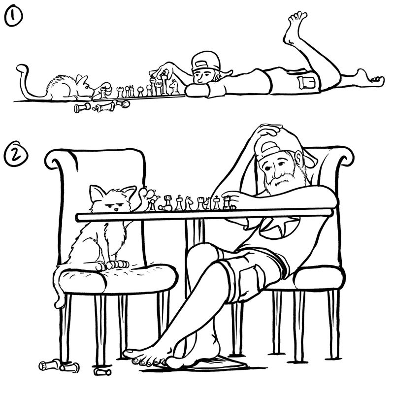
-
@Aaron_T really love the second one with the slowtch (sp) and the cat's arm/hand position is far clearer.
-
@Aaron_T Love the concept! One small composition thing about 2: right now the two chairs are almost exact mirror images of each other. I wonder if giving a little more variation either in their shapes or at least their positioning/angle might add some energy to the composition?
-
@Braxton Good call on that one. It was a mirror in the sketch to save me time and I didn't adjust it when I started inking it. Thanks @Heather-Boyd...I agree!
-
I like him being on his stomach, from your last two, but you cant really tell its a cat. it looks more like some sort of rodent. If you redraw the cat a bit more catlike i think it would be cute