Copy covers for practice
-
This is a great idea!
-
@Jeremy-Ross I like the colour block of the title roar of the original but I enjoy your colours more for all the rest.

-
@Heather-Boyd thank you so much for your feedback! I was going for a raspy aggressive feel for the letters.
-
@Jeremy-Ross no I like your letters just the colour of the block behind it haha
-
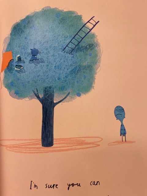
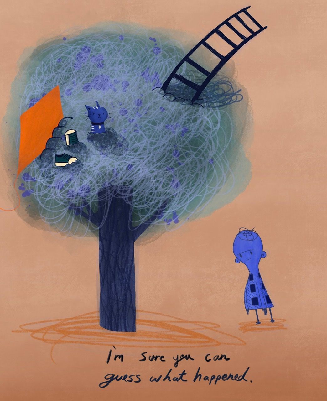
Hello everyone, trying something new yet again. This is a copy of a page right out of Oliver Jeffers’ “Stuck”.
This was so much fun making. It took me 2 hours to do, very loosely.
Original Art
My Remix
-
@Jeremy-Ross Doing copies of covers in this way seems like such a great way to practise! The full-colour ones you've been doing as of late are beautifully done, and it looks like a lot of work. I'm surprised they were done in about 2 hours. Also great to see you having fun with these.

-
I'm doing this too, after being inspired by a post above. My first one is almost done. I'll post it this week sometime. I've spent the last few weeks working on it. Looking for covers, solving issues they had or you are having and learning new techniques to replicate their style has been a great learning experience. Both to get better at using a digital graphics monitor and helping to definine a personal style. I plan to do three, all in different styles.
-
@Jeremy-Ross I love your cat and bendy ladder rendition (esp the ladder
 ).
). -
@animatosoor thank you so much for the support! Actually, only the copy of Stuck took me about 2 hours. I tried to finish as quick as possible to see if I could draw and paint under a tight deadline.
I know copying Is much easier than creation, but I’m using this as trying to gain insight into the minds of the artists that have already mastered their crafts.
The copy of “Dude” above took me about 15 hours, off and on, but I learned a lot from Dan!
I’m hoping to find a style one day, but not exactly trying to nail down my style just yet.
-
@deborah-Haagenson, I’m excited to see your copies! Thanks for the feedback, so grateful to offer a bit of inspiration.
-
@Heather-Boyd thank you much!
-
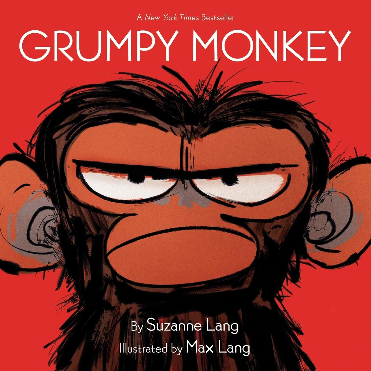
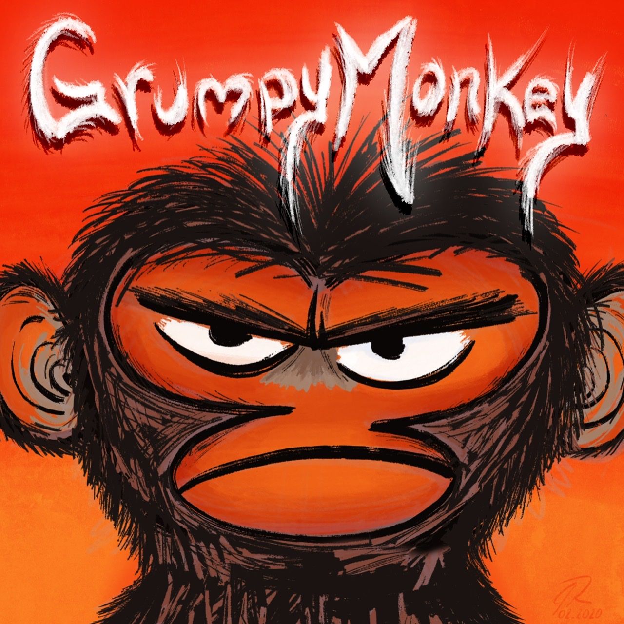
Had a little free time today so decided to try my hand at “Grumpy Monkey” written by Suzanne Lang and Illustrated by Max Lang.
Original Art
My Remix
-
Love the pieces you're choosing. You're doing a really great job.

-
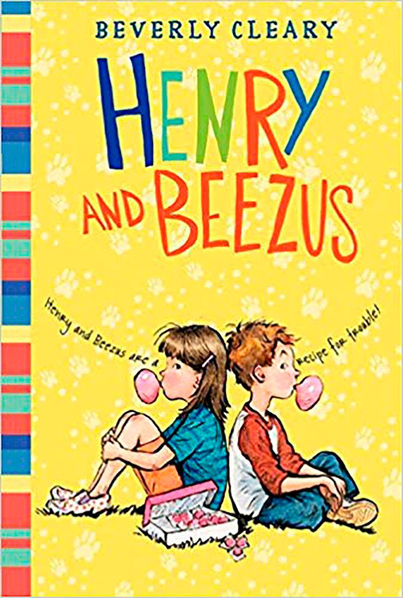
@Jeremy-Ross Here it is! In my case I pulled the colors from the original and created a silouette for the title from the original.
My Rendition
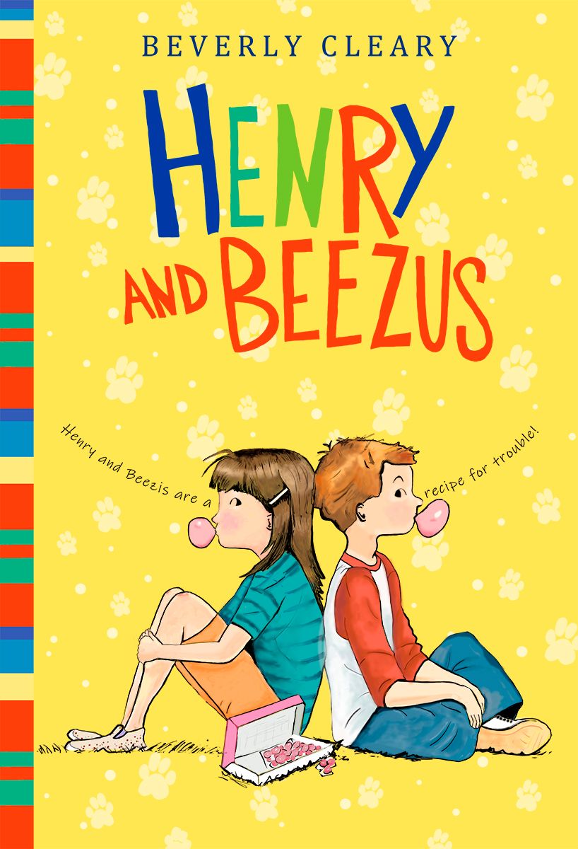
Orig Rendition
-
@deborah-Haagenson great work! Very crisp line work and beautiful colors!
-
These are awesome! Really cool way to practice! Can't wait to see what cover you do next.
-
@deborah-Haagenson awesome!
-
Hello again everyone!
It’s that time again! This time I hand picked a page out of the beautiful book, “Why?” By Adam Rex and illustrated by Claire Keane.
I REALLLLLLLY had a blast making this one! Claire is incredible!
Original Art
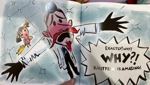
My Remix
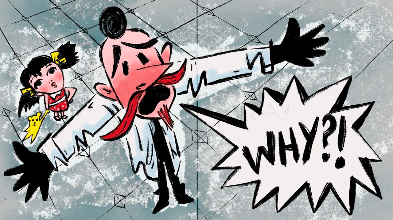
Thoughts??
-
@Jeremy-Ross
Hi again. I think it's a good copy but I find his eyes for his main character somehow evokes more desperation and yours a bit more alarm. That's what I noticed.
-
@Heather-Boyd, thanks for your feedback! I can definitely see that too.