How do I make natural looking text?
-
Hey guys! Just wondering if any of you might know how to apply text in photoshop that looks more hand-drawn? I know how to put basic text, but I don't like the "cut and paste" look of it. Would any of you know how to make text that looks more natural, or hand-made? I don't have a cintiq, so all of my digital work is from a tablet. I also work traditionally and do my edits in PS.
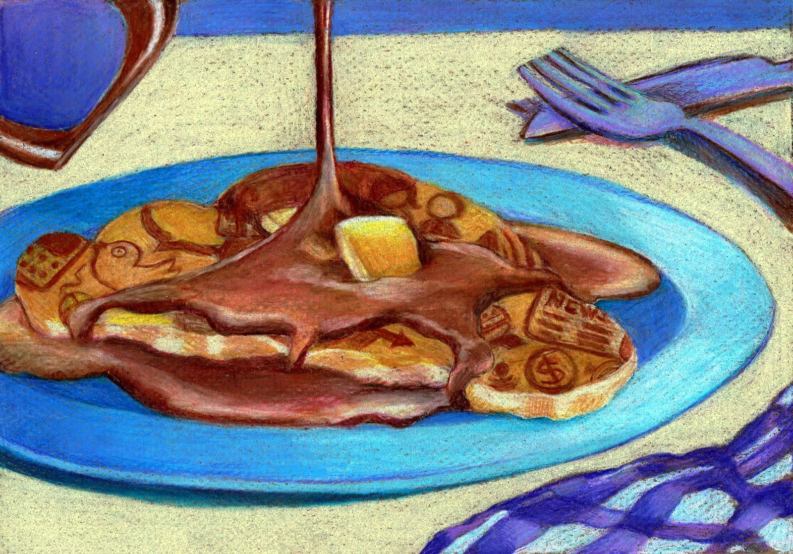
These are the two that I have to apply text to.
Any tips would be helpful! Thanks!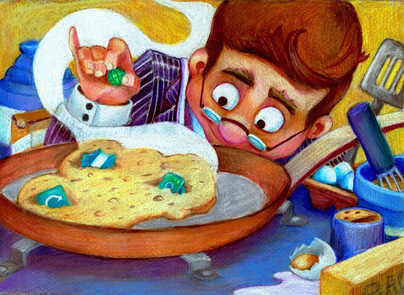
-
And what I mean my text, is that I need to add words onto all the labels. Sorry, should have specified that!
-
I don't know the answer because I am a Photoshop noob but I just wanted to say these are two beautiful pieces! Really well done Christina!
-
Hi Christina,
I'm not 100% sure what you meant by words on the labels, but whether it's part of the illustration, or words that form part of the story, I reckon that a "handmade" type of font would probably help.
If you really needed the font to blend in with the illustration better, I would then consider giving the text layer a different blending mode. Another trick would be to not use 100% black as the colour, but try something maybe dark grey, dark brown?
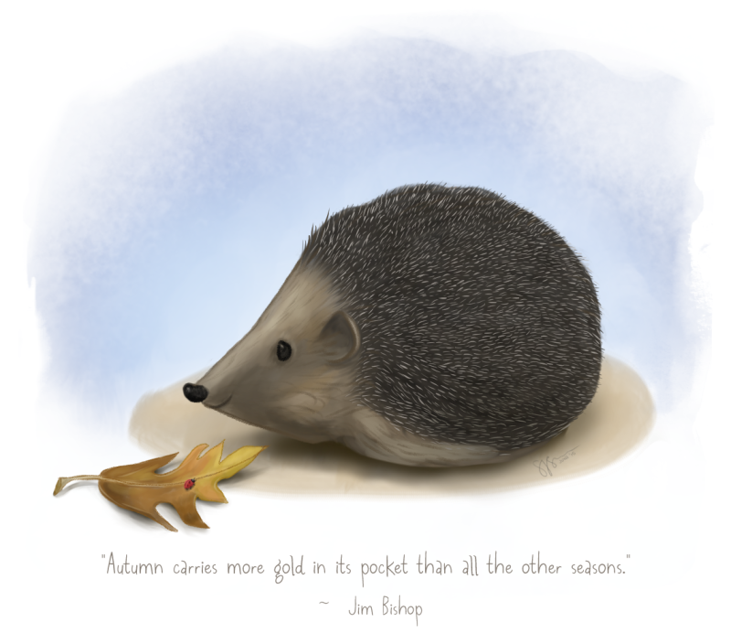
Here's a little illustration of mine, which uses a handwriting style of font - is this the type of thing you mean?
-
You want to put words onto the ingredient labels? I wanted hand-painted looking text on something so I found a font I liked and lowered the opacity and then painted over it with a textured brush. I don't have a cintiq either. It's an old Wacom tablet. I hope that helped...?

www.lydiamueller.com
Twitter @lydesigns -
@Dan-Tavis Thanks so much! They're to accompany an online article about creating your own "cloud" storage. I hope I got the idea across!
-
@Samalah @gimmehummus Yes! I would like something more handwriting -like. Thanks for the tips!
And yes, I need to add words to the ingredient labels. Where did you both find your text? Do you have a good download site? -
Hope you don't mind - I just had a very quick play around in Photoshop, and found that you can get some sort of realistic integration by choosing a painty style font, applying an oil paint filter to the text layer (or one of the other filters, if your version of PS doesn't have oil paint) and then applying a mask and maybe roughening up some of the sharper edges with a textured brush to make it look as if it's part of the original artwork. Not perfect, but a step in the right direction...
")

As to where I get my fonts, alas I am a font geek and have been collecting / purchasing them for a very long time! If you are willing to spend a little money, then you can definitely get a higher grade of font with more alternative characters and variability. I would have a look at Creative Market https://creativemarket.com/fonts/display
Some fonts like Veneer already have a wear / stamped sort of pattern built in, with lots of versions for each letter: https://creativemarket.com/YellowDesignStudio/8013-Veneer-Font-Family
Hope that helps!
-
Hey there! Just to add my two cents to the "where do I get different looking fonts from" question.
I use dafont.com and it works beautifully with photoshop. Just download the fonts (for FREE, donation optional) and instal them to instantly have access to them in photoshop.I hope this helps! Cat x
-
@gimmehummus great technique!! I'll use this in the future