Oct WIP - Composition Critique
-
Hey Everyone! Finally had some time to work on the Oct prompt. Trying to nail down the composition and just wanted to get some feedback. Trying to go for more of the mad scientist vibe versus more cute.
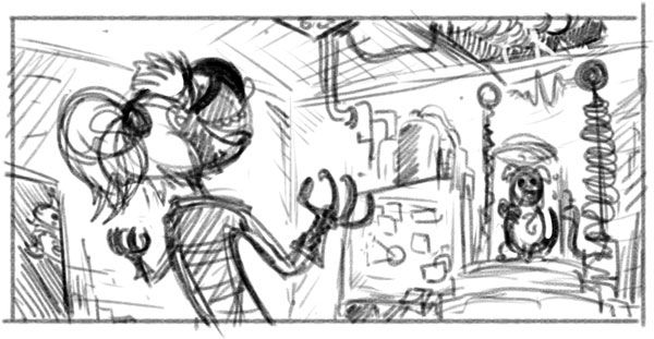
I figured I'd try and get the composition set on the computer then do traditional ink for the actual drawing. Here's my starting point for overall layout:

-
Looks good to me! Just watch for tangents (fingers by the edges and corner of square shape).
-
Thanks will do! The next version up I've moved the board and the girl so those don't intersect at a weird spot. I'm just not sure how much revising I'll do digitally before pencil/ink. This is the first time I've started digitally and gone the other way, so we'll see how it goes

-
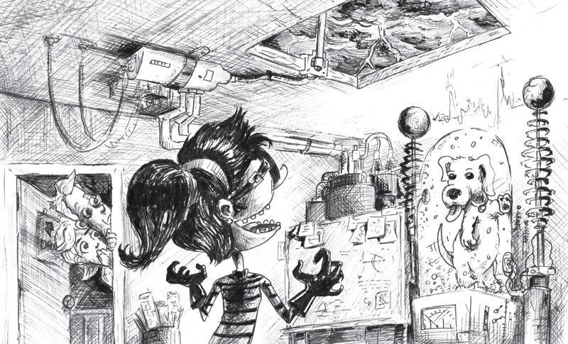
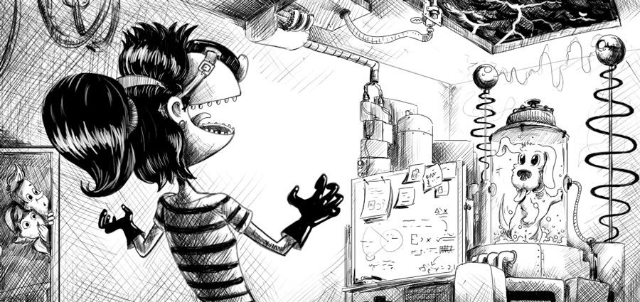
I did both a quick traditional and then I took the digital a lot further. I'm curious to see what folks feel has the better appeal. One issue I'm struggling with is my scanner just can't seem to get a clean image. So that's why I ultimately did a digital version as well because I felt maybe I need to complete it in digital if I can't get it to scan well enough on a final version.
Here is the traditional ink:

And then here is the digital:

-
I feel like in the latest version (digital), the parents are too squished in the corner giving them a sense of not belonging in the same space as the rest of the scene. Something is also off about the perspective of the room and the door frame, and that white-board next to the dog. Very fun concept otherwise.
-
@jdubz I like the overall composition of the traditional better but the dog is rendered better in the digital. The parents are MUCH better in the traditional version (like someone else said, they are too squished and look out of place.) Also, there is this weird empty space in front of her head in the digital that is not there in the traditional. I also like the background in the traditional better. I like the contrast better in the digital. So basically I am no help at all but maybe have given you some ideas that you can improve in the digital 2.0 version.
-
I like the traditional one. It has a lot more character and I found myself looking at it longer, enjoying the details. I would use some digital magic to fix the perspective on the door frame. After that, it looks good to me.
-
Another vote for the traditional. I think it has more texture.
-
I like the contrast and the dog design of the digital, but like the comp and details of the traditional piece.
-
@clipant Thanks for the comments. I definitely noticed that. I might widen the scene a bit. What's really odd about the perspective is that I changed the doorframe to match the actual perspective grid I was using for the room, but it looks off even though it's lining up and I don't know why that is. Maybe it's just the size??
Appreciate the comments all... honestly I'm not sure what to do with it. I'll see if I can fix some of the issues digitally. I kind of felt similarly where there were things the digital version solved, but I still thought the traditional was more... (maybe compelling is the right word??) to look at. I might just redraw a larger traditional to try and solve those problems. I'm definitely having a far harder time getting the details "right" on the digital version because the feel is just not the same being able to hatch on actual paper with 3 different pen types.
-
@chrisaakins I really like how yours is coming together - is that all digital? I'm really not sure how to fix the contrast issues in the scanned image. I tried also to take a hi-res image of it on my phone and still isn't looking great.
Maybe I can mess with the levels in PS on the larger version, then shrink it down.
-
@jdubz I too prefer the traditional sketch but prefer the dog in the digital one. I think the issue with the door looking weird is that in a normal room even with tall ceilings the top of the door frame will be about 2/3rds up the wall. The top of your door is a bit far away from the junction of the wall and ceiling?
-
@jdubz Thanks! I work traditionally and then edit it on IG to make it look good in terms of tone and contrast.most of the originals look better than my photos. I, too, need a good scanner. I may edit/colorize some of my next few ones in PS because my markers are running out. Maybe you could scan it in and just edit it?
-
@chrisaakins Do you mean Instagram when you say IG? Your scanning familiarity is definitely more advanced than mine

I think I need to just sit down for a couple of hours and figure out how best to get the balance in PS. I attempted to edit it a bit, but the sections I changed just didn't match and it started to look disjointed.
@gubhart Yes I think that's it exactly. I didn't flip my canvas at all and looking at it today that's definitely messed up scale-wise when I read that comment and then looked at it with fresh eyes this morning.
-
@jdubz I do mean Instagram.
-
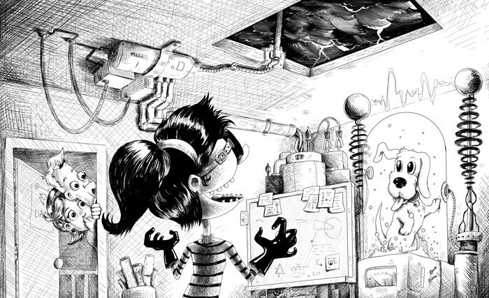
I tried something completely different - I inked the original sketch using Procreate and I attempted to combine elements from both images to get the better pieces of both worlds

-
@jdubz I like it! Looks like a contender for sure!
-
Shia LaBeouf slow clap


This turned out soooo good!
-
Thanks all - really appreciate all the great feedback. I'm going to try and get some more consistency in that top left hatching then I'll call this one done!
-
This turned out great!