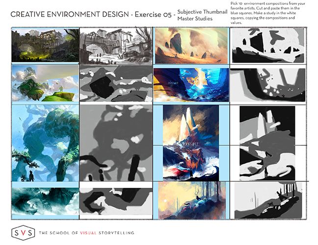
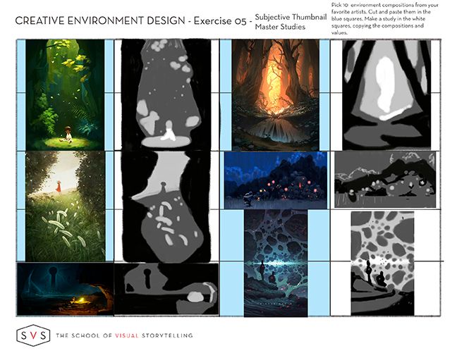
Group run through creative environment design week 2 art and feedback
-
Started a thread for week 3!
-
Once again, If anyone here wants more critiquey feedback on their work, post it and tag me with an @ and I'll give you a short critique.
If you want a critique but DON'T wanna post it here for whatever reason feel free to PM me on these forums or DM me on discord

I don't feel AS comfortable critiquing these, but I'll do my best!
-
@murielle Thank you!
-
Week 2 just finished up. Challenging, some were more helpful in visualising than others.


-
@Braden-Hallett You do so well on all these exercises __ amazing stuff.
-
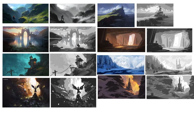
Very belated week 2 attempt


-
@Nathalie-Kranich Nice work! Looks to me like you nailed it

-
@Nathalie-Kranich These are great, your values look spot on!
-
@Nathalie-Kranich Pretty wow wow!
-
@Heather-Boyd @Erin-Cortese @Braden-Hallett thank you guyys, I swear I spent four times as long trying to find images to copy than I did copying them. How was your process for that, and where did you lot look for masters to study? I just sort of went with 'stuff I like ' but I'm not sure if there's a better educated way of determining what is worth studying

-
@Nathalie-Kranich I chose mine based on a variety of things, but they were all compositions that I either liked or had styles I want to experiment with in the future. Many, if not all of the compositions were ones that I already had saved on Instagram, or were taken directly from people I follow. I had so many saved to choose from that I narrowed it down based on wide format and different levels of detail.
I learned a lot doing it this way - one of the more detailed ones I did, I absolutely hated doing. It came from an artist who does environments that I thought I would love doing, and now I know I have absolutely no desire to work in that style. I learned things like that from the other thumbnails too.
-
Just my Pinterest boards. Then when I reviewed first collection -there was a colour scheme which was super cool (for myself to see that I naturally combine works by colours/complementary). So I based mine off of colour (unconsciously) and value to help me work through my struggle with that. Composition was sort of in the back of my mind. I work more on how a work makes me feel -atmosphere and mood and such.
-
@Nathalie-Kranich I think we're all in the same boat for picking study material

After a certain point a tried to stop thinking about the images and just take the ones that caught my eye. Pinterest was awesome for source material.
-
Ha, that makes me feel better then, anything we like goes I guess! I browsed Artstation for mine.
I also just noticed just how formulaic a lot of the images I picked out appear, in terms of placing a vertical object on the line to the right third, against a bright background, framed by a dark foreground. It applies to all of them, apart from the first, which is just the same formula flipped! I feel like @Heather-Boyd 's second set of choices also have a lot of similarities, with bright midgrounds being framed by quite dark foregrounds on both sides, like a cave.