Would really appreciate some feedback
-
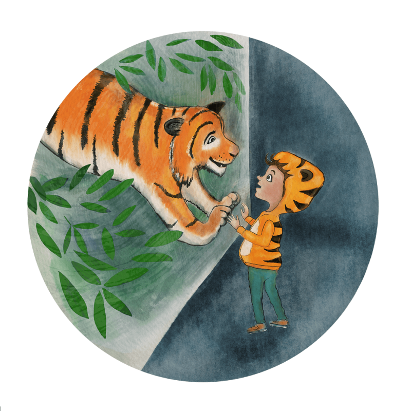
Hello. I would really appreciate some feedback on my picture. I'm drawing it for a character design challenge group I participate in with a weekly topic (the word is zoo). I'm hoping to one day be a children's book illustrator. I've been working at improving my drawing for years now, but starting from a really low skill level. I subscribed to SVS Learn a month ago and feel like I've learned a lot so far, but am overwhelmed by the many ways I can improve, and how much I still need to learn. Thanks in advance!
-
@lucy_gow First off I like the concept, and the colors help draw your eye to where it needs to go.
So just 2 simple things that stick out to me, first are the paws of the tiger. I'd say find some reference as they seem to be the weaker part of the drawing here. Also, if they are supposed to be pushed against the glass we could probably see some of the padding on the bottom of the paw
Secondly, the tiger is getting larger as it goes back which makes it look a little fat or just a little strange. Usually you think of tigers being more sleek so I'd taper the back of the tiger as well.
Overall a great start!
-
@benr Thank you so much! That really gives me something to work on straight away.
-
@lucy_gow hi this is really nice but I think the tigers head and paws should be much bigger in comparison to the child this would make the tiger more imposing too.
-