"Hidden" work-in-progress (input/critique/comments welcome)
-
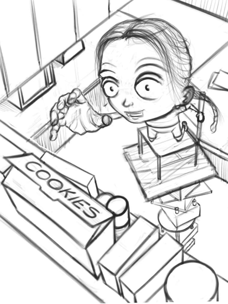
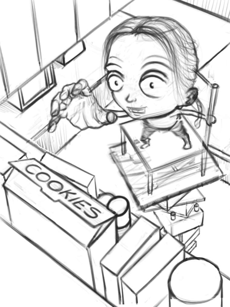
Here's a cleaned-up sketch of my idea for "hidden". Looking for comments, suggestions, critiques, etc.
(I go back and forth on whether it is clear enough, but the cookies obviously not hidden since she's going for them. But, she discovered where they have been hidden and is now attempting to get them. It may be overstating the obvious, but just in case it's not, that is my intention. Hopefully it reads that way.)
Thanks!
-
Hi, Shawn. I love your concept here. Ilike your character’s pose but perhaps you can work more on your perspective. Make the furniture appear as if they’re shriking the lower they get. That’ll definitely add dimension to the illustration. I can’t wait to see you progress. I hope this helps.
Portfolio: nyrrylcadiz.com
Instagram: https://www.instagram.com/nyrryl_cadiz/
YouTube: https://www.youtube.com/channel/UCbJCF1Im8ZO7hpGWTKOJMuA -
@nyrryl-cadiz This looks like it was drawn in isometric, it my have been intentional
-
@rcartwright @Nyrryl-Cadiz Thanks for the feedback.
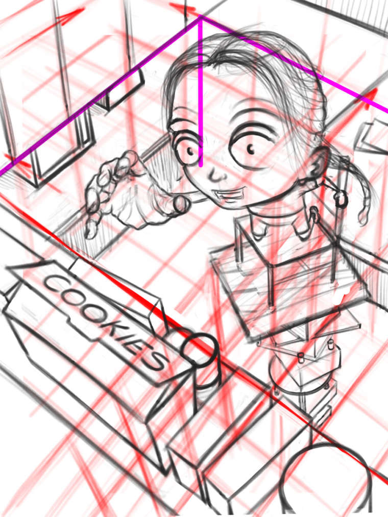
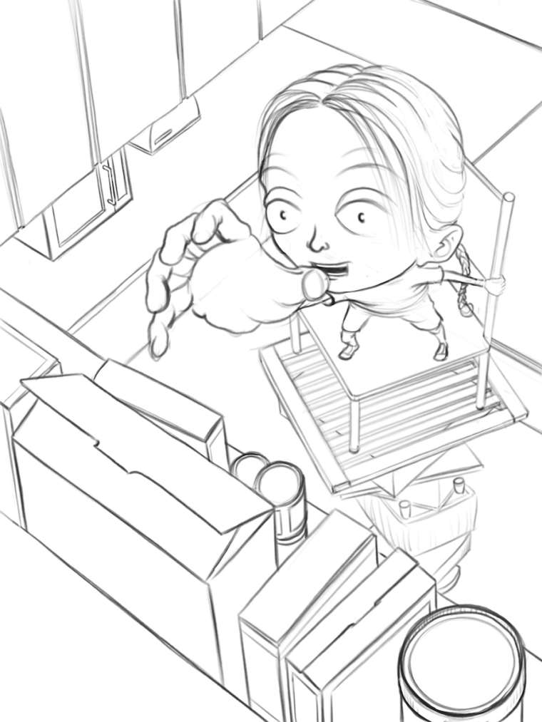
My intention was to do a three-point perspective and try to exaggerate it more so the top of the cabinet where the cookies are appears way up and a little perilous. Down below you see the kitchen counters. Here is the same drawing with my perspective guide lines turned on. (They're a little messy, so hopefully you can make them out.)
Still, maybe it's not coming across the way I was hoping?
Thanks!
-
Part of the issue is that the exaggerated character perspective doesn't seem to fit with the environment
-
Hi Shawn. Overall, I think this is really cool! The perspective is quite ambitious and I think you are almost there, but need a few adjustments.
Just my opinion, but I think you aren't quite selling the perspective of the character or her pose. The perspective between her two hands is quite dramatic, yet the perspective between her reaching hand and her head isn't so much. I think if you made her head smaller, the forced perspective would read better and you'd get a better sense of her reaching up. I also would encourage you to think of making her stand instead of kneel. Having her stack all those objects, only to have her kneel in order to reach those cookies, doesn't seem quite logical to me and it sort of deadens the feeling of her reaching something high. I would also suggest that you have the objects she's standing on get progressively smaller as they go toward the floor. This will just push the perspective a bit more and give us the feeling of more depth.
Anyway, you really have a fun image so far and I can't wait to see it entered into the contest.
Website: www.tessawrathall.com
Instagram: www.instagram.com/tessawrathall_art/
-
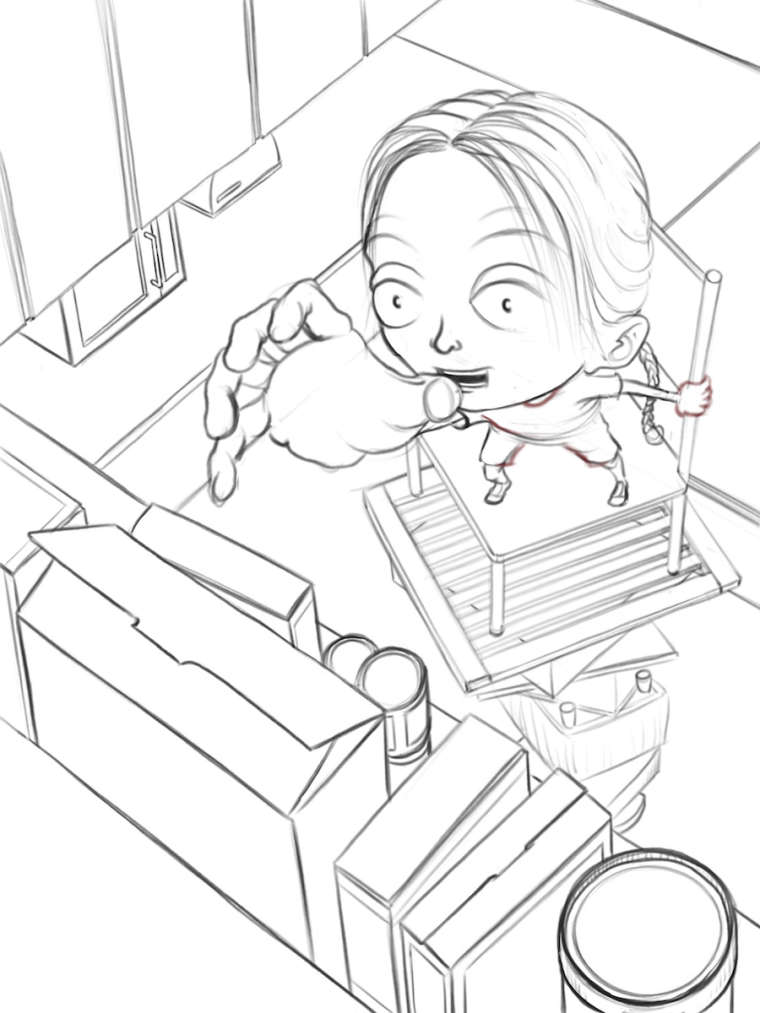
@tessaw Thanks for the feedback. Those are all good points – especially the kneeling one.
I normally draw stylized people with heads much larger (about the size of their body) and with kids it's even more exaggerated. But, combining that with the extreme 3-point perspective is proving to be tricky. I think you may be on to something with shrinking her head a bit. Or, maybe make the reaching hand even bigger??? (Or a combination of the two.)
Thanks again!
Shawn Turek
Website: http://www.drawnbyshawn.com
Instagram: http://www.instagram.com/drawnbyshawn
Twitter: https://twitter.com/drawnbyshawn
Facebook: http://www.facebook.com/drawnbyshawn -
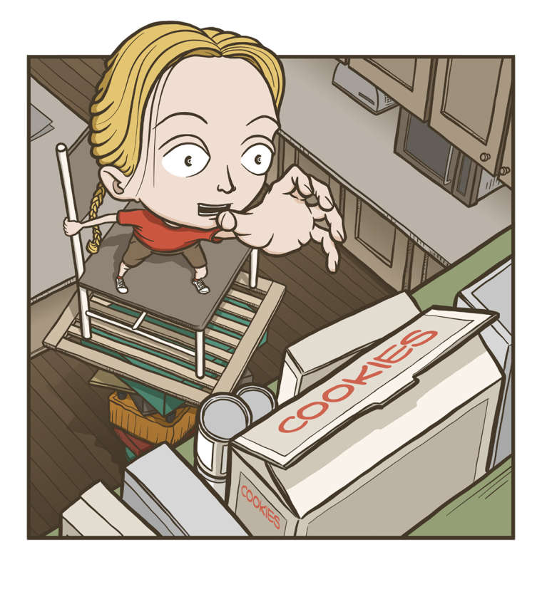
I made some adjustments based on the feedback I've received so far. (And thanks again for that.)
-
@drawnbyshawn said in "Hidden" work-in-progress (input/critique/comments welcome):
@tessaw Thanks for the feedback. Those are all good points – especially the kneeling one.
I normally draw stylized people with heads much larger (about the size of their body) and with kids it's even more exaggerated. But, combining that with the extreme 3-point perspective is proving to be tricky. I think you may be on to something with shrinking her head a bit. Or, maybe make the reaching hand even bigger??? (Or a combination of the two.)
Thanks again!
I had a feeling that stylization was perhaps the reason for the way you were doing the proportions, but I think when you are trying to do an exaggerated angle with a certain feeling you're trying to convey, making it "feel right" is a bit of a bigger priority, because lenses can play all sorts of tricks with proportions. So even if you tend to stylize heads a lot larger, I think for this particular piece, you can afford to play with the proportions more for perspective's sake.
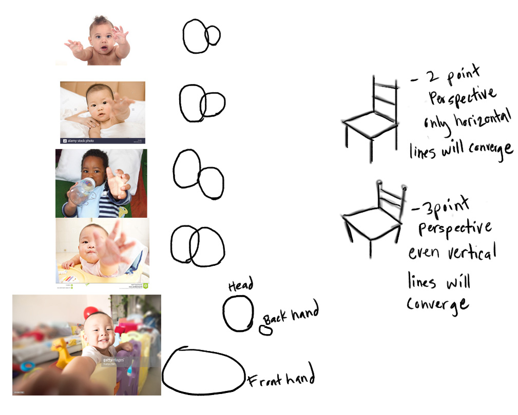
I just want to include some examples of how much you can manipulate proportions depending on what you are going for. I took babies where they are all extending their arms far from their bodies and you can see how much of a difference proportions are changed depending on the camera work. I've represented the size of their head and the size of their hand with circles.
I also know you are going for 3 point perspective, so don't forget to converge those vertical lines on the chair.
Website: www.tessawrathall.com
Instagram: www.instagram.com/tessawrathall_art/
-
@tessaw Thanks for the additional feedback!
-
I think you should try to make the hand bigger, you can cover a little bit the face so you can separate the front part (cookies) with the background .
-
@donfito Covering the face is an interesting idea. When I first read that, I wasn't sure that was going to work, as I thought it would be important to have her face completely visible. But, I was working on it this afternoon and tried it and ... it does work better I think. I'm not covering it much, but just enough to make a difference. Thanks!
Here's my latest cleaned up sketch.
-
Looking good! I felt like the back hand was a little small for the body overall, even though its further away. And maybe you wouldn't see the neck from that angle but could see the shirt collar. I drew over your drawing so you can see what I"m talking about, hope this is helpful. This is a really fun illustration, nice work!
-
@shiggins180 Thanks! Yeah, that does help, especially the shirt collar.
-
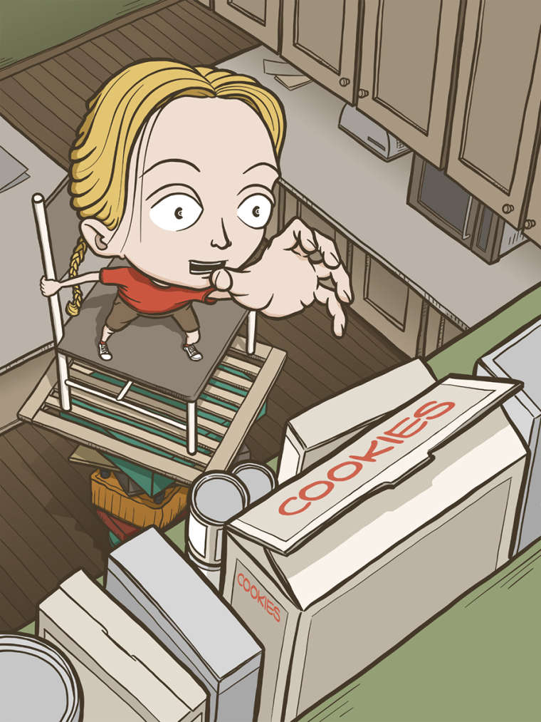
I've worked on this one quite a bit, so I figured I'd post where I'm at. I'm going to do more with the boxes on the foreground shelf, and just have "cookies" in there as kind of a placeholder.
I also have two versions. One has a cropping that pulls the character forward a bit more (which I'm liking).