Texture critique
-
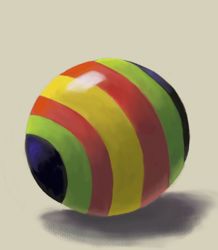
I'm watching Will Terry's Texture Class and did the following opaque ball assignment. I liked the way it turned out except for the black "nose." It feels like there should be a highlight there because otherwise the black doesn't look shiny but the light is coming from above. I settled for putting a little purple tone but am still not happy with it. What would you do? (I know the stripes aren't perfectly elliptical. I need to work on my ellipses in general but I was doing the ball and stripes quickly because I wanted to spend time on the color.)

-
When I squint down at this the light side and the and the reflected light seem to be the same value but the light side should be lighter. Yu could also go darker in your core shadow
-
Nice colors! The stripes do not follow the perspective of the ball: they are not ellipses - in particular the black one at the front, but all need some tweaking. I had a teacher once that made fun of „pointy edges“ in ellipses and put us on the spot when we did that...ah, memories

Apart from that, the cast shadow is too soft and opaque and you are missing the occlusion shadow (slightly darker soft area right under the ball) so it feels like it´s floating.
The position of the highlight is really a function of the position of the light, so you probably shouldn’t add more than what the lighting situation calls for. As an aside, it helps to have an area of slightly higher saturation around the highlight, especially on bright local colors -
@smceccarelli I knew the stripes were off and was too lazy to fix them! I couldn't figure out how to make it look like it wasn't floating and will try adding the occlusion shadows.
@rcartwright One thing I'm constantly fighting is my timidity with color and value. I always tend to underdo rather than overdo. I'll work on this some more.
-
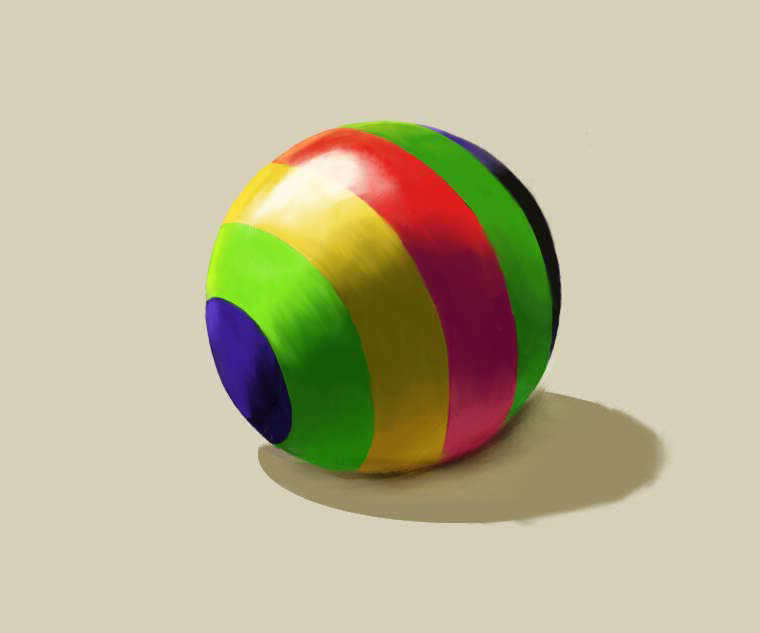
Finally had time to work on this more. I tried to fix the ellipses though after spending tons of time reading about the construction of ellipses, I'm still not sure I got it right. (I couldn't find anything on how to draw successively smaller ellipses in the proper proportions which is what stripes on a circle are so I ended up guessing a lot.) I did darken the core, and actually took a photo of an orange to try to get the lighting better, but the bottom of the ball still feels off to me. I don't know that I want to spend more time on this but I'd love to know for the next time what you think I could still do better.
What I mostly learned is that if I ever have to draw balls in an illustration, they will be solid colored, not striped!

-
@demotlj huge improvement already
-
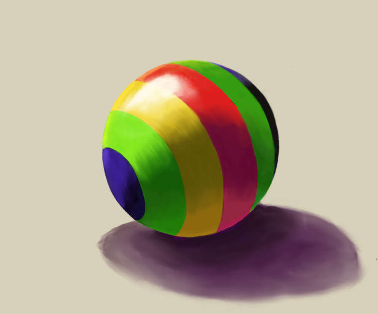
This is just super quick and rough. Your main problem is the shape and color of the cast shadow. Cast shadows of balls on a flat surface are always perfect ellipses and the edges are sharp close to the object and get softer moving away (unless there is diffuse light, but let's not divagate). The color of the shadow should relate to the color of the surface on which it is cast. I have also put in some reflected light on the ball and on the surface - that helps to give a better sense of volume and transparency of shadow.

-
@smceccarelli That really helps and the line of shadow you put on the bottom edge of the ball also helps it blend into the shadow underneath. Clearly I have to study shadows as much as light.
-
@demotlj This sounds very much Tao, but really there is no rendering of light without proper rendering of shadows....Actually giving a sense of light in a piece has much much more to do with painting the shadows right than with anything else....
Don`t take my super quick paintover as a reference - it has still a lot of mistakes. There is a lot of „sphere tests“ out there: if you type that on YouTube I am sure you’ll find a lot of resources!