Faeries & Tigers | Critiques Wanted
-
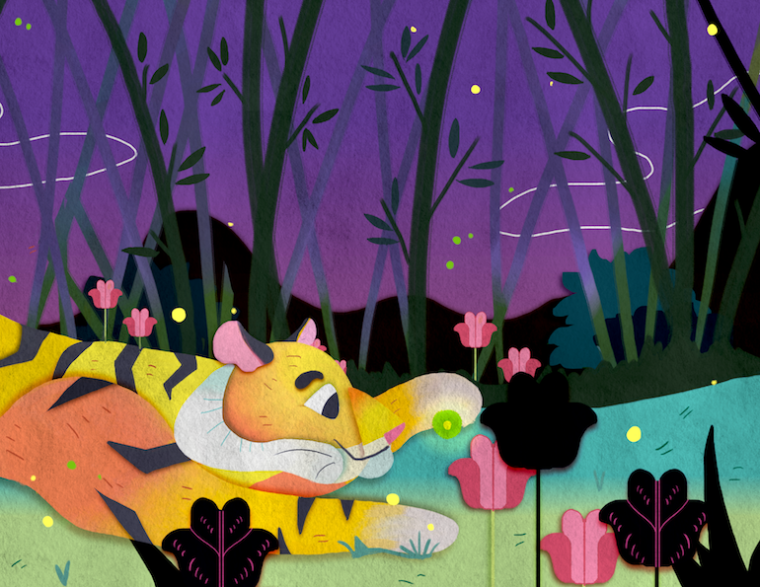
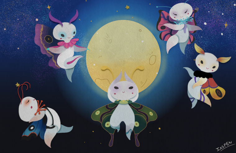
Hi, everyone. I'll be graduating soon and there's a fellowship I'd like to apply to once I do. The tiger is my most recent piece, and the fairies were done roughly a month ago, but I'm happy to go back and refinish it. I would really, really appreciate any feedback anyone has.
On a side note- when I was working on the tiger, I realized that because I always work at max brightness my colors might seem a bit dull on other screens. I edited it a little bit this time once I finished, but I worry it might look too bright...
-
@ixspen Hi, I love the collage look. It's really fresh.
Here's what I think:
-
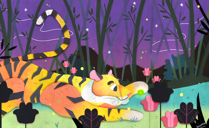
I think the tiger is cut awkwardly. Since you've shown us a portion of the legs, my eyes sort of trail off in that direction and want to see more of the tiger. You can move the tiger more to the left so that it will be cut at the torso. Also by doing this, the tiger will perfectly hit that line of thirds. Lastly, I think that lonely flower in the middle can go. It's blocking the view of the tiger.
-
The fairy piece is great. I like your designs. I think you can work on the fairy with pink wings on the upper right side though. It's not that it's wonky or anything. It's just that its legs and wings are making a tangent with the moon. You can just move it more to the right.
That's all I have to say. Overall, I like your illustrations. I like the characters. I like the style. I hope this helps.
-
-
This post is deleted! -
Thank you, for the warm words Nyrryl! Also, what you've said has been helpful! Thank you so much for taking the time to look!
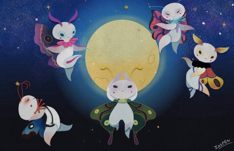
These were my adjustments.