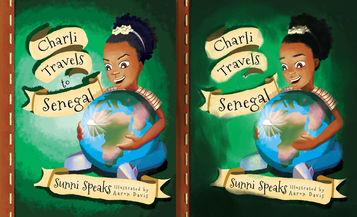
New Cover. Feedback Please!
-
Hello!
I'm working on my first children's book and I'd love some feedback on the cover. I'm still learning about color theory and how to make colors work together so that's the thing I'm most insecure about now. Any feedback is appreciated. Thanks!

-
@aaron-e-davis This is looking good - I feel like I might be worth trying more of a blue for the background - this would give you a more unified color scheme - one other thing would be to draw the girl’s pose without the globe present - Will Terry et al call this “drawing through” - this could help make the pose more believable - at the moment it looks like the globe would be occupying the same space as much of her body - if you have someone that can take this pose at this eye level for you that would really make it easy to nail the pose.
-
Can I ask what the expression is that's being conveyed? It doesn't quite read clear to me. That's the biggest thing that stands out for me, but that might just be personal perception.
Also, with the stitching effect along the left hand side, I wonder if a little occlusion shadow might not help? It reads a little flat compared to the rest.
-
I like the overall design of the cover. The issues that stand out to me are:
-
the lighting is very harsh, as if a bright spotlight is shining on the cover, which is mostly caused by the very dark shadows. The shadows need to be toned down, and the background gradient needs a smaller range of light to dark
-
her right hand appears larger than the left, and I would show four fingers on the right wrapping around the globe. Her left needs to be adjusted so it looks as if it is holding the globe as well.
-
her expression is a bit evil looking, mostly caused by her eyebrows. Also, her ears a too small for the size of her head.
-
I agree with @Jazeps-Tenis about the globe looking like part of her body. Longer legs might help.
And now that I have said all that, I really think the whole cover needs to be redone. Considering the subject of the book, I would have Charli already in Senegal, with a well-known landmark in the background, her in her travel clothes, maybe holding a map of Senegal in her hand. Would be more eye-catching.
-
-
Hi Aaron! I think it's a fun image that could be really appealing as a cover after some refinements. I usually offer tips on how to improve a current image without redoing everything, but you may consider what others have said. I would definitely consider what they've said as far as drawing issues are concerned. I hope you don't mind, but I did a rough paint-over, mainly concerning the color, though I did adjust her eyebrows and ear. Here are my thoughts:
- I think the spot light was a bit harsh, so I lowered the brightness of the background. I used your midtone as the brightest spot instead.
- The shadows of her skin are very red. To unify the shadows with the background more, I color picked the mid tones in her skin color and moved it a little towards green on the color wheel and then darkened it, keeping it fairly saturated. I also changed her hair. Instead of blue, I moved it more toward green.
- Darkened the brown border on the left and added occlusion to the stitching.
- Adjusted the lighting on her face so it had softer transitions.

Congrats on your first cover! It's a great start. Good luck.