Looking for Advice on Lighting and Color for this WIP
-
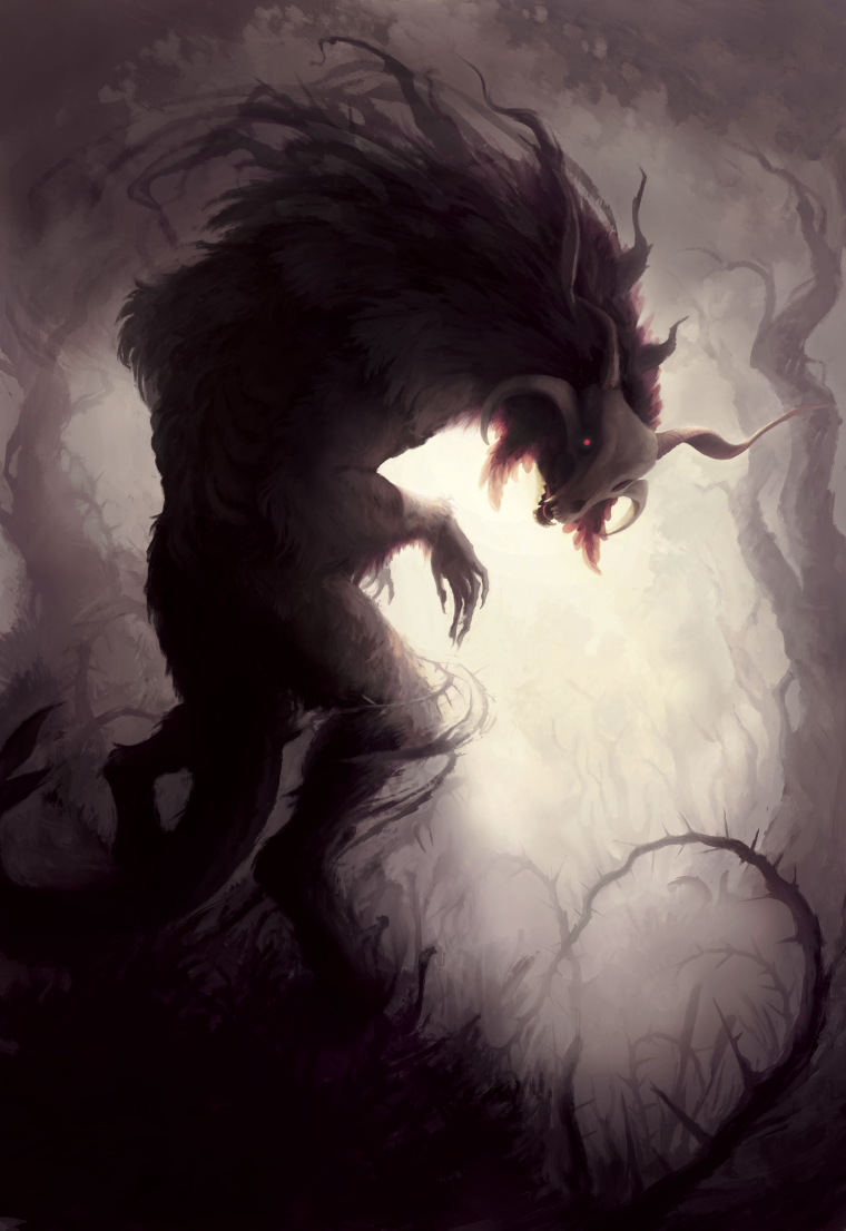
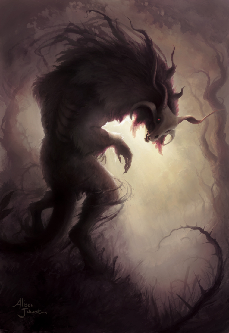
So I've been working on this piece and I do like how it's turning out so far, but I'm wondering if the lighting/color pallet feels too contradictory. I'm not sure if the lighting is coming across as too warm and... romantic(?) despite the subject matter.
Now, the intent of the image isn't supposed to be as creepy and foreboding as possible, though they are components. The idea is that this creature just noticed you and you don't know if it's going to run or attack. I guess I'm going for more mysterious than immediately dangerous. I felt like warmer colors helped with this, but I don't know if I've taken it too far.
I'm also wondering if the color palette is too limited.
This is still a work in progress, but any other critique is welcome.
-
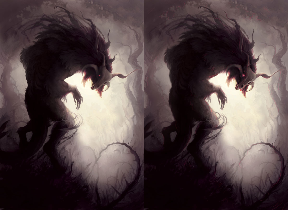
I think it's beautiful and I like the color palette, though I think you could distribute the pinks and reds more throughout the piece- just a personal preference. I know you are asking for color and light advice, but I also think your edges could use some fine tuning. You've got pretty sharp edges along the backside, and you are going softer on the interior edges of the skull. I think you could play with the edges a bit to bring more focus on the head (if that's where you want it). Bringing a bit of atmospheric perspective to the back leg and part of the tail may help too.
Did a subtle paint over, hope you don't mind. I tried to bring in the reds and pinks along the edges of some of the foliage and played with your edges a bit.
Again, I think it's really beautiful. I personally think that overall, you are achieving your desired intentions.
Website: www.tessawrathall.com
Instagram: www.instagram.com/tessawrathall_art/
-
I think it's great too. Try a little complimentary colour rim light on the left
-
This is amazing! I think if you sharpen the image around the face and claws, give it more contrast it will give it a bit more of an ominous feel. And for crying out loud, do NOT touch the color palette!! Its stunning!
-
This is stunning. I agree with what was said already. Last thing that crossed my mind when I saw this was "How Romantic." Ha. It's definitely doing what you wanted. I liked what Tess W did too... His eye looks crazy cool with that glowy effect and a touch of red on his leg... looks very predatory, almost bloody. If he turned all the way around you better get ready to pee your pants.
-
@tessw already said it pretty well. I would just chime in and say I love the limited color palette, and this might just be a personal perference but if it were MY piece, I would bump up the colors around the center, around the face. Because of the limited subdued palette you can get a real impact by really punching your colors in way up in a few select areas.
-
Everyone else has pretty much got this covered. I would not have thought 'romantic' so your OK there. I like the idea of adding a little more contrast with light and colour to the focal point (The head). Basically what everyone else said! Awesome painting!
-
Thanks for the comments everyone. I think bringing a bit the established colors into the environment was what I needed to do, though I may have gone overboard. It's close to being finished at this point other than tightening up the closer horn and maybe addressing some of the looseness in the lower half.
-
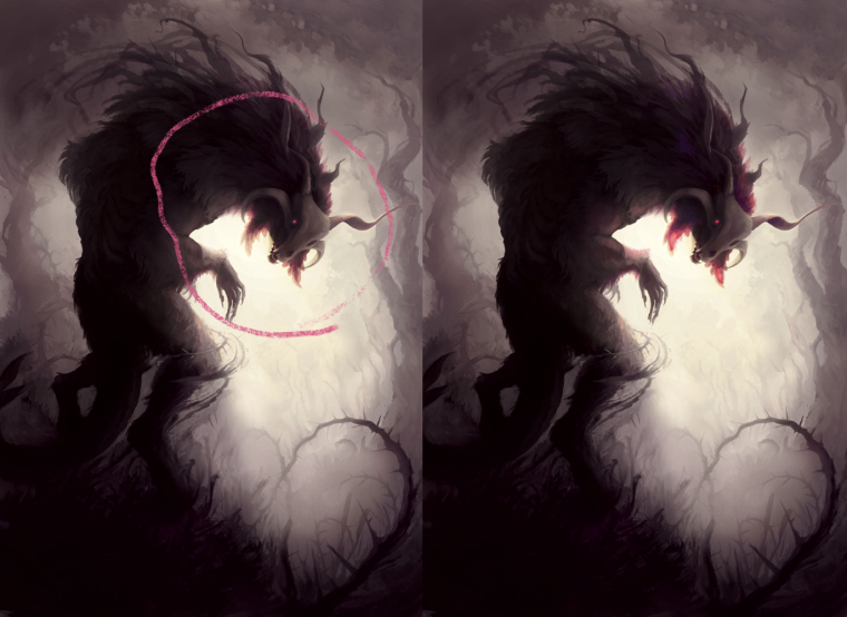
Oh one quick thing, is that X formation of the thorny vines distracting? I've been trying some other arrangements, but it starts feeling forced and I keep reverting back to this arrangement.
-
It's looking great and I had to look for that X formation so no it's not distracting. Not for me a least. Quality work!
-
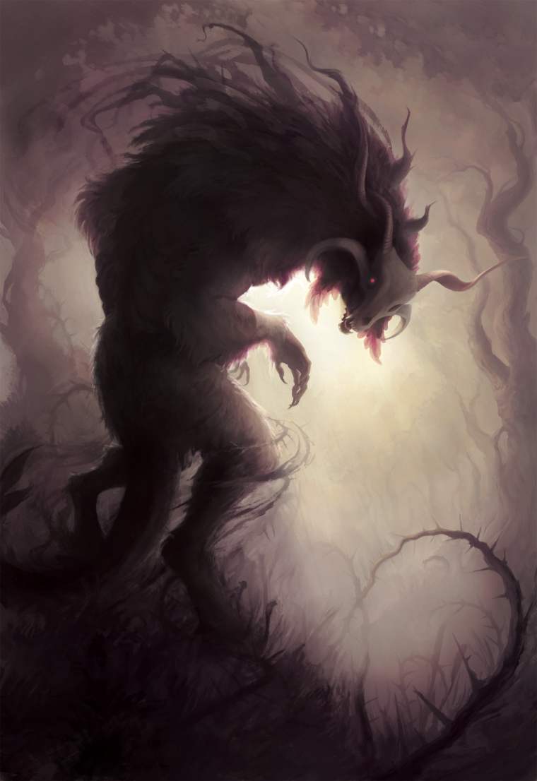
Alright guys it's done. Thanks for the help.
-
Really impressive! Cheers to a job well done- it looks great.