advice/critique on animal parade spread illustration
-
Hi guys!
I wondered if I could get some advice/crit on this piece I'm working on for a book. I'm really struggling to get it right, and have started to resign myself to the idea I might have to start again from scratch :S
I just can't seem to pick what is off in this spread- I'm thinking its that its too orange overall? And/or perhaps its a value issue as well, or maybe that I'm not pushing the colour enough (maybe too stingy on amount of colour on the brush?).
I was really trying to get across the idea that its bright and warm, and contrast to earlier parts of the story which are darker + bluer/cooler, but don't feel like I'm getting it right. I really would like the animals to be bright and colourful.I've tried a few tweaks in photoshop just to see what it might be, before I go ahead and change anything on the painting.
I'd REALLY appreciate any advice you guys might be able to offer- I'm banging my head on the wall here
I don't have too long to get this finished so hope it might be tweakable from this painting, but if not I can start again- I really want to get it right.
Here are some pics:
pencil sketch

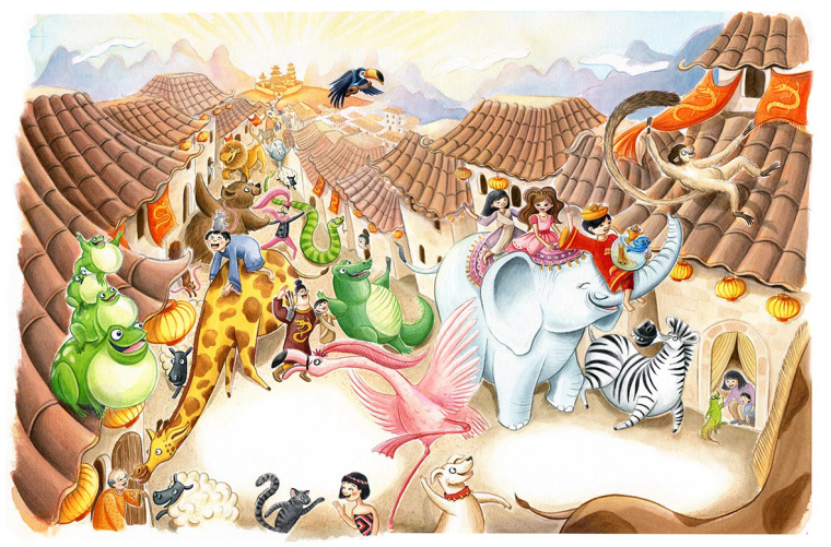
scanned illlustration- no edits

playing around with the colour+saturation of the rooves
adding in a darker ground colour (more blue-y).This is the first of a number of paintings and I hope that it'll get easier as I go!
Thanks in advance for any and all suggestions!!!

Emma -
ok weird- it won't let me upload images to the main post- here they are:
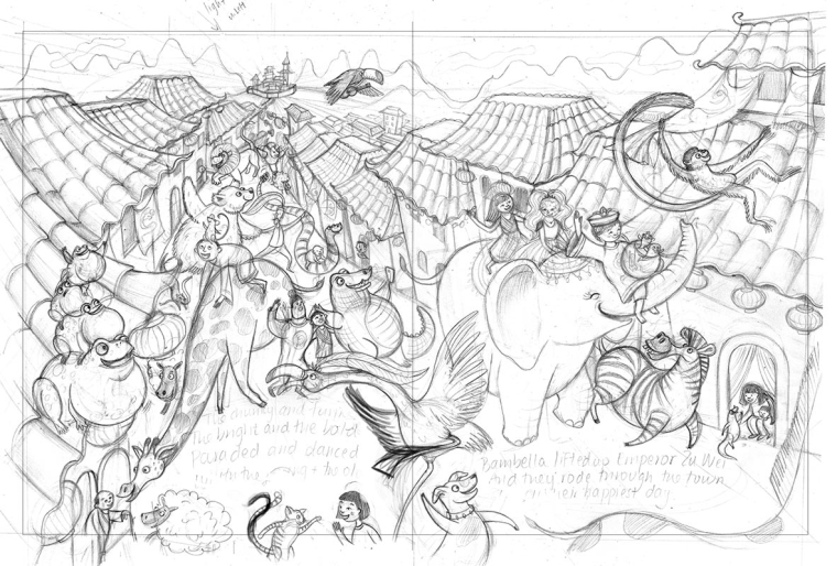
pencil sketch
painting scanned no editing
trying out tweaks on colour and saturation of rooves
darker ground colour.Thanks guys!
Emma -
or maybe the sky needs to be bluer to offset the orange? -
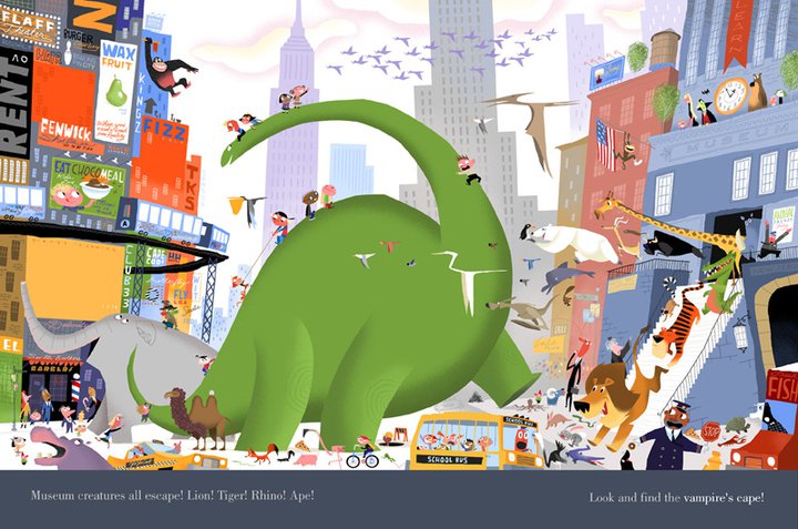
I feel like it is hard to pick out a focal point, partly because of the colors and small shapes also the street creates a natural path back into the picture but I'm guessing the elephant is the focal point? Try lightening or lowering the saturation of everything in back unless it is important to the story.
-
I agree with @rcartwright that it is a bit hard to find the focal point. Everything feels like it is fighting for my attention. I'm not sure why there are 2 very brightly lit spaces in the foreground, i'm guessing that is where the text will go, but for me it seems a slightly awkward place to put it.
Also I would be a little careful in the consistency of your scale and perspective. The monkey on the top right seems about the same size as the zebra and the person riding the giraffe would be a lot taller than the people he/she is next to. The animals and people on the bottom of the piece also don't follow the rules you have set with the other animals and seem somewhat placed on as an afterthought.
The design of the animals and the people are cool though, as well as the buildings and it seems like a really fun image
")
-
thanks so much for your advice @rcartwright and @Gary-Wilkinson . those are both awesome points.
I have tried lightening/lowering sat of background, plus moving the text up above. maybe I should redo this with way more partying animals in the front and have the text over the sky...perhaps that would also fix the issue of the foreground animals looking tacked on as an after thought.
I already am liking it more with the lower saturation background. I guess I tried to do this but obviously not enough in the actual painting!!!
@Gary-Wilkinson I did have some trouble with the sizing of the animals- I did make the monkey bigger as he was supposed to be closer to the viewer as its (supposed to be) a slightly top down view... but obviously I didn't quite pull it off haha.
It looks like I'm gonna probably repaint this, so will reassess the animals sizes as I do thatDo you reckon this version is looking better? Not sure if the rooves need to be brighter or if its better like this....
-
@emma-scheltema I would say those changes will be a big improvement. It's fine to not have perfect perspective (nothing would be fun if that were true) but as long as it's trying to stay constant then it should be ok.
Moving the text and putting more animals at the front will work really well I think. I would also recommend to do something about the toucan as it stands out quite a lot, perhaps try move it to the left or right side of the image
-
I think it looks better now too. I think you could darken the shadows under the animals to up the contrast in the foreground and really make some of them pop
-
This is really fun! The scale of the animals is working for me, except for the monkey on the roof. It looks giant. I'm liking the text moved upward, but then you cut off that Maori girl in the front. Is she important to the story? Gary makes a good point about the toucan.
Speaking of the story, it seems so intriguing! A strange mix of animals and a few people from different countries sprinkled throughout a Chinese village. What's going on!?
Overall the image is working for me. I know it's busy, but I think it flows well as a book spread. Great work!
-
the biggest area that stands out to me is the roofs. They look OK in the sketch, but once painted, some turn into an optical illusion of sorts. The roof near the elephant's rear looks to be going up and out rather than back, as does the roof below it. The perspective is off a bit on some of the roofs, and it is definitely off on the right side where the buildings touch the street. And the buildings on the right lean into the street, while the ones on the left do not. And due to the height of the buildings behind the elephant, the kids in the doorway near the zebra appear to be on a second floor.
Mind the lamp over the black haired girl on the elephant; looks like a hat.
I like the words in the street; keeps your eyes in the action. Though a bit more space would be good.
-
I would like to add to what @tombarrettillo said about the rooftops. I think there may be too much detail in the tiles in the background and if you make them less detailed then it will help the viewer's direction
-
@Emma-Scheltema Hi and welcome, Great illustration style. I saw your post last night and have been thinking about your question for awhile now. I would have to agree with most of what has bee said so far, the two light at front of the illustration feels awkward but I do like placing the text into the sky. -
There needs to be a focal point or area to allow the viewer's eyes to rest as they explore the illustration.
And just a side note but it might be more apparent when reading the whole book, but I am not sure who the main character/s are.
Overall I like the illustration and I think it actually works really well in the pencil sketch. so it could be that it lost a little something in the translation into colour and a rejig and recolour would work?
-
A good artist to look at would be Bob Staake. He has done children's books with a lot of busy scenes. I think he is successful because of resting points and also patterning simple over more complex and vise versa, as well as simple over simple. I think people have given you good suggestions on how to do that with the roof. Maybe it's as simple as lightening the roof tops and having less shadow detail.
-
I also want to say that I feel it's sometimes ok to have a scene that doesn't have a clear focal point, if the image is all about searching a studying all the tiny details. A chaotic unfocused scene may be just what is needed, but it depends on your intentions. Your scene seems more narrative to the story, so I think having resting spots is probably ideal for your particular scene.
-
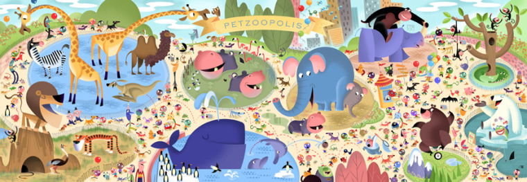
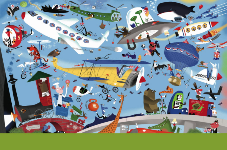
@tess Great ref, I think what works in these illustrations is that the illustration is cut into sections with the big and small, For example, the second illustration with the zoo animals has the big section which is the giraffes, elephants and whale section. then there is the medium section hippo, rhino, lion, and bear. and then there is the small objects scatter around filling the illustration. which allows your eyes to wander and rest between the different sections as you pick out the detail of the illustration.
-
wow thank you all for your excellent advice!!! I really appreciate it
@Gary-Wilkinson thanks for the advice on the text, and the toucan- he does stand out a bit more than necessary- I will move him in the next iteration.
@holleywilliamson - oooh I'll try that as well, with the shadows! Thanks it sounds like a great idea.
@TessW thanks so much for your detailed reply and also the illustration refs!!! I think I'm definitely going to rejig the text to be up the top now. I'll redo the front animals/people so they are also not so cut off as in my rough example. I was trying to go for a scene where you could spend time looking through the details rather than one clear focal point- though if there is one, the focus should be on the elephant with the main characters sitting on the elephant. Hopefully it'll make sense in the context of the story (which I can share more of once its been out- its for a self publisher
).
When you say resting spots, do you mean clear focal points or rather, areas of 'breathing' space- with not much detail (ie taking away the detail and saturation from the rooves would make it less cluttered and busy on your eyes, so your eyes can rest there?)?
Thanks so much for your encouraging words@tombarrettillo thanks for the advice about the rooves- that overall huge orange area was what was bugging me a bit too. I will check the perspective things you mention too. I think the rooves are probably attracting the eye way too much, as @Gary-Wilkinson says with the detail as well. I'm going to do some tests on how I can fix that!
@julian-beresford thanks for your kind words! I really appreciate your suggestions. I think that reducing the saturation+detail in other parts of the image will hopefully attraact the eye to the main characters (the characters on the elephant). Hopefully its also a bit clearer in the context of the book (I haven't done any other final illos but can post some others as I go!)- this scene was supposed to be when the main characters meet up with all the animals and they are all celebrating- less about the main characters and more about the overall 'party/parade' atmosphere- but I agree it probably needs an initial focal point of the elephant/characters. Thanks for your suggestion about the colour too- it something I know I struggle with especially on huge environment spreads like this with lots going on!! Hopefully repainting it with all these tips in mind will give a better result

Thanks everyone!!! I'm going to rejig the sketch and will post it once its done before I start the repaint!!
-
@Emma-Scheltema No problem, I would love to see your other illustrations from this book - Are you using watercolours? because this is something I have to watch out for when using water colour.too
-
I feel like there needs to be more contrast between the animals, the huts and the background. They all kind of seem to get lost or jumbled a bit with so much going on in the picture. I fell it is hard t get the whoel picture without spenidn time sorting it out. Does that make sense? Besides that, I love your illustration and the brightly colored animals. Really cute. I like the dog in the front too.
-
@emma-scheltema It was mention regarding perspective, but the buildings/houses seem to converge too tightly. Perhaps more (smaller in perspective) animals should be in the back along side one another. It looks so tight that the elephant could not have fit through the space, let alone alone side other animal. It is an awesome concept.