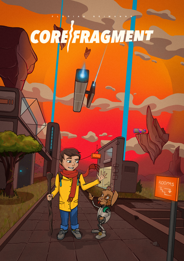
I work on a style for my comic, whats your opinion?!
-
Hey guys

i started a few month ago to draw (or better again) and my main goal is a complete comic (the word "graphic novel" intimidates me :-D) in a fantasy/sci-fi world. Now i finished my first scene in a way the comic could look like.
I would be very happy when you give me your opinions and thoughts on the picture.

Thanks :-).
Florian
-
@flolle I like your color choices and you seem to have some decent line work but I think you need to spend sometime on the human characters anatomy
-
@flolle In addition to what @rcartwright mentioned, I would work on the perspective. Your front-to-back angles are ok, but you pretty much have no perspective going up. All the vertical lines are parallel. Even at this angle of view, there should still be a bit of vertical perspective as you go up. Also, the image seems unnecessarily tilted, I assume for effect, but it isn't working here.
Not knowing the story, it is hard to comment on the images content, but might be good to zoom in on your characters a bit more, maybe even taking the view lower, and looking up at the characters slightly. Also, considering their proximity to each other, their greeting needs work. A like what the rabbit is doing, but the kid, realistically, would not be waving to the rabbit if he was that close. I would have the kid doing the same thing back to the rabbit, or maybe a high five.
I would work on the placement of the floating rocks. The one above the building would work better if moved to the right so we could see the point at the bottom. And the one in front of the ship should move tot he right of the longer laser/light so it does not look like the ship is shooting it.
Finally, from a design standpoint, your title needs to be much larger, stacking the words, and maybe making the "O" in "Core" the spot where the fragment graphic is placed.
Hope that helps!
-
I know there is some trouble in the anatomy. I'am working on it :).
And thanks for the critcis about the gesture of the little guy. The message must be more in the focus while i concepting the composition. I thought about the perspective, colors, characters, buildings and so on, but the message is the most important thing. For a beginner these are many things.Thank you very much for your feedback! And i hope you can understand my English. :))
-
@Flolle Great to have you here. I think you did a great job on the background especially the colors. A few things I see:
Your perspective seems to almost twist as the image goes from background to foreground. The characters seem to be standing on a flat plane but as you go back every thing is at an angle.
The other thing I noticed is you have quite a few tangents between the characters and background line work.
Also I'd put the rabbits arm bending backwards holding the necklace so there aren't so many tangents with its leg and the pose doesn't look so awkward.
-
I would recommend a book called Framed Ink https://www.amazon.co.uk/Framed-Ink-Drawing-Composition-Storytellers/dp/1933492953/ref=asap_bc?ie=UTF8
It's awesome and should help you out with composition which I have begun to realise is the most important start to your images. I'm a slow learner haha
-
Another excellent resource is Will Eisner's Comics and Sequential Art.
If you do not know who Will Eisner is, do some research as he began the whole graphic novel genre. He was an incredible artist and the best teacher one could have.