Comments please
-
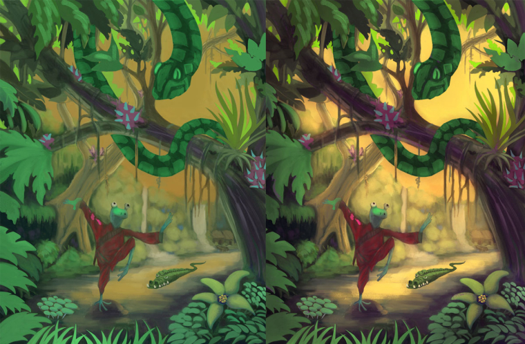
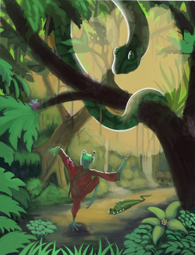
@rcartwright This is a nice start. I like the frogs expression like he's trying to keep his balance in the pose. Adding darker shadows to the top and bottom foreground greenery would definitely make the frog and crocodile pop more. Can't wait till it's finished.

-
Wow, this is such a fun piece!
I do have a couple of thoughts. First, I think that the values could be pushed further to really separate the background from the foreground. Second, I think you can harmonize the colors a bit more, thinking in terms of yellow vs purple. So perhaps warm your greens a tad (bringing the more toward yellow) and go a little further with the purple in the shadow areas, and maybe distribute some of that purple onto some of the foliage throughout the piece. As you render the frog, try to make him pop out more, so he has more contrast than the crocodile. I would also think about making the crocodile a bit smaller so she appears to be farther back, just to create visual interest.
Hope you don't mind that I did some adjustments. I lightened the sky and brushed some of the yellow from the sky onto the background elements. Then I put a yellow filter over the whole thing and brushed more purple into the foreground.


Again, really fun piece. You are really cranking them out. Good job!
-
@mallette Thanks for the feedback
-
@tessw Thanks for the feedback, I actually have a filter over the sky right now to lower the saturation I do that so I can build up my color and darks and play around
-
@rcartwright I think Tess covered everything, but I wanted to say I love how the hands and feet are so expressive. Nice.
-
@laurel-aylesworth Thanks for your comments
-
@rcartwright +1 to what tess already said, but I would also like to add that I think the snake could be more of just a silhouette. It will still be obvious as to what it is (though I would push the head to the right slightly to not cause a tangent with the wood) and that would help give it a more ominous feel. I would suggest that you try out a few lighting and color schemes, before you push into building it up to achieve the effect what you want. I just noticed the village in the scene and that would be a nice source of lighting for the scheme if you wanted to go for more of a night scene with an orange/blue feel.
Could you explain the scene a little more? Is the frog just training and the other animals are sneaking up on him or is he getting ready to fight the snake? If it's the former then I would have him not noticing any of the other creatures and in more of a closed eyes, spiritual expression. If it's the later then he could do with a more intense look on his face and the pose could be more dynamic (as it is, he looked like he may fall over to the right. At the moment i'm not getting whether I should be worried for the frog or cheering him on for an awesome impeding fight.
Not sure what the purple things are, but I kinda like them if you are going for making the forest a scarier place and as @TessW said, pushing a purple color scheme in the shadows may work nice with that if that's the way you want to go, although I would move the purple thing that is right in the middle as it's doesn't seem like it's a major point, but it catches my eye more than it should.
I know it's yet to be finished, so I hope you don't take my comments too harshly, there looks like there is a lot of potential in this piece and I'll look forward to seeing future updates
 Good luck with it
 -
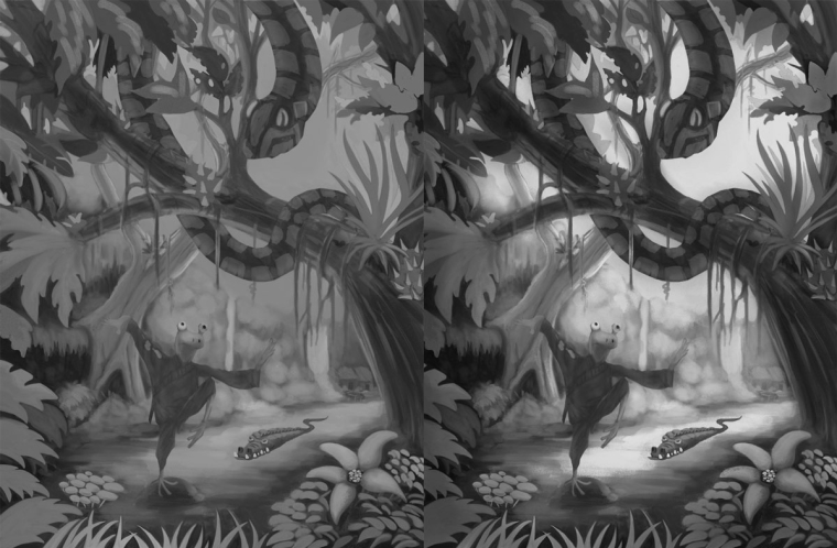
The main issue I am seeing is that the value of the snake, frog, gator and leaves are all pretty much the same. The snaoe os very hard to read. I would also get some highlights in on the snake and frog to draw the eye to those objects. I also agree that the background needs to be beighter. He is an example of what I am talking about. I still the even in the draw over, I should have pushed the values a bit more, but I think it kinda gets the point across.

-
@eric-castleman Yes I haven't done any painting on the frog or snake. I tend to do a much less saturated under painting as a build up. The splotches of red of bright red on the frog are an indication where I will take the brightness but that will come later.Thanks for your feedback
-
@gary-wilkinson Yes when I paint the snake he will be darker I made him green because I want him to be less noticeable to the view at first and the direction of the frog's eyes are the device that helps move you to there, when I up the saturation on the frog's red gee it will become the main focal point (hopefully). As for the pose it is a combination of studies from tree frogs and Tai chi training, tree frogs have an amazing ability to stick to be flexible and stick to objects,
Thanks for your feedback much appreciated