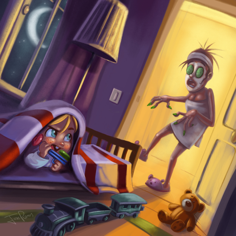
Worst Fear - WIP
-
@tessw Thanks Tess, yes I think I was the first again, It would be great a special prize for being the first submitter. LOL

I took an old illustration of mine to which I painted that creepy silhouette in the window, I had no time and I wanted to show something this month.
-
Wow! Super fast again! Nice work @Jose-Ramos This style is quite different from your last.
-
@bnewman Hey, thanks...Yes, you´re right...I used brushes with texture, and the character is not so cartoonish like the last one.
-
How come can you paint so cool and so fast?:)
-
@Jose-Ramos you might add an extra dimension to the story if instead of having the actual shape of a man with a knife....maybe its something like a spooky tree that just happens to be gnarled and twisted in that shape.
-
@evilrobot Hey, I see what you mean with an extra dimension, is not bad idea...

-
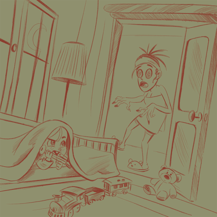
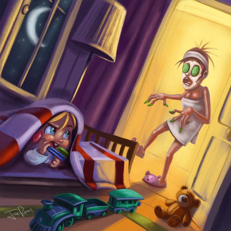
I had free time, and I was drawing this rough sketch, I thought it could be funny.

-
@jose-ramos ha ha! brilliant. Mom needs a mud mask though.

-
Hilarious! I love it.
-
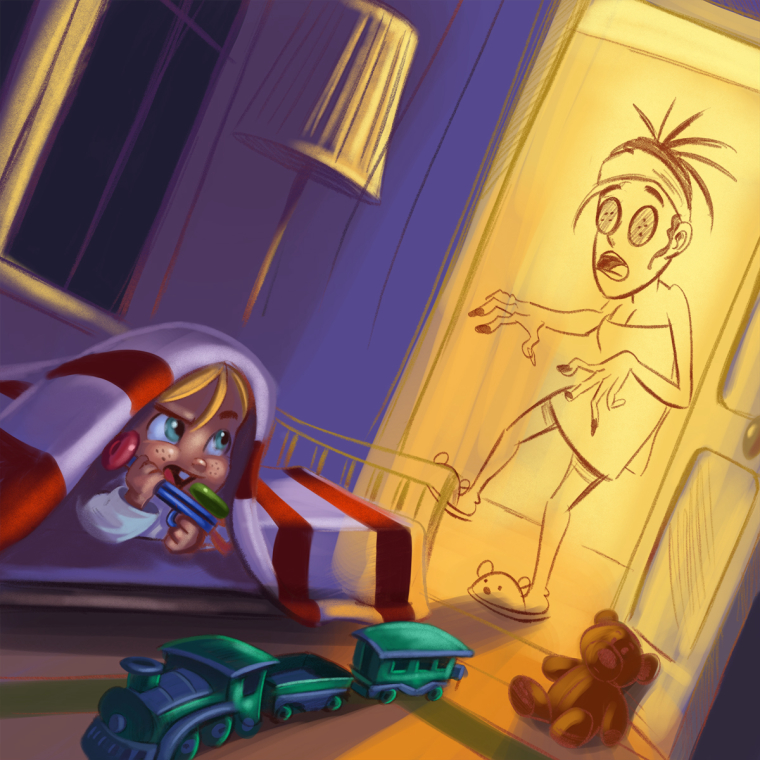
Working on color
-
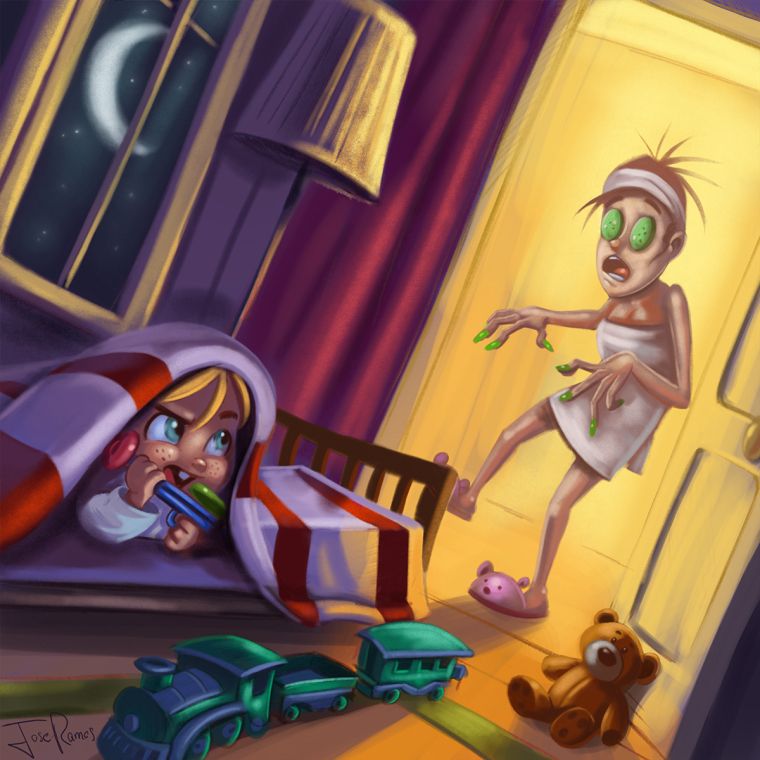
I´m not sure which one is better, but how I uploaded the first one to the main post, I gonna let it like this.

-
Great work on both, but I really like the design and story in the second image. As bnewman said, it would really benefit from adding a mudmask on her face and maybe some fallen mud on the floor or door. Something I noticed pretty fast was that the curtain was red which makes it hard to draw your eye to a specific focal point. I love the concept though

-
@gary-wilkinson Hey , Thanks for the tips Gary!!... I hope the mud mask is more clear now, and I desaturated the curtain too.

-
@jose-ramos Looking good. Changing the color of the curtain seemed to make the make less busy which is good. I noticed that you put more detail on the train. I think less is more in this case as it draws your eye to it a bit much. Have you tried to give it a more wood based color? My focus is battling between the boy, train and mother atm (and also partially the highlight on the window frame), so it might help to try and suppress the color of the train, but make it longer so that it flows from behind the mother towards the boy if you get what I mean.
The top left part of the image is quite unimportant, so I would also try to tone down that area a little bit and maybe darken down the mother a bit as the light on her as i'm not seeing where the light is coming from. If you are in a dark room and are heavily backlit then the side facing away from the light would be quite dark. I think that this would help give this piece a touch more horror by not making it 100% obvious that it's his mother at first. Hope some of that helps (just spitting out thoughts and ideas

-
Great work Jose! Really love this piece, it's funny, and the colors are great!
I like the comment that @Gary-Wilkinson made. One nitpicky thing I would add is that the curtain looks like it goes with the door, and not the window... I would maybe show a bit of wall beside the door and put the curtain overlapping the window. Especially since the wall and window are clearly not supposed to be on the same wall, the fact that the curtain it where it is now makes it look like the room is round... I would also try to indicate the room corner a little. Honestly, maybe you can get rid of the curtain completely!
-
I´ve desaturated the train color and now we can see a little of the wall, I really like the curtain so I think I gonna let it.
Mom now looks mor in the dark...
