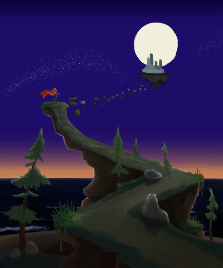
WIP on new piece. Critiques welcome/encouraged
-
Hi all!
I'm working on my next piece right now, I'm still rocking out all the landscaping details and foliage type items. But wanted to share my progress here, critiques always welcome of course.This particular idea was something complete different in sketch. I initially just wanted to do a large staircase with a dancer at the top, but then my imagination took over and just created a large path instead and the dancer was replaced by a mysterious figure in a red cloak instead of a red tutu. And then the broken floating path to a distant city was put in.
My end goal is to continue to darken the bottom of the picture to really help pull the eye up to the red and white (Cloak and Moon) and put emphasis on them both as they are my main elements here. I tend to get carried away when working on surroundings though so this time I am trying to keep it simple while not too empty.

-
I love it! Very nice colors.
I have just some remarks/opinions: compositionwise it would be cool to have something blurry (a plant, bush or tree) in the lower right corner, blocking some view.
I think the floating castle's perspective is a wee bit off, and should show more of its bottom. Also for the tree on the left, the top part is over the horizon line and then you should look underneat it, but since its angling this way that cant happen, but the leaves should be more rounded to the bottom.
Hard to explain, ill see if i can drawover it to explain myself haha.
edit something like this? for the image right under might not bethe right place, maybe just left of the middle, or not at all :).

Just my fifty cents, great piece!
-
@dennis-spaans Makes perfect sense, thank you for the critique! I plan to work on this for the rest of my day so we will see what comes of it soon!
-
@jason-kilthau cool, im curious how it will turn out :).
-
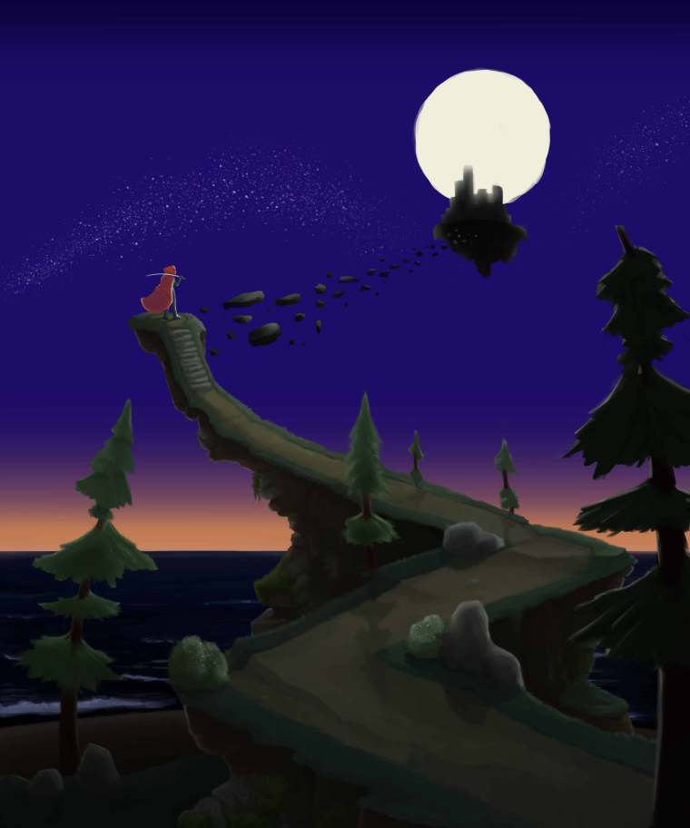
Ok so here is the almost finished progress. I have been spending more time just tidying things up and starting to add in little things here and there. I still plan to work on the sky and refine the moon a bit more as well.

-
A more finalized version of the piece.
