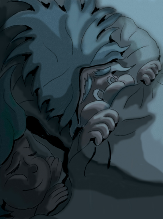
bed scene ;-)
-
Hi,
This is early stage of painting. I just wanted to check with you guys, if you have any comments of what I could improve. Thanks
")
-
@aska, cute idea, I can see the little guy is pretty scared by something!
I'm no expert, but I'm thinking maybe working on the shadows could make the image read better. I wasn't sure where the light source was based on where the shadows hit. Softer transitions might look nice too, between the lights and darks, but maybe you were going for a more "graphic novel" style. If so, then you have it right with distinct darks and lights.
Hope that helps a little!
-
@Kat light source: top left corner (moon light from the window, that is outside the pic). I am not great at shadows, but i will work on it. Its still very rough so i will try to soften transitions once i figure out proper values. Thanks for comments
-
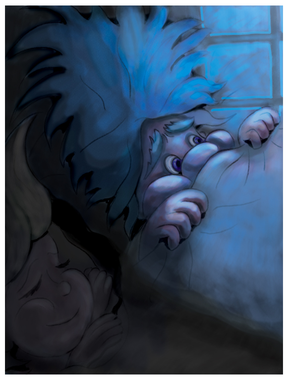
What a lovely idea. I agree about the shadows. Maybe there should be more contrast between the light source and the shadows. Love how sweet the lady looks and she is fast-asleep.
-
Here's a crazy idea-I wonder if you could set up the scene in your home, with a stuffed animal tucked under the covers in bed and a strong light shining on the scene in the direction you want for your image. You could study how the light and shadows fall on the objects and maybe get an idea of how to light your image more realistically.
Just a thought.
-
thanks guys. I might try stuffed animals. I could also use my kids ha ha
")
-
-
hi, thats is the result. I am not sure about it, but its more difficult than i expected so i just have to move on, otherwise I will stay on this pic for days and loose my mind!
-
Definite improvement in the lighting!
-
@DOTTYP Hi, it's looking much better - but what I would do first, is look at reference. Here is a link to moonlight coming through a window. It will give you ideas of colour palettes and composition etc. https://www.google.co.uk/search?q=light+through+a+window+onto+hair&rlz=1C1CHNY_enGB616GB616&source=lnms&tbm=isch&sa=X&ved=0ahUKEwjsv4WayPvTAhVgFMAKHSueC80Q_AUICigB&biw=1920&bih=950#tbm=isch&q=moonlight+through+a+window - I hope this helps. Looking great.
-
@Peter-Jarvis Thank you
I was trying to google some reference, but my finds were not as good as yours. I will keep them for next image. -
@aska It's my pleasure. I hope they help. Lighting and mood are so important but can the most difficult to achieve. It's the continual learning curve. Good luck.