Feedback on painting style
-
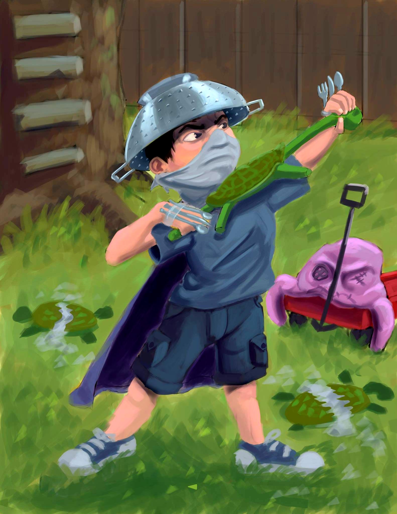
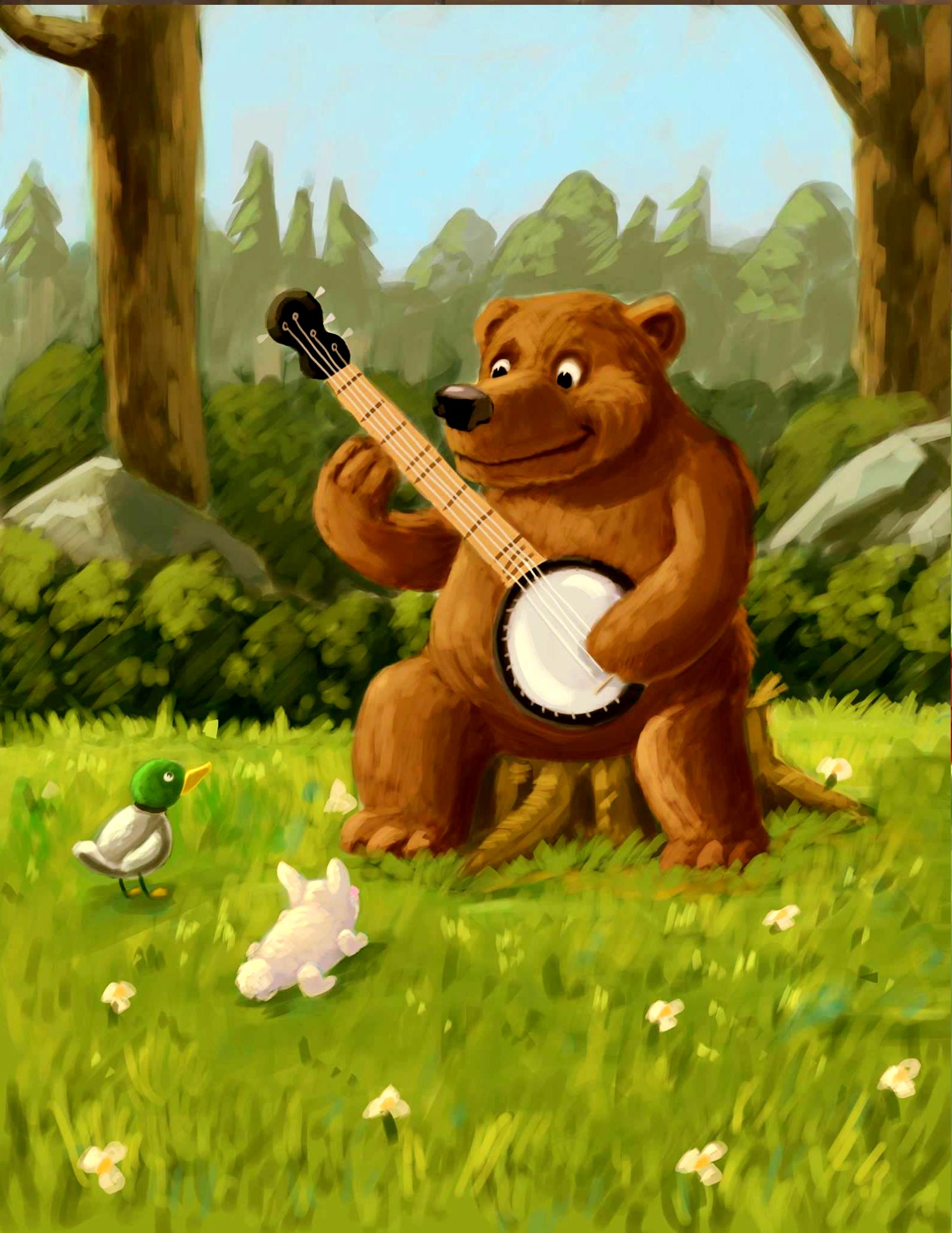
Hi! I've been digitally painting for a while now and since I've started watching videos on SVS over a year ago I feel that my painting skills have gotten stronger. However when I finish a painting it seems to have a pastel/chalk feel to it. They never seem to feel right to me when they are done. I'm not sure how to approach a painting differently so that I don't get the same effect. If anybody has any suggestions or feed back I would be very appreciative. Thanks!


-
hi Brody, Nice work! Of course you are improving with every new piece you make. but when you miss the technique Its hard isn't it? I am trying to find my way through this too. Working with colors and values is hard. Start out by coloring your piece working in greyscale. choose a view values, no more than five. The most interesting parts are where you find the darkest and the lightest parts. Keep that in mind. Use light upon dark, and dark upon light. I have learned from Tyler Carter that when you paint desaturated colors, your shadows should be saturated.Good tips you also can find in the SVS color and light class. Make (small/quick) studies from paintings that you find appealing. Now the best tip I can give you is Practice, Practice, Practice. Hope this helps! Good Luck!
-
Normally paintings look chalky because of insufficient contrast. The difference between your lightest light and your darkest dark is not strong enough. I have run a level adjustment on your paintings, and I think it already takes some of the chalkyness away:
A good way to approach painting at the beginning is to work with black and white first (as it used to be done with oil and pastel painting - that is how I learnt it at least!) and then add color in a second phase. There are several ways to approach this process, and many tutorials online (I even have a YouTube video that shows that!
Another factor you may want to consider is your brushes - if you like the rough look that you have here, maybe you should try to work with textured brushes, so that the strokes look less "digital" and you get a more organic feel in your textures. -
Wow! Thank you both for the feedback! Values are definitely something I've struggled with all along. I need to invest more time into value studies and working in black and white.
-
If you are painting these in Photoshop, you can create your own textures (or find some online), then upload them into Photoshop and add them to your brushes.
-
I think that the pastel effect is nice for some parts of the backgrounds, the ones that are far away or don't require to be a focal point. so don't ditch that style altogether yet!
")
personnally I wouldn't push the contrasts too much, especially for the background, you actually lose the charming chalky effect too much
for the rest of the painting, I would say the main problem is your edges and refining what you have on the canvas. your edges are all soft, in the whole image. you should try and make them harder (but not too hard, it wouldn't suit your style) on the areas closer to the viewer and that you want to be a focal point.
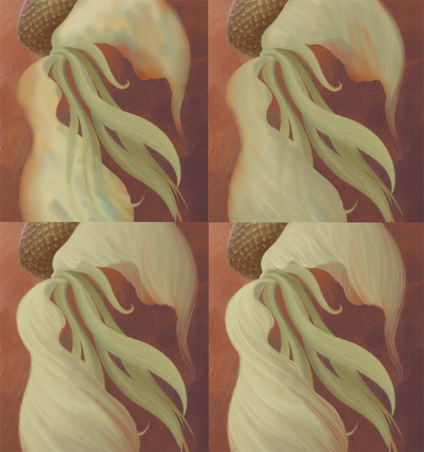
Refine those lines and colours, give them more definition, maybe more colours to build onto as well, through a richer underpainting. watching Will Terry paint helped me a lot to understand all thatjust a quick example with what I'm working on at the moment (even though it's a different style but it helps illustrating what I'm talking about). it's a mermaid under water so I wanted soft edges. As you can see, in stage 2, you could almost think "nearly done, just a few more lines", but I defined the colours more on stage 3 first and then even more with the lines on stage 4. maybe you could push it even more, but I'm not at that level yet. still learning, like you ^_^
anyway, all that to say, I think your style is good, but not pushed enough at present. I'm sure it will come in time. your edges definitely need more attention anyway
-
like @Rebecca-Hirsch says, textures help me a lot to
-
I went back to the original took it to grey scale and painted over it to figure out my values. Then went back and used the new grey scale as reference for values. I think this helped eliminate some of the chalkiness I was worried about. I like how the new version turned out. Thanks again for all the feedback!

-
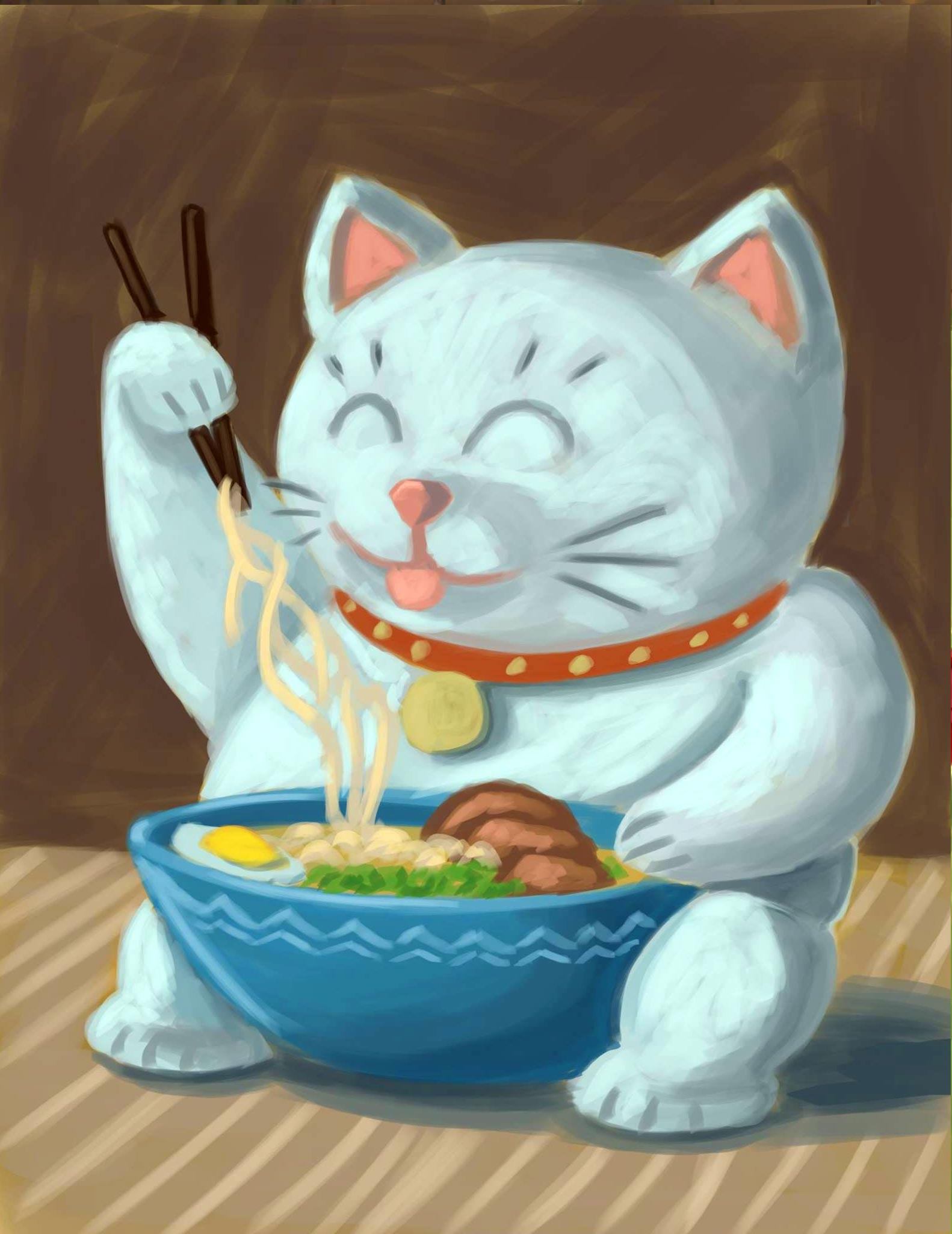
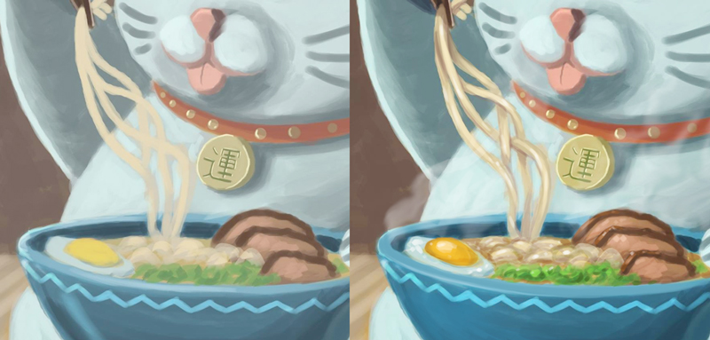
@Brody-Willard Hi there, and thanks for sharing your work with us! I thought I might offer some feedback on the "chalky" look you've mentioned. I think there are a few contributing factors to this, and I'll list them below using the cat with the ramen piece as an example:
-
Color saturation - Especially on this one, all of your colors are desaturated which will lend the image to an ashy or washed out look. When I pulled this image into Photoshop and color picked, nothing went over the halfway line in terms of saturation.
-
Values - Others have mentioned this, but values can be tricky but they are essential to creating an image that moves the viewer's eye where you want it to go and adds contrast and depth to an illustration. Know where to use your extremes, the darkest dark and lightest light, strategically.
-
Texture - Again others mentioned this, but if everything looks like it was done with a large standard Photoshop round brush, it's going to look somewhat generic and unfinished. Experiment with some brushes, download some if you don't want to make your own.
-
Detail - Although there is definitely a wide range of levels of detail from one illustration style to the next, adding little details always helps with polish, assuming there is a good base drawing in place, otherwise it's just building on top of a poor foundation. I like to think of an illustration like building a house, start with the big things and then move in to the smaller. Have a good base drawing, figure out values, block in color, add drop large areas of contrast and light, then move to smaller texture, highlights, etc.
Below I did a quick paintover, or rather just took what you had and used it as a base color block in then took it a little further. You could definitely keep refining this if you wanted, but I just wanted to show what a difference a few techniques could make. Here's a summary:
-Brought levels down a little so that I could add highlights. Will has said it before, if you start really light there's nowhere to go when you want to add more light. I usually start with my base color block in a little dark so that I can both go darker or lighter.
-Drop shadows like on the noodles, help to define shapes so they don't glob together.
-Material and texture. Another thing that makes the original look "chalky" is that all of the different elements seem to have the same specularity, or shinyness, to them. Ramen is wet, eggs are shiny, the bowl is hard and defining the rim makes it look more so. Think about how the different surfaces in the scene will respond to the light. Also the ramen is hot and would steam. Little touches can go a long way to make something feel more finished.Looong response, but hope it helps!
-