A quick painting...
-
Hi everyone…just wanted to share a couple of things. Recently I was looking through my old artwork and found a bunch of vintage cars including this one…did it back when I first discovered dip pen and ink….
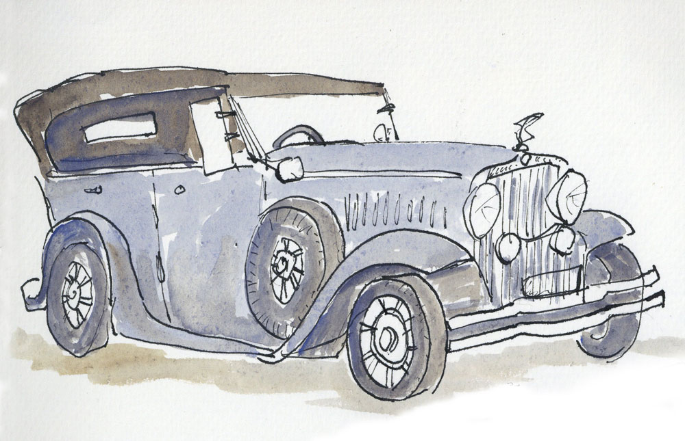
It made me realise that I don’t do little sketches like this any more, but perhaps I should….I tend to gravitate towards doing big projects with a purpose, like 3rd Thurs and the various things I do for work…but I never do a lot of quick n dirty art…maybe it’s secretly a bit intimidating, the idea of being totally spontaneous! ..whereas it's easier to plan and avoid failure that way.
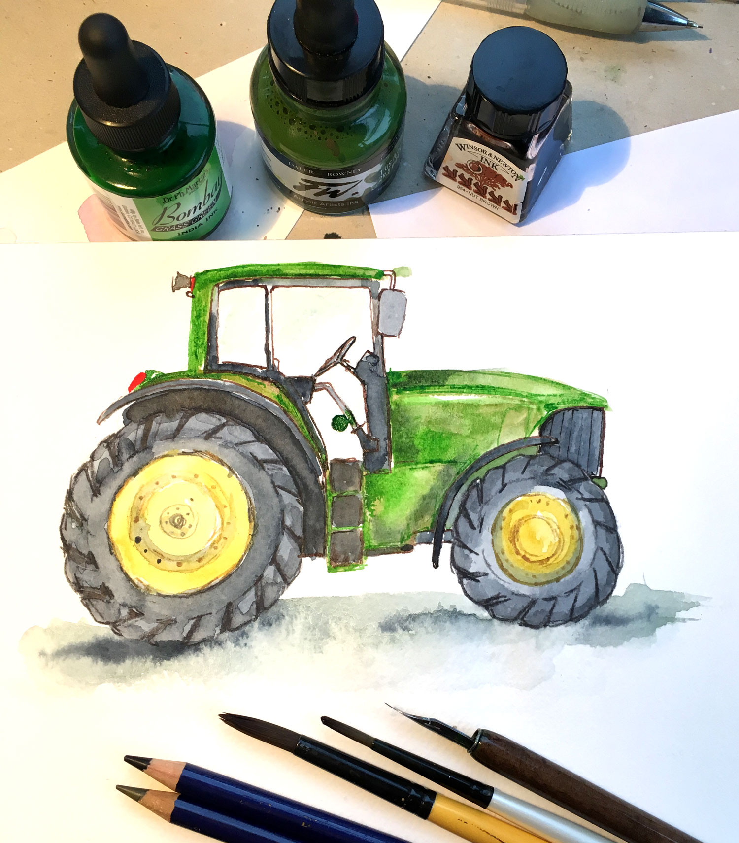
But also I need to crank out finished personal work more often than just my 3rd Thurs creations, both to experiment with technique and get quicker. So I thought I’d try something new with my evening yesterday…I told myself I’d do a v quick sketch and then give myself just 30 mins to ink and paint it. It ended up being 45 mins but anyway, it was actually fun doing something free and spontaneous. I really want to be able to loosen up more and not tighten up in my final work…so even if it’s not the world’s best picture, I felt like I made a little bit of progress..
-
I love it! I think it's a good idea.
I like the look of imperfect free art
-
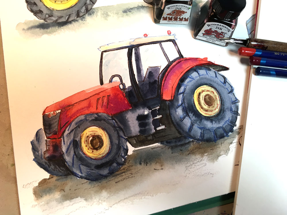
Thanks @Marsha-Kay-Ottum-Owen! I did another one tonight:
It's partly also because I got a new book recently - ostensibly for my son at bedtime, but really it's for me to drool over the pictures...and I want to figure out how the illustrator Sara Ogilvie creates her look...let me find it, here:
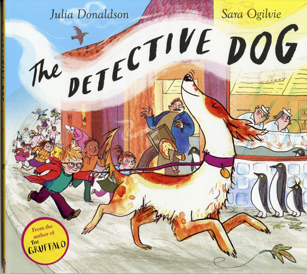
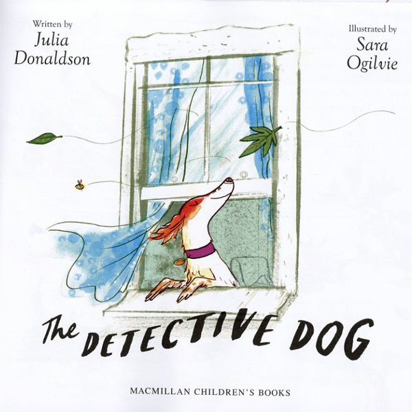
She does a lot of what looks like pencil, some watercolour, some digital, all sorts I think...it's all really loose and sketchy but really well put together. I get the impression that she must do a LOT of sketching, to create something that looks loose but still structured.
I haven't quite done that sort of style yet but I want to work it all out. So much to learn...
-
The top drawing looks much better to me than the other two. It's less overworked. The gaps in the wash where the paper shows through gives the drawing more vitality. It reminds me a bit of Quentin Blake or Ronald Searle's work!
-
@zoe Thank you! I appreciate the compliment (I love Quentin Blake in particular!) and I agree that the recent ones don't have the same looseness. Argh - it's like I try too hard! Isn't it funny, that..that you can do better by trying less. Except you have to have sky-high motivation to get anywhere. This is why art is so maddening, yet addictive.
-
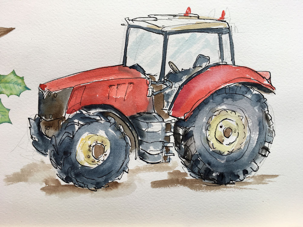
Okay, so I did one more very quick tractor before bedtime, trying exactly same technique as the original car...
-
I love all of them! Also the more painted one. Yes, the more loose look a lot like Quentin Blake, though he would be looser with the drawing too, I think.
Hope you are aware that inks are not color-proof! Contrary to watercolour, they will fade and discolour with time, especially if exposed to light. -
@smceccarelli Thank you! Glad you like them

Thanks also for mentioning about the lightfastness of inks - it would be awful to have originals fade! I did know that, although I didn’t know when I got my first ink set (the Winsor and Newton ones which as you say are not lightfast). So I did a bit more research, and found other sets which claim to be lightfast - Daler Rowney acrylic inks (which I got because Catherine Rayner uses them and I wanted to try to learn her methods…), and Dr Ph Martens coloured india inks….so I have a lot of little bottles begging to be used occasionally!
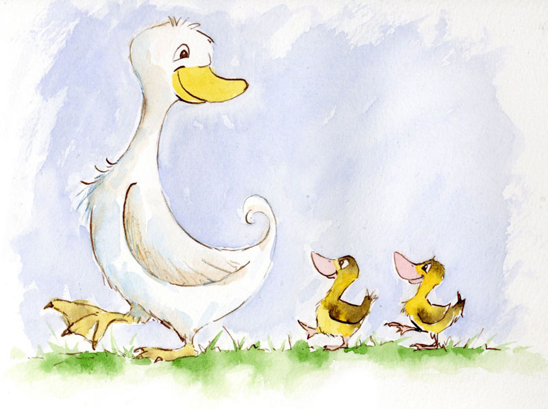
Here is tonight’s quick sketch - kept with the farmyard theme:
-
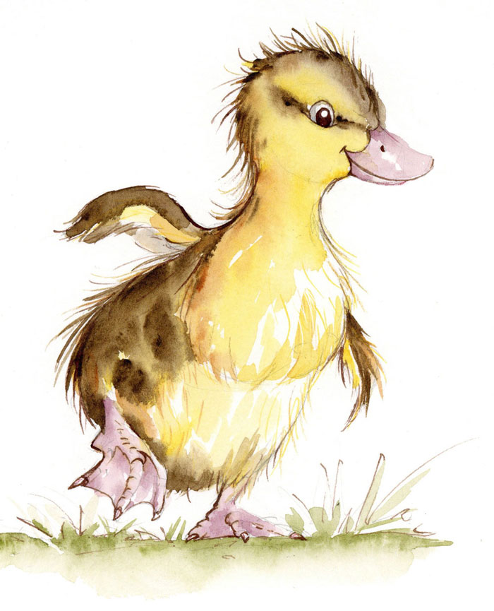
Did another duckling tonight..wanted to try to do a bit better than before...did it bigger scale which maybe helped.
-
@Dulcie I used to make a lot of flyers when I was young I'd work and work trying to make them prefect until I wore myself out and then I would reach this magic moment where a really loose result came out and I would use it. It's like you have to work to get there..warm ups?
-
I love the duck. You are so talented!
-
This post is deleted! -
@Damien-Rambacher @Marsha-Kay-Ottum-Owen Thank you! Yes I think it is definitely a case of keeping going, and trying again and again until you hit the result you want..