Asking Community Respectfully
-
@Pamela-Fraley I'm definitely going to February's SCWBI conference!
-
@KathrynAdebayo thanks, it's difficult to find the niche. I'm preparing for local art fairs in the fall too see what the common ppl think of my work.
-
@Mariana-B I've made a deck of cards before. It's under mocha myths and magic on my site. I want to master them and print them on nice card stock but it's too expensive for me right now. The prototype I printed came iut nice, you just can't do card tricks and fan them.
-
@AustinShurtliff I've been poking here and there, it's hard to find the right audience. I feel like I need that little push of momentum. But nothing really yet. I am preparing for some conventions and art fairs this and next year though! Social media isn't working for me.
-
Woah! Thanks chatgpt? I guess?
-
@Zachary-Schrage I know it can be overwhelming! Start small, but consistent. Send emails to 10 companies per month. The next month, send a new piece of art to the same 10 companies and add 10 more. The next month, send a new piece of art to the previous 20 companies and add 10 more. Often it's not even about how many companies you contact, but how many times you contact the same company.
One thing's for sure: it's NOT your art that's the problem. Stop looking for the problem in the wrong place (and losing your confidence as an artist because of it). Art doesn't sell itself no matter how pretty. You're going to have to put in some work to have a real business, Zachary.
-
@NessIllustration I'm never going to give up! I love drawing way too much
-
@Zachary-Schrage Wow, you’ve already got a lot of feedback, but thought I’d throw in my two cents:
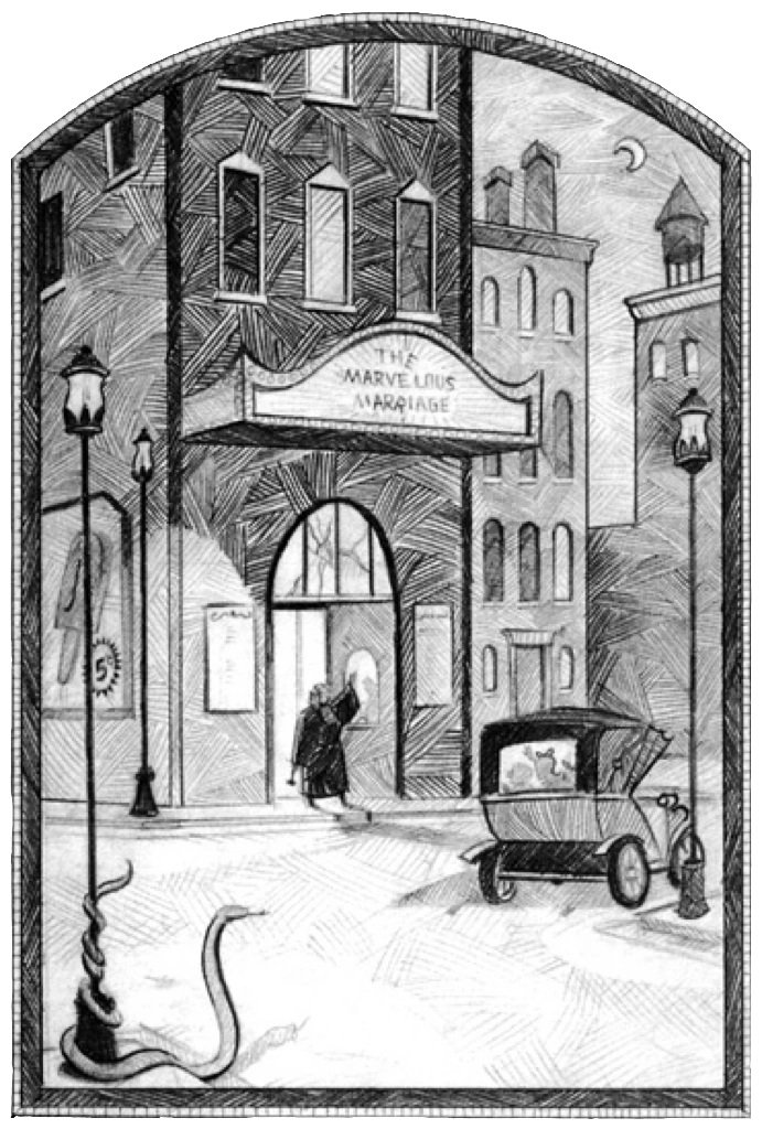
Your technical ability in this black and white style is absolutely incredible! I love the scratchboard aesthetic and your control of atmospherics, value and texture. You’ve got some award-winning stuff going for you.
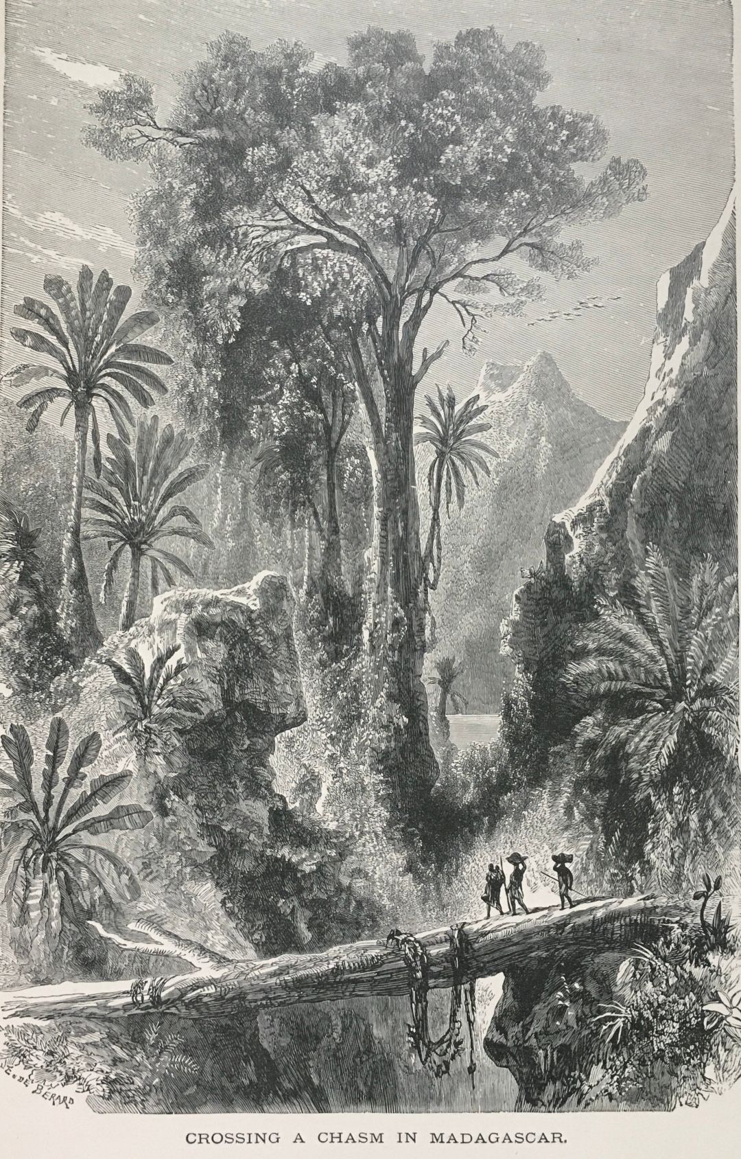
For my feedback I’d say this: Your style feels like a combination of Ray Cruz (see “Alexander and the Terrible, Horrible, No Good Very Bad Day”) and Chris Van Alsberg (see “The Mysteries of Harris Burdick) with a sprinkle of Anime. You could take this as another compliment (I especially love Chris Van Alsberg), but one thing to note is that, at least right now, I think both of these styles feel kind of dated (both books came out decades ago in the 70s and 80s). Actually, after a little more thought, the style that it REALLY reminds me of dates back to the 1800s (you probably know this already, but I just wanted to point it out):

Keeping absolutely everything in your portfolio black and white probably adds to that feeling. How and whether to try and make your style feel slightly more contemporary is a difficult question to answer, but one that you might want to think on (anyone else in the group here agree or disagree with me?).Having said this, I think of Jed Henry, who leaned into making fan art pieces that look similar to old Japanese prints, but they feel contemporary because of subject matter and color application. Maybe you could figure out your own version of doing something like that.
At the very least, I’d work on creating a few more pieces with color to round out your portfolio. I think you definitely can do this: You demonstrated great use of color in your windowsill sketching piece. I’d replace the two anime fan art pieces—They’re pretty good, but not at the level of everything else, and I would just take out the colored 4-wheeler piece, which looks quite a bit more amateur compared to your other work.
I hope this helps in some way! You’re doing amazing stuff!!
-
@Zachary-Schrage I take back some of what I said after looking at some other pages on your website. You totally have some color work, and it looks like you’re rocking it at starting projects. Maybe you just have to take some of your color work to your main portfolio page, and like some other people have talked about, figure out a marketing strategy!
-
@Sarah-VanDam @Zachary-Schrage Actually I think your black and white style would be fabulous for the middle grade publishing market. Middle grade books like early readers often have illustrations, but only black and white because most of the book is text and inserting random color images is expensive. Your work often features children or tween aged characters and some storytelling, often fantasy elements. You would fit wonderfully well!
Think like... A series of Unfortunate Events by Lemony Snickett


-
@Sarah-VanDam yea I do have some color pieces, I'm hoping to get more so I can split my portfolio with color and bnw. Color just doesn't look right on my ink hatching. All my color pieces have limited linework.
-
@Zachary-Schrage So far, no one you’ve spoken to knows where it fits in the current market.. Black and white art, hatch mark artworks are both niche interests. You’ll need to provide more proof of concept on marketability.
Can you identify the strengths of your choice in style? Hatching usually invokes the idea of something being antiquarian, or gritty like with the Spiderwick Chronicles, Batman Black & White series, and some manga. You can continue to produce works of these expectations, or experiment to find a new way the audience can enjoy pen drawings.
Maybe use colored ink instead of black? Make a short comic of Harley Quinn beating someone up in rainbow color hatch marks? You get the idea.
You seem to like fantasy, and not adverse to fan art. Have you considered producing portraits and/or scenes from the current trending properties: House of the Dragon, Elden Ring, Monster Hunter, Baldur’s Gate 3, Rings of Power, War of the Rohirrim, etc… I’m imagining it would be like when Aubrey Beardsley created a series on Arthurian legends, or a lithograph by Albrecht Dürer.
And if you're really good at portraiture... It's the American presidential election season... Portraits on bills...
There’s a small chance for your work to resonate with the fandom, maybe even earn a write up by a nerd culture website. But the primary goal would be to develop and showcase skills in portraiture, sequential art, and marketability.But maybe you’re more interested in producing works like that of David Macaulay (The Way Things Work, Pyramid, Cathedral). You’re quite good at architecture, and there are architecture firms that are looking for ways to market their building projects. You can do a series on the newest skyscrapers. Maybe someone who is a fan of Macaulay’s books, and has a lot of marketing $, will see what you’re doing and connect the dots.
Also consider how a lot of new skyscrapers generate revenue by including observation decks for tourists, or a ‘museum’ to something, and have their own gift shops. They need products to sell. And I’ve been to them. They sell junk. But their merchandise doesn’t have to be junk. Get what I’m trying to say?Or maybe you’re a disciple of Chris Van Allsburg (Jumanji, The Polar Express). Your portfolio shows a strong interest in children’s tales. Perhaps you can produce a book dummy for either an original story, or something pre-existing can benefit from your drawing style. Right now, without samples of sequential art, you rely on people to take a chance on you. Business people want to make a good bet. Let them know you're a great investment by showing you can produce a book dummy in certain timeframe.
I hope one of these 4 paths I’ve presented is a realistic roadmap for you. Do your best.
-
Absolutely don't listen to me at all, because I haven't been successful at getting representation or any kind of big jobs, but I generally agree with two main arguments already made here:
- Try putting together a series of illustrations that show a story or sequence of events. While I do think your work it fantastic, I also think you should have more illustrations than what you show on the front page of your website. I already recognize about half of those as illustrations that you have sent in as your monthly prompt. I would do a lot more work, then do some website editing to decide which illustrations are the best of the best.
- Your illustrations are old fashioned. That's not a bad thing at all, but the people in the world of kidlit and children's book illustrations all chase after trends. Just go into a Barnes and Noble and look around at these books. If you ignore the books that are classics and just pay attention to the contemporary books, you'll notice a lot of homogeneity among the illustration styles that are trendy. I would personally pick you to illustrate books for me, but I'm partial to old fashioned stuff, and my job is also not reliant on selling as many books as possible, so what do I know?
-
@Zachary-Schrage hi Zachary. I'm gonna keep this short. I think your style could work for middle grade. and I think you need to do sequential illustrations. that's all. all the best
-
@Nyrryl-Cadiz haha thanks! I like short and simple
-
@Zachary-Schrage always


-
I really, really love your work. Like others have said, it reminds me of Chris van Allsburg’s work, but not in a 1:1 way…it’s also got some oldschool Rembrandt etching vibes. It’s super cool. Have you looked into the Folio Illustration award, and the Folio Society? I don’t know much about the industry, but my sense is your work would fit in well there and they’ve got enough eyes on what they’re producing that you could get some visibility. Have you had any luck with agents? I imagine it would be super helpful to find someone to champion your work and help you find the right niche. Like others have said, I think it’s a matter of right eyeballs (something I’m telling myself at the moment, too!)
-
@NessIllustration @Zachary-Schrage I absolutely agree with you that the black and white illustrations lean towards the style of young adult novel illustration. I could see Zachary going that direction. But I’d say that even Brett Helquist’s work is looser and a little more gestural and shapey, which, even though he also works in hatching, gives his style a little more of a contemporary look.
-
@Sarah-VanDam Thanks everyone for the sweet replies! Alot of comments are pointing towards middle grade audience. I had a professional childrens book writer tell me not long ago to go the same direction since they are usually black and white anyway. I could see it working. I am preparing for SCWBI conference in February. Also selling at some tables at local art festivals. I am going to apply for MOCCA arts fest too. Since I graduated last spring, I can be more proactive now!
-
@Zachary-Schrage upon exploring your website I discovered your process video for a wolf illustration. Very well done and an excellent result.