"Flight" WIP (Nov HTFYA) - Alex Wilkins
-
@Larue I was having some similar thoughts too, thank you!
I think remember the bigger picture of the "shock" like you're saying is important.
And to your note about prep work, I'm probably over doing it, but I want to produce some really quality work!
-
I was going to say the same, Wendy is looking a lot like a boy, which would be fine if you had a whole book to tell her story with...
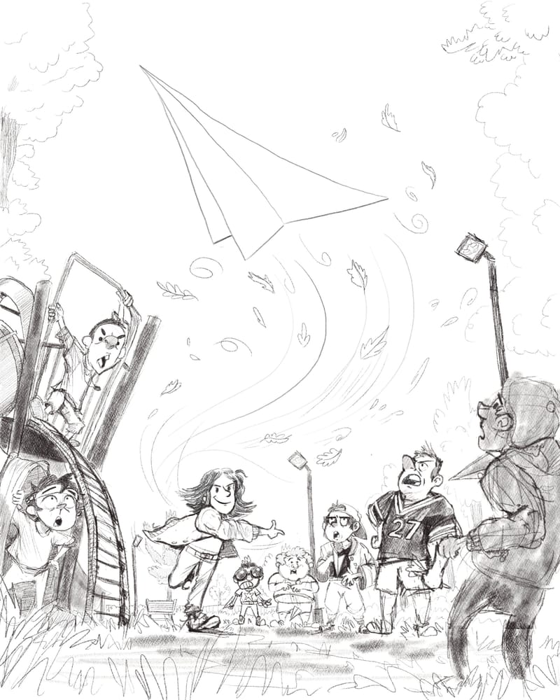
One more tiny thing: the chubby boy dropping his plane: I think the plane should be pointing downwards more so we don't think it's flying, and if it's closer to the ground it might read more clearly as a separate object rather than a picture on his pants.
It's coming along fantastically! -
Alright. I believe the pencil work and composition line art is done. I honestly have no clue what I'm gonna do next, but I feel confident with this composition.
I worked the last three days on the boy characters and took y'alls advice about Wendy's persona.
Let me know if you see any problems with this piece or any helpful critiques. Definitely trying to make this the best possible for the Critique.
-
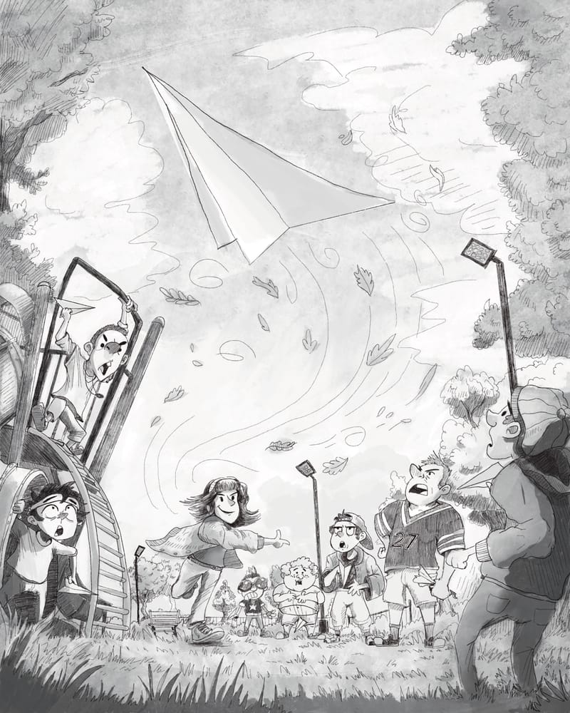
@alexw what would you think of adding a couple crashed paper planes below the main character (upfront) following the flight line so our sight goes from plane to her to the planes in the ground and then itll be easier to find the paperpplanes on the other kids hands?
I had this idea because I had to look for the planes so I thought it might be helpful feedback.It is an amazing research work, thank you for sharing
Stroogle.xyz (webcomic)
-
@makekong That's a great idea! I have to go back today and clean up the line work, so I will definitely put your thoughts into the piece.
It goes to show that even though this is a solo piece, it takes a team to build something cool!
")
-
@alexw your work inspires creativity so I thank you for it!
-
Hi Alex,
I like how you took the suggestion to give the piece more of a story - I like what you came up with.
I also second the crashed planes idea that someone shared.One suggestion I'd offer for your consideration is based on the assumption that your characters are intended to be children. Some of the figures seem to have pretty adult-like faces. You could give the feeling that your characters are young by softening some of their features and bringing their eyes lower on their faces. Lassoing the eyes and nose and pulling them down tends to have a wonderful de-aging effect.
I hope this is helpful. Best wishes for your piece!
-
@KathrynAdebayo This is very helpful! I had a couple of individuals in my life mention the same thing. I need to practice drawing child-ish faces more for sure. This illustration has definitely revealed a lot of lacking skills. But your guys' feedback has been super helpful.
-
I'll be attempting to do color paint overs on this piece starting today.
I'll be honest. I have no clue what I'm doing, but this experience truly has challenged me and revealed a lot of weaknesses. And the evidence of that is I'm finding a lot dissatisfaction in the process and the product of the work involved. Meaning, when I'm sitting, putting headphones on a re-drawing lines, painting over areas twice or three times because it doesn't look right, that's when you can very easily just want to give up, move onto something else, or just think it's an automatic failure.
Ya, maybe this piece isn't chosen for the critique, but at least all of the work involved taught me things:
- Learning to deconstruct objects in the world into simple shapes, enables you to place them in proper perspective.
- Stylizing a human character still requires anatomy.
- Try to draw something from memory, if you can't really do it well or if it doesn't look right, then look at references, draw something in a cheaper sketch book to get a feel of the object you're trying to draw.
- Thumbnails and a lot of planning and messy drawing construction is very important at the start when planning a composition to look good.
- I think gauging a completed "area" of a paint over or a drawing section, is considered "good enough" if you stop having that "this urks me" feeling. For instance, the park on the left for me is "good enough" because it generally looks like a park. It might not look appealing but it conveys the message.
- Getting feedback is helpful because different perspectives can spark a new and improved idea.
- Showing your work while you're in the middle of making the drawing is helpful because you can see if its readable or accomplishing your goal. Wendy for too long wasn't a girly girl, so now she has bangs and a head band. Whether this improved it significantly, IDK but I should probably keep going.
One extra note:
Trying to paint over my grayscale with a Multiply/Soft Light layer and the color wasn't coming out and I realized I needed more grays in the sky. So I took a gander on the internet and found a sky I liked and realized that Sky, grayscaled, is pretty "dark" in a way. Another thing to brush up on, when drawing black and white gray scales.
Colors REALLY make things "pop" so to speak. My perception of sky feels like, the blue in the sky is bright so a lighter gray? But I guess with paint overs, you'd do a 50% or a 40% gray instead. This can get pretty technical.
-
@alexw love the concept, the angle, the characters and the whole composition! Really cool. Only thing I notice is that you could definitely push the gesture of the character throwing a lot more. Could get a lot more dynamic than it currently is.
-
@Tom-Harshberger I agree with you. I believe I've drawn and re-drawn her pose 6 times. I've already entered into the coloring phase however, any recommendations on how I could still fix it? I might liquify that area of the piece to push that gesture more.
-
I love that you're taking note of what you've learned through the process. I keep telling myself to do that, but instead I end up having to learn from the same mistakes over and over...
I'm really looking forward to seeing this in colour! -
@Robyn-Hepburn Well. Here you go!
All finished
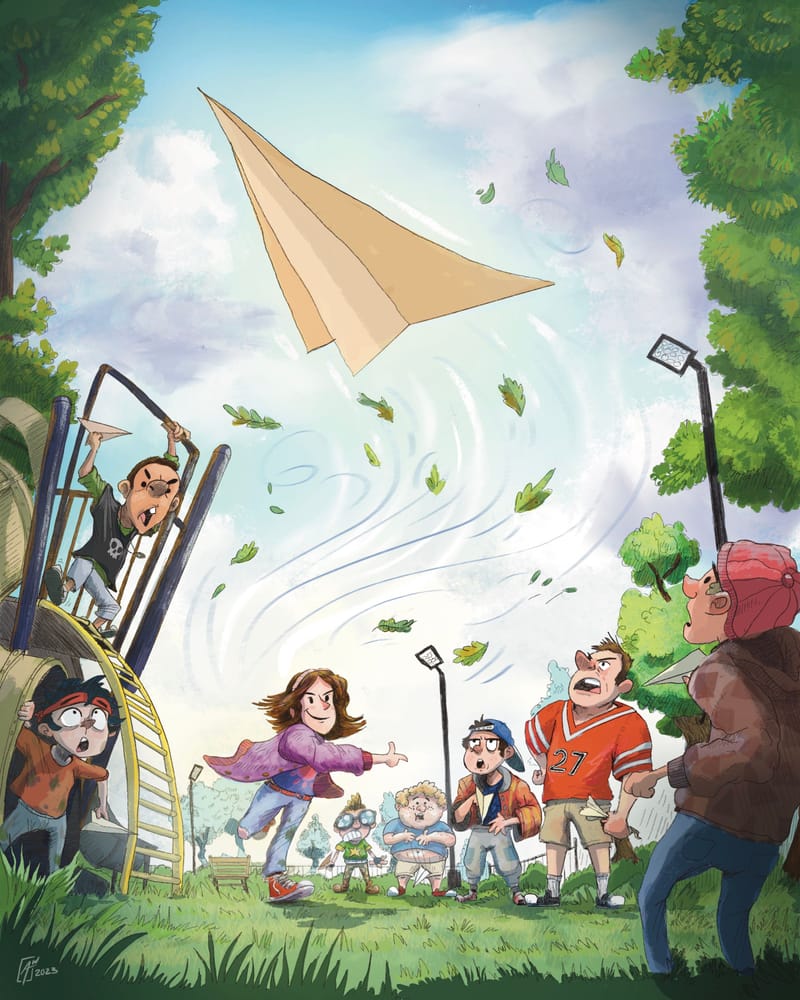
I could say a lot of stuff about this piece, but I will say, if it wasn't for your guy's feedback, I wouldn't have been able to arrive at this point!
-
@alexw Came out great!
-
@alexw Hooray! 🥳 Everything about it makes me happy.
-
@Robyn-Hepburn it is nice! I like the pencil version best though. I saw it and imagined it was a b&w interior illustration for a chapter book. Im a sucker for pencil marks.
Blog: mamatheartist.blogspot.com
Coloring page newsletter: https://bit.ly/Color-in -
@R-Fey-Realme I agree with you. I'm not super experienced with color, and I see more black and white in my mind's eye, so I felt like the BW version was more successful. And I'm drawn to that style too.
-
@alexw you should put the black & white version in the submission post. Something Lee said at the end of the last HTFYA video makes me think they are going to talk about rendering in November. No matter if you want pointers on your color rendering or on your black and white rendering style i think it would benefit the lesson they put together to see your piece in both color and black and white. And include your prompt sentence in the sub! I loved that context.
Overall im a huge fan—great story, dynamic composition, interesting and expressive readable characters. I think if they got to see both render trys they could have a really insightful conversation about rendering (which I really hope they do, because they have already hit story and composition like 5 times)
cheersBlog: mamatheartist.blogspot.com
Coloring page newsletter: https://bit.ly/Color-in -
@alexw Really solid piece, well done! Good to see the critiquing process result in a better outcome for you, I need to take a leaf out of your book.
-
@R-Fey-Realme I'll take your advice and do that right now!
@Jason-Crowley thank you! I hope that my application of your guy's help inspires you!