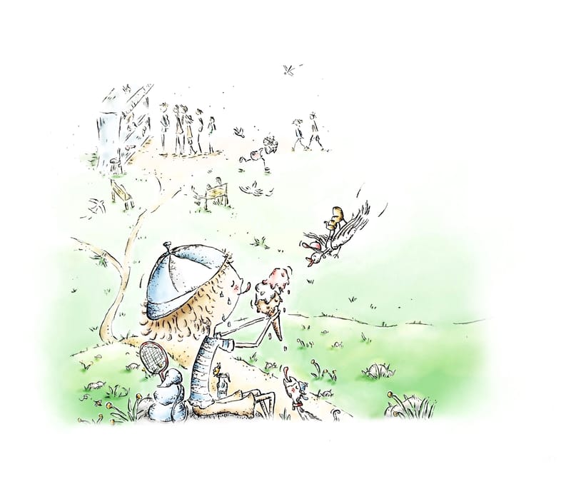
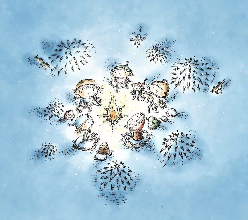
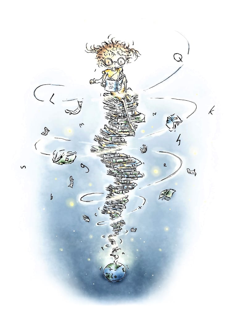
I would really appreciate feedback on my illustrations, I´m trying hard to get them to the professional level but don´t know exactly how to improve right now....
-
Here are just couple of my illustration examples. I really try to draw like telling a story with one image and to create emotions also with them. I´m aiming to the professional level so any feedback would be so appreciated!


-
Your illustrations already feel interesting and like they’re telling a story so really well done. I also really like the uniqueness of the style and color palette.
If there is anything in which I could see room for improvement, it would probably be the silhouettes. Right now, you have this great delicate line art style, which I wouldn’t change! But, because the lines are very broken up and the colors are very close in value, I think the different objects are blending into each other a bit.
I think there are two approaches here:
- You could try making your values contrast a bit more. I would hate to see you sacrifice your delicate style and make it super high contrast, but just adding a bit of darker value where objects overlap can make things stand out much better.
- Or, you could try making your line work a bit more bold. You don’t have to make it super bold or anything (you probably don’t want it to have a comic-book look) but you could just try to make the contour of each object stand out a bit more.
In the second image, I think there is also a slight issue of the bushes looking very similar to the characters in shape and emphasis - maybe make the lines for these a bit thinner?
That being said, I think it’s already looking very appealing and unique, so these would be small tweaks.
**I did edit this as I felt my first explanation wasn’t really getting across what I meant. Sort of just tweaked some of my word choices.
-
@skeletortoise Thank you so much for your feedback! I agree that the distinctiveness could still be improved. Because I also like the style of my line, I wouldn't change it, but otherwise, based on your feedback, I'm going to pay attention to the silhouettes! So thank you again I really appreciate your time and effort for commenting!
-
@Enni-Heikura hi! You're definitely almost there. I love your style. It's giving cute, sweet, and nostalgic. My one advice would be to improve your hands a bit. I don't mean make them realistic but just to add more details like fingers. One way to gage an artist's skills is definitely through the hands. I hope this was helpful. All the best.
-
@Nyrryl-Cadiz Hi and thank you for your advice! I totally agree that my hands are not the best one, so they could be definitely improved! All the best for you too!