My Glowing WIP (wow, that sounds vein, but GLOW is the topic, so cut me some slack, please)
-
@ArtMelC Like the two-second soccer ball, that was a two-second tree line to show the dark backdrop (since I’m not using library for it). I think we’re having the same thought – or at least close to it for bringing the ghost out more. Though, I’ll confirm it. Thanks!
-
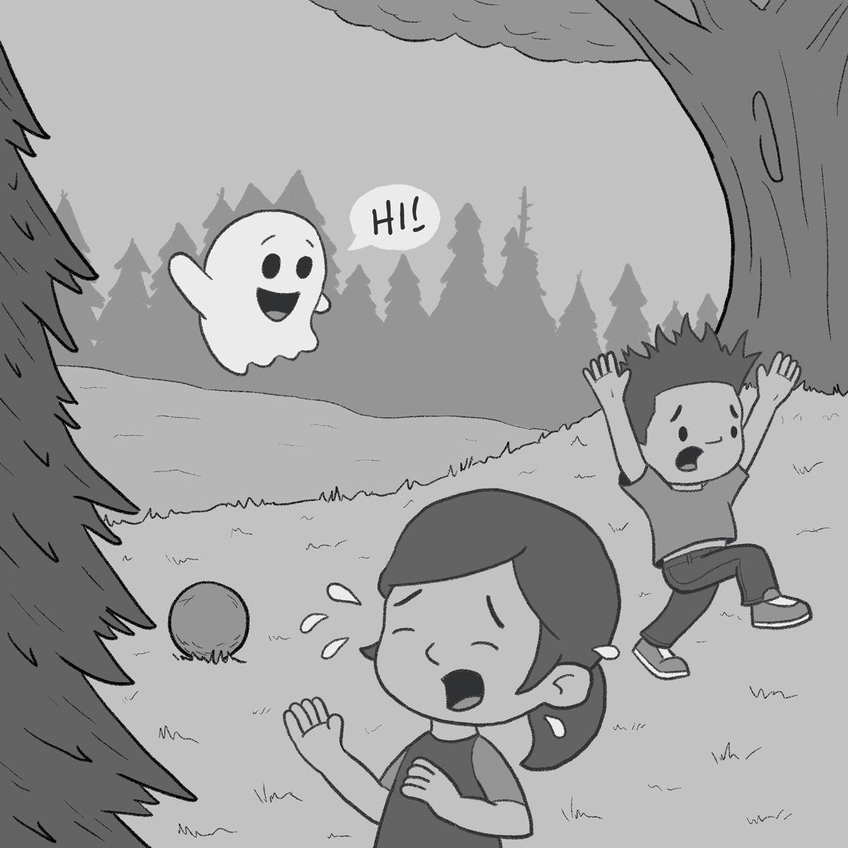
Line art down and a first value pass.
-
@KevinTreaccar hi! looking great! My one suggestion is to lean the boy forward more. right now he looks like's just marching instead of running.
-
@Nyrryl-Cadiz Can do. Thanks for pointing that out!
-
@KevinTreaccar This is looking great! Would suggest making the ghost somewhat transparent instead of opaque. Maybe move him up a bit so the top of the tree line is visible through his body?
-
@susanhowarth-art I like the thought and I'll keep it in mind as I keep going forward. Right now, at least, it's just not working with my treeline as I get rid of trees to create that. Feels more like a tangent. Might be able texture through later, though. Thanks!
-
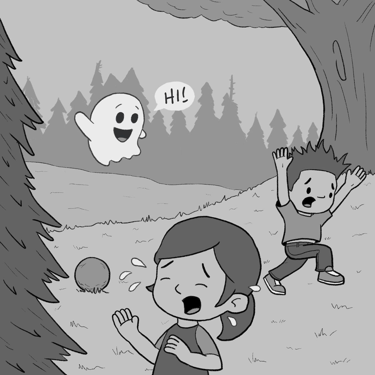
Tweaks per feedback. Thank you!
-
@KevinTreaccar she’s crying because she dropped her cookie


-
-
@KevinTreaccar ok I’m sorry it’s a soccerball!
-
And a first pass at color.
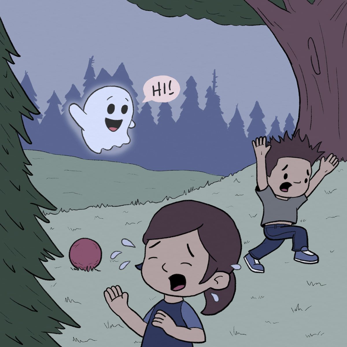
-
Added 10% gray throughout the entire background. Which do you prefer – left or right version?
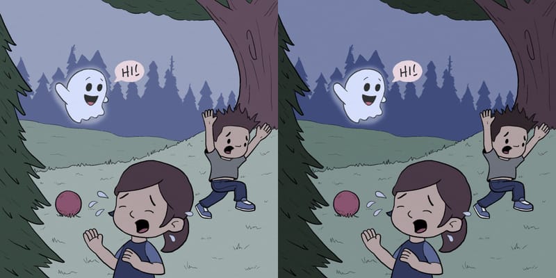
Thanks
-
@KevinTreaccar I prefer the one on the left. The treeline looks more hazy / far away, which I like.
-
@susanhowarth-art Hazy. I like that thought. Thanks.
-
Figured out it was really just the grass I didn’t like on the left. Added more tone to that and now I’m leaning into hazy.
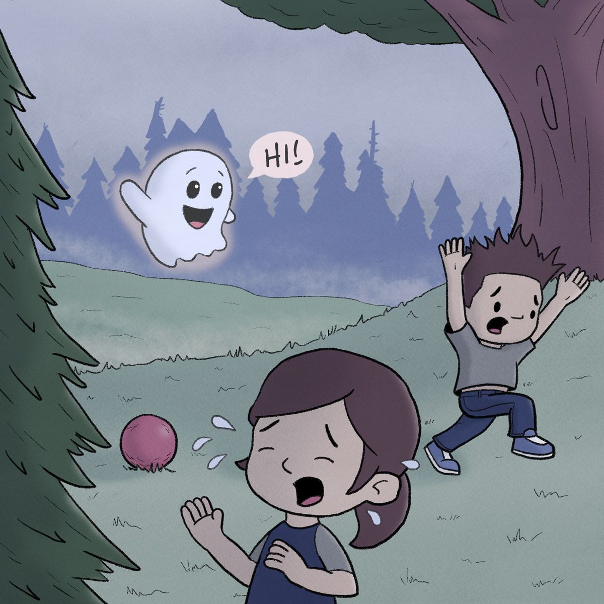
Wondering if I’m ready to start adding textures to the image.
-
@KevinTreaccar looking good!
-
-
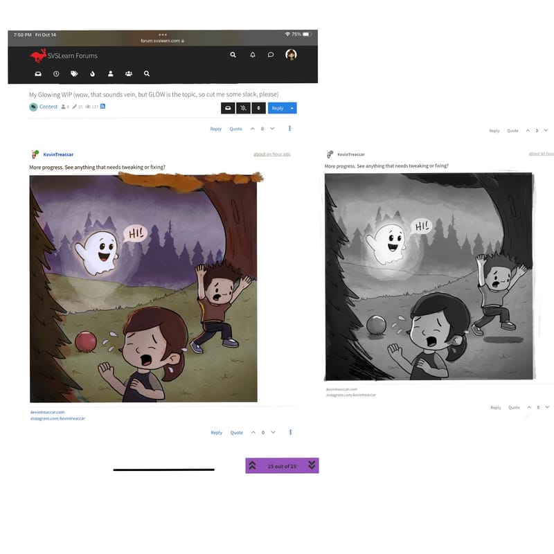
More progress. See anything that needs tweaking or fixing?
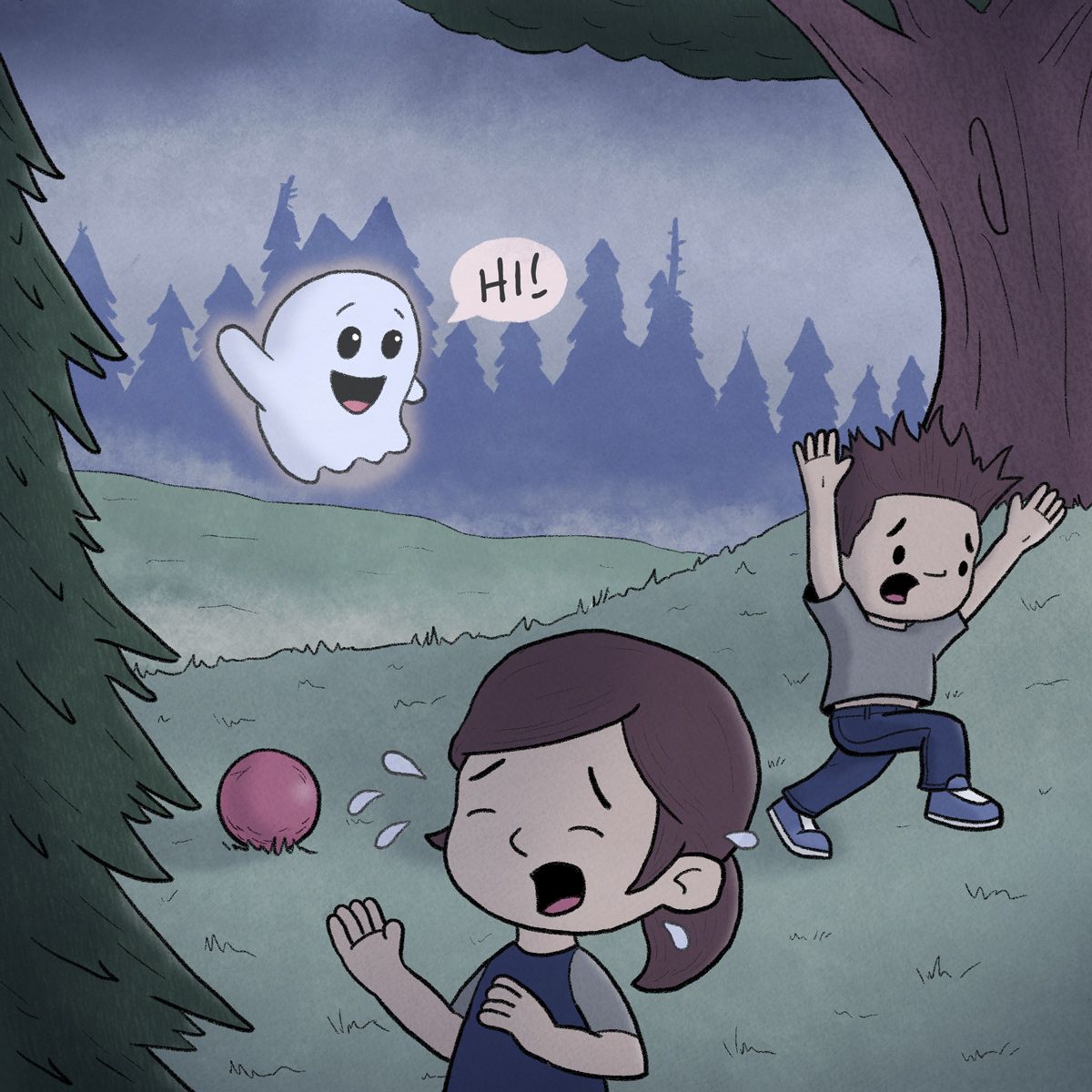
-
@KevinTreaccar please don’t take this wrong way, but I feel like I see this color palette from you often, have you tried any others? A warm fall color palette would look nice or even black and white or greys? also adding a bit of the glow as highlights on a few things would help out. Hope that is helpful to you
-
@Asyas_illos I actually had the same thought on color, so I’m definitely not offended. And while I have plenty of things that still need a lot of work, color scheme is what I’m least confident in.
It’s probably hard to believe, but it’s 100% coincidence – which probably reveals the big hole in my color picking process. I accidentally started with similar blues for GLOW and CLOUD, then process of elimination sent me down the same track. RABBIT ROAD RACE started with green and then wound up the same.

Thank you for the ideas on colors. I’ll give your scheme a try and also try some others, too, because I need to figure out how to break my one-scheme track.
And I like your idea on the size of the glow and reflecting off more objects. Not how I was originally seeing it, but that’s definitely more visually interesting – and that’s what matters.
Thank you
