Critique welcomed
-
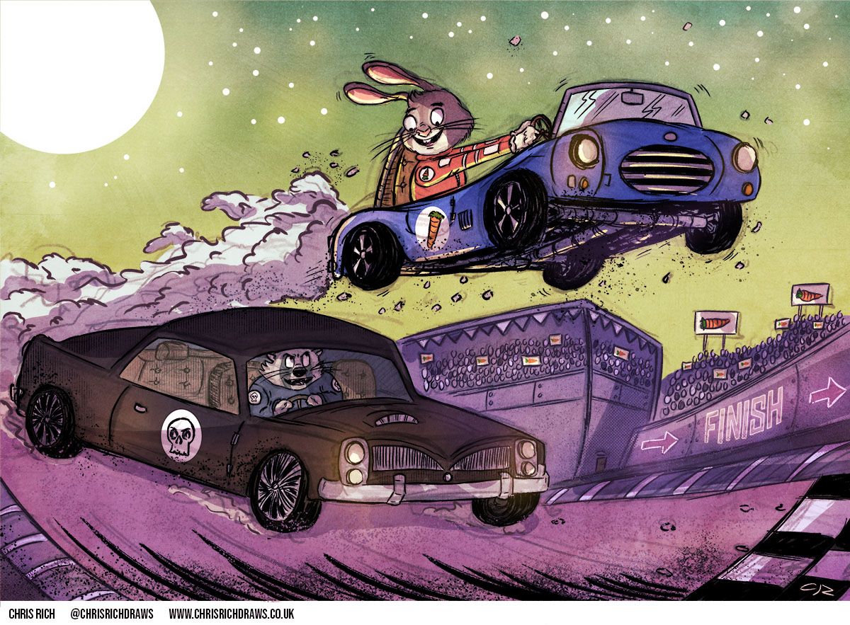
This was my entry for the critique arena prompt 'rabbit road race'. Since I didn't make the top 16, and therefore missed out on the critique element (which is such a valuable part of the process), I would welcome some feedback here on how I might have adjusted this image to make it more successful.
I had good vibes about this when I composed it, but perhaps my loose line work didn't sit well with the other pieces which were perhaps executed with more accuracy? It also turned out to be an approach and idea which was used by many others, so maybe the concept was not inventive enough? Anyway, I'd love to hear what you guys think on how I could have improved this submission.
Thanks in advance
Follow me on:
Twitter @chrisrichdraws
Facebook www.facebook.com/chrisrichdraws
www.chrisrichdraws.co.uk -
@ChrisRichDraws I think you have a lot of successful things going in your image. The linework, texture, and palette are some of its strengths. The characters are appealing and have personality. Also the eye contact between characters adds some storytelling. There is a sense of movement. Storywise I couldn't tell whether the rabbit's car is flying, or just going super fast. If it is flying, I'd wonder how the rabbit got it in the air. I like how the rabbit's car is silhouetted against the sky. It could stand out even more if the rabbit's car is a color like orange or red. Those are my thoughts. Hope this helps!
-
To me this piece doesn’t feel like "rabbit road race". Your main character is a rabbit but I think the raccoon should be a rabbit as well. Over all your line is good but I think the lines for the smoke behind the car could be a bit more organized. I noticed that it looks like there’s a low opacity under sketch that shows through in some areas. I don’t know if you intended this as a conscious stylistic choice but it doesn’t feel intentional so I think that could be cleaned up.
A big change you could make is redesigning the cars. Right now both of the cars don’t show much variation. The raccoon car for example is pretty much separated into three equally sized chunks, the front, middle, and back. Look for something to exaggerate like giving the car huge tires, making the front super long, or making the middle super tall. Small, medium, huge is often used as a compositional design rule but it’s a great tool for designing objects or characters as well! Hope this helps -
Thanks both for the critique, greatly appreciated. I'll try and apply it to my next illustrations
")
-
@ChrisRichDraws I think the linework is amazing. I like that left in the sketch lines. technique-wise, I think this is a beautiful work. I think it's the story that it's falling flat on. Yes, it's a Rabbit Road Race but what else? What sets your piece different of the other similar pieces?