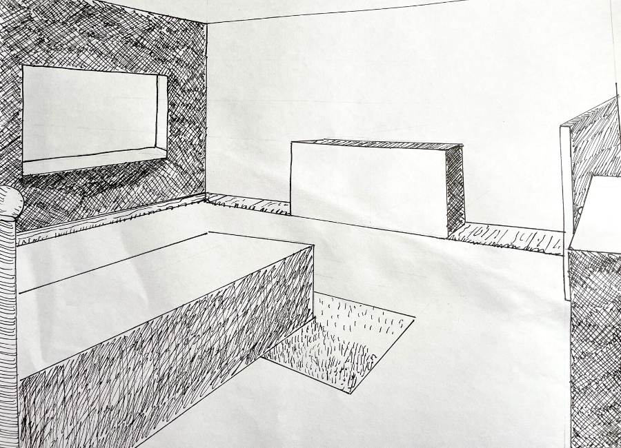
Basic Perspective Drawing Final Assignment - June
-
Hey! I just finished my final for the Basic Perspective Drawing Class. I am a beginner just looking for some feedback that this all "looks right." Thank you!

-
@mcschweitzer Looks good!
-
@mcschweitzer great job on your perspective drawing.
There's a few things I can pick out that feel off.
1- the window sill should fall lower. You initially had a great line in where you erased your pencil sketch. I would go to that line for the corner of your sill, and then bring the edges back to their respective vanishing points.2- not all of your lines are vertically parallel. In 2 point Perspective, the vertical lines should be straight up and down (if you're drawing square/ rectangular things that are straight in regular life like dressers and beds and doors and walls and what not).
3- the items in the right side of the frame don't seem to follow your vanishing point lines. That's not an issue if they're meant to be offset in the room, but right now, they feel unintentionally off. I would measure those again.
I think you did a great job, and I love that you worked traditionally!
-
@mcschweitzer I love the whole look of this layout! I like that it doesn't feel too polished or perfect. The perspective makes just enough sense that you can get away with little imperfections, and it has definite hand drawn charm. I'm sure it would work perfectly as a children's book illustration ^_^
I recently watched Will Terry's "Draw 50 Things" class, and was surprised to find that he wasn't fussed with super-duper accurate perspective for his interior space. He kept his vanishing points in mind but didn't actually draw them down or use perspective lines as a guide, and he followed the rules just enough to make his image look right. All his lines were drawn purposefully wonky, and the whole finished piece felt natural and visually pleasing. I'm sure that comes with experience and isn't necessarily helpful for a beginner, but it's reassuring to know that once you know the rules you can get away with breaking them a little.
One artist I'm really interested in right now is Izzy Burton. A lot of her pieces are drawn from photo reference, and she uses the lasso tool in Photoshop to purposely make her images wonky in order to add character and charm. I notice she also doesn't draw down her vanishing points or make a grid but goes by eye (she also admits she doesn't fully understand perspective). This is great if you're going for a certain look, so it's good to know that you can be "off" but still get away with it if it's part of your style.
Anyway, I think you've done a great job on this piece. I'd love to see it finished with objects, colour and characters in it

-
@davidhohn Thank you so much for the feedback!
-
@AngelinaKizz Thank you so much for taking the time to give me some feedback. Yes, that window sill threw me off! I second guessed myself and "remeasured" while inking and then realized the original line was the correct line (aaaaah). I really thought my vertical lines were parallel until you mentioned that! I will definitely work on that next time! Thanks again!
-
@Meekipink That was the nicest way of saying "it's wonky" I could have ever imagined. Thank you for your kind words! I really do like images that have a hand drawn look, but know I need to get the skills first! Also, can't wait to take that class, I've heard it mentioned so many times on the podcast. Thank you so much for sharing and for the feedback!
-
@Meekipink Thank you for sharing Izzy Burton's website! I love her work and I wouldn't have known about her otherwise!
-
@Lisa-Clark Oh, you're absolutely welcome - I've only just recently come upon her as well! She's incredibly talented and has perfected using colour and light to bring her scenes to life. It's mesmerising watching her work ^_^
-
@mcschweitzer Hahahaha!

 Ahhh.... but it's a good wonky!
I once tried to draw a bedroom scene in perspective using Procreate and I made the mistake of using straight lines for everything. Needless to say, the whole thing ended up looking incredibly boring, and I couldn't figure out why.
Now I know, you need to embrace the wonky!