Portfolio piece critique
-
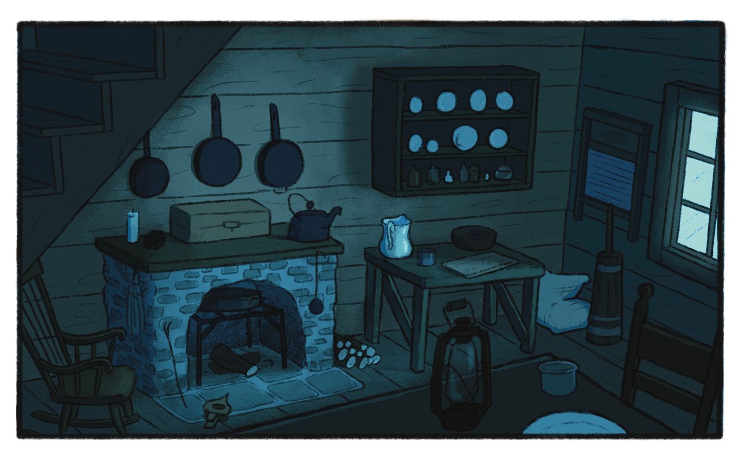
Finally done (or nearly done maybe) with the interior assignment for the CBP class.
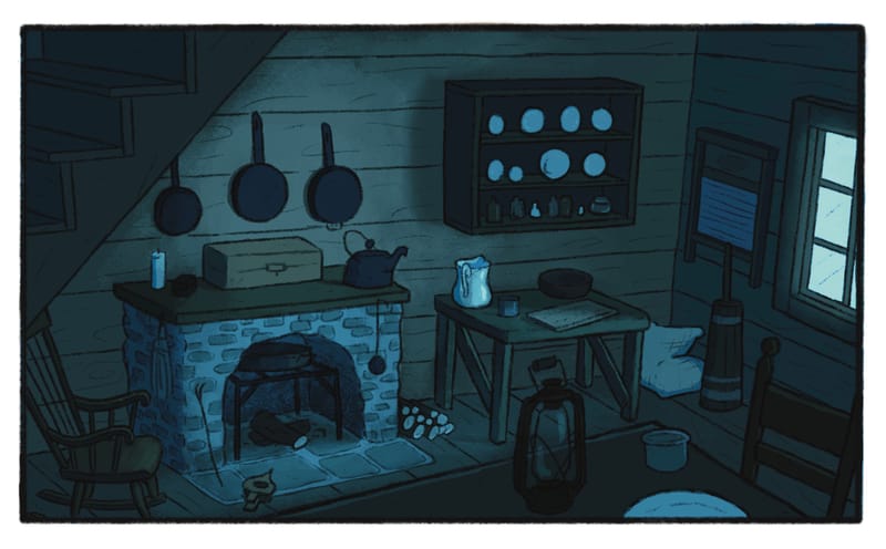
This is the the home of Hansel and Gretel so my goal was to make it feel a bit drab and dreary. (Ignore that there are two images. Just testing out how different files show up here)I’ve reached the point where I feel like maybe it could be better but I can’t pin point anything and that’s pretty much when I call it done. However, I do intend for this to be a portfolio piece so I want it to be as good as I can make it so please give me any and all feedback you can. If there are improvements to be made I want to make them!
My main struggle with this piece was getting a good balance of values so that might be something to pay particular attention to. A big thank you to all of those who have already helped me with this one!


-
@griffin I think illustrating an interior and getting all the proportions and perspective right is very difficult, so good job. I do think it could have more contrast, and the brights could be brighter. Some of the shiny objects could look shinier.
-
@matthew-oberdier interesting! I was actually afraid that the I had made the pitcher too shiny and brought too much attention to it. I actually did have the plates a bit brighter at one point but because I wanted the fireplace to be the focal point I dimmed them down but if you think the focal point on the fireplace is a non issue then I’ll definitely consider brightening up the lighter objects
-
@griffin I think you did a great job improving this. And great lighting suggestions @marek-halko.
-
The design of the room could use more character to help tell the story of Hansel and Gretel.
For example, the parents purposely led their kids out into the woods because they had fallen on hard economic times. Can you modify the props in the room to hint at this? Brainstorm on the important visual elements of the story: bread crumbs, the woods...
-
@willicreate you just reminded me that in my original design a few months ago I did include a loaf of bread to hint at that part of the story. I think you’re right, it could use a bit more of that kind of thing.
-
@Griffin I agree with @willicreate It doesn't look drab and dreary. I think it looks more well to do and at night than anything else. What if you had cracked plates in a stack and a rathole? A cracked window?Piles of laundry? An empty cupboard with empty containers with a few crumbs spread out?
I really like the room, however. I think it is a great piece but I don't think it tells the story of H and G. It looks more like the setting for Little Women or Little House on the Prairie.
Your perspective is also quite good. And your color harmony is superb.
One last thing that bothers me from a composition standpoint is that the highest point of contrast, the pitcher, is smack dab in the middle drawing the eye there. It's all I keep looking at.
I hope this wasn't too critical. I really like what you made, I'm just not sure that it meets your goals.
-
@chrisaakins thank you so much! This is exactly the type of feedback I’m looking for. I think you raise great points, this could really be pushed to show a more impoverished lifestyle. I also thought the pitcher might be too much of a focal point! When I showed it to a few other people they did’t see it as an issue at all but I think I at least gotta remove the highlights on it.