Advice please
-
Competition - Star - advice
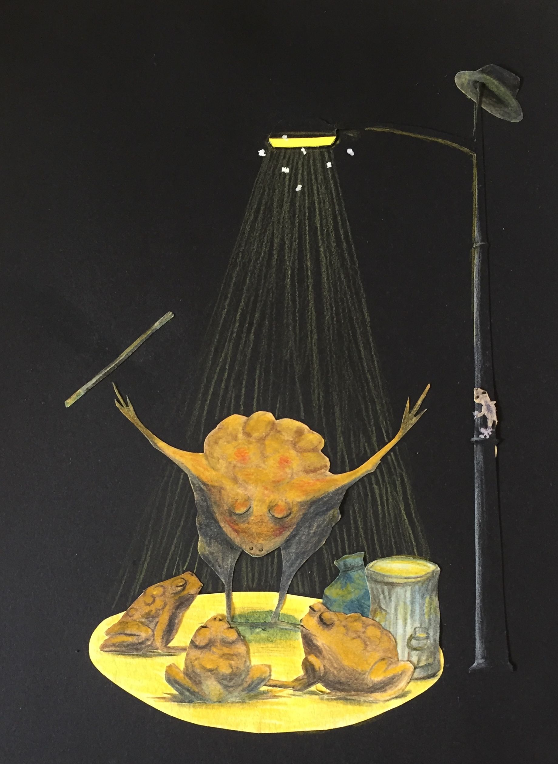
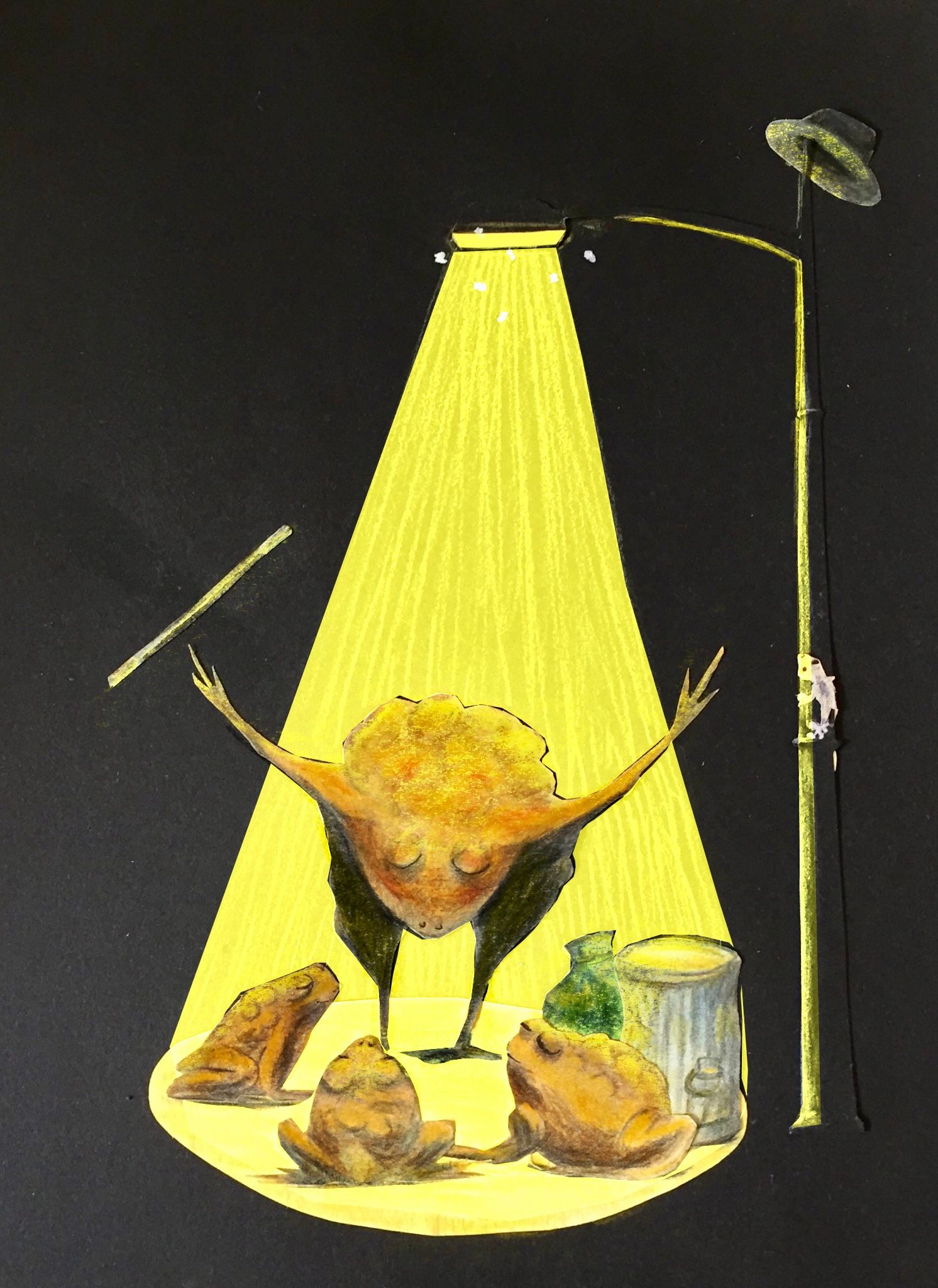
Everyone this is my second version of the Toad Show and I would greatly appreciate advice on the lighting and shadows, composition, message, if you have time.
Cheers
Helen
-
Hi @Helen fun idea! Quick question: Is this cut paper or digital?
Either way, this could totally work but you could fix a couple of things that might make it a stronger piece.
One is to darken your shadows on the toads. YOu have a black background and their values probably ought to approach that black and they don't. If this is traditional you could use India ink or charcoal over the color pencil.
Is there a reason the other toads' eyes are closed? I would keep them open and maybe even have them clapping or something. they look like they are all in prayer or mediation or even asleep.
I might consider losing the little lizard. He is not important to the story and he distracts me so it might distract others. I would lose the flies on the lights, too. YOur biggest contrast really ought to be on the lead toad's face if he is your focal point.
Lastly, the lead toad's foot is touching the other toads in the mouth and it is creating a tangent. You might move him up or down.
I hope this helps!
Have fun with this and please post your results. I would love to see your changes.
P.S. If this is mixed media traditional, have you considered more collaged effects to add texture? For example, they could sit on newspaper or book pages on the floor. You could use tissue paper over the shadows to deeper them. Just a thought. I am sucker for mixed media.

-
@chrisaakins Chris thanks for all the points for me to look at - yes it’s mixed media and I’ve bogged myself down using a paper suggested by a Caldecott winner and I’ve lost all my textures - off to make changes!
PS you do great critiques - something I need to learn. -
@chrisaakins I just realised which piece of Star work was yours - replied go the boots

-
Hi @helen, I like the paper cut out style.
At first, I thought it was raining on the toads, but then realized it was the light.
What if you hit the toads with a strong cutout yellow light instead like this example?

-
@jeremy-ross thanks that makes more sense than my rainy light
-
Hi Helen, This is so fun! I never do paper cut outs, but I love to see them.
I agree with the feedback Chris and Jeremy gave!
You could also add a bit of fall off with the strong light source. Then the light on the star performer would be stronger/warmer (which would emphasize this character) with slightly weaker/less warm light on the audience.If you update this it would be fun to see the changes!

-
I really like this, very whimsical and playful. If I could only fix one thing it would be more crisp lines. A lot of the details are very soft harder, more crisp textures and lines would be a nice contrast to the soft, smooth watercolor textures. This will also make the lighting look stronger because when a like is that close to a subject it is going to create harsher shadows. Hope this helps!
-
@emily-atwood-art many thanks Emily it has gone into the I need more time pile
 but thank you for your comments.
 -
@griffin thanks Griffin that makes total sense!
