Need Help with Type - Book Cover - Personal Project
-
I agree that B is better. The fish hook is as @Melissa-Bailey-0 said, "ominous."
-
@Nyrryl-Cadiz I like the fishy too!
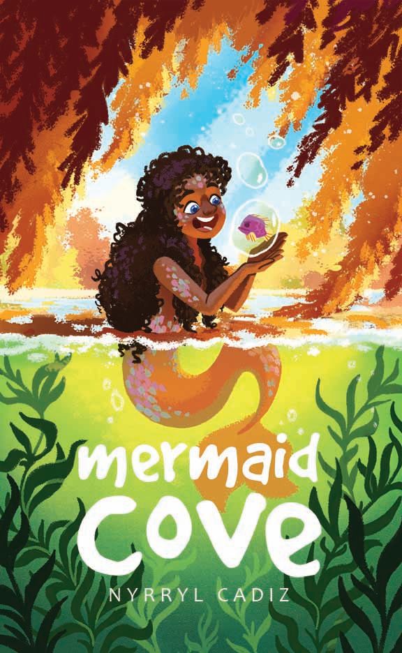
For the font though I still find your name a little hard to read.
Since you're name isn't part of the title I think you can make it smaller / not the same width as the text above. It'll help it feel like it's own entity and The "nyr" part of your name is hard to read over the busy dark green leaves anyway.
-
@Nyrryl-Cadiz I also agree that B looks better to me!
")
-
@Nyrryl-Cadiz I'm with B as well, A is a little too ominous for the joyful vibe of the rest of the scene.
-
@Kim-Rosenlof @Melissa-Bailey-0 @demotlj @carlianne @Jacy13 @Tristan-Lapetz Thank you so much for the feedback, everyone! I totally see what you mean, tho I must admit, 'ominous' is actually what I was going for. lolz
However, I gave it some thought and I've decided not to use either. I just feel that both are not up to snuff. I know I can come up with something better but I think I've just had it with this piece for now. I don't wanna work on it anymore. I just want it to be done.

I hope y'all don't hate me for wasting your time.

@carlianne Thank you so much for the note on my name. That's definitely something I'd never even think of. Here it is below. This is probably my last edit on this piece unless I deceide otherwise. lolzzz
Again Thank you so much, everyone!!!!