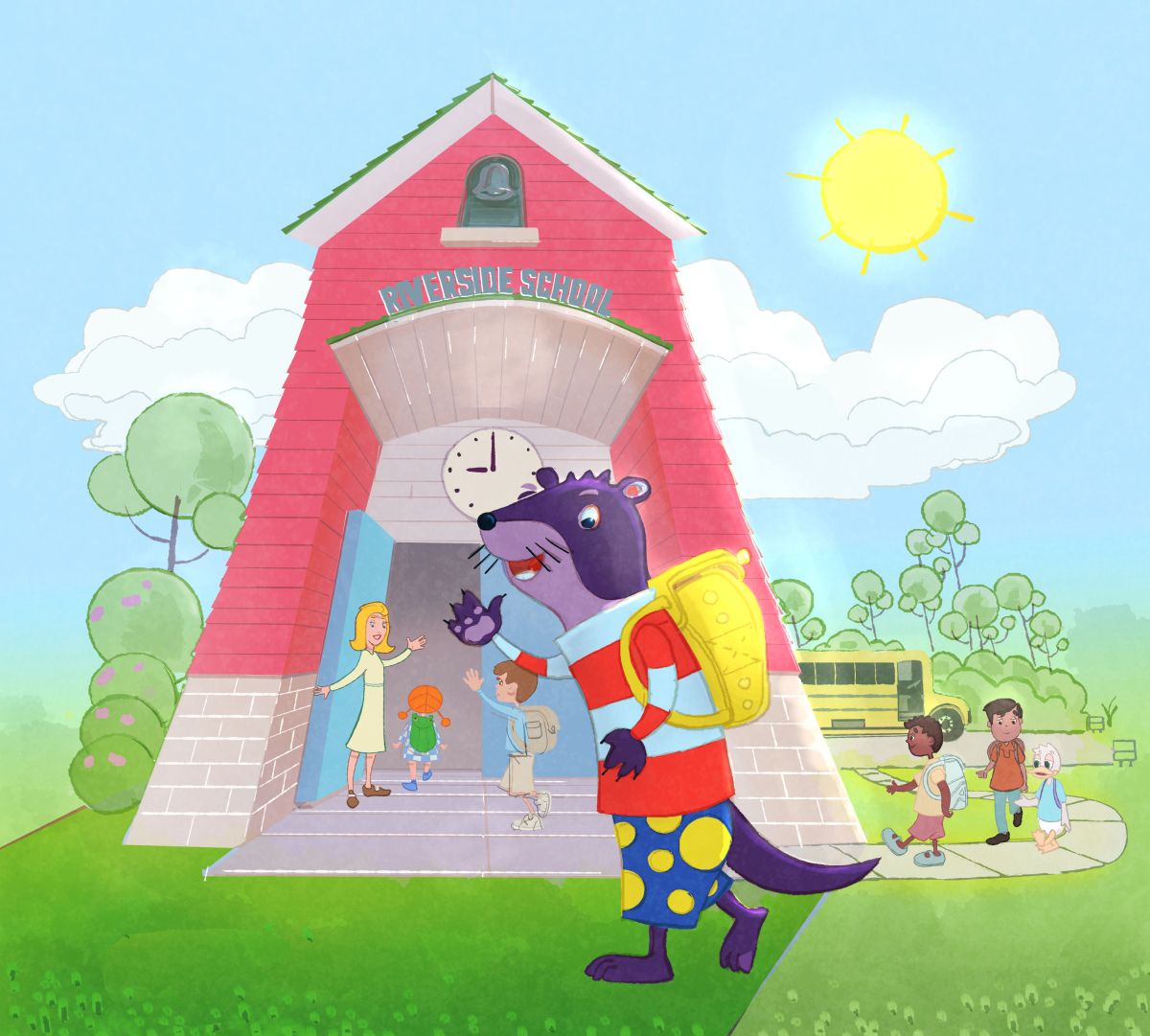
AUGUST CONTEST: It's the first day of school for Albert!
-
@Kevin-Treaccar I hear it's a zoo in there

-
This post is deleted! -
@LisaF Sure, if you go to the zoo for a fun display of educational content, controlled chaos, loud noises and the possibility of someone taking a bite out of you.

-
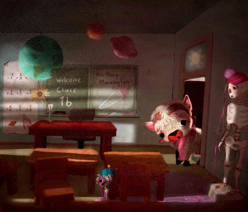
Hello everyone. Here is my piece for the month. As always eager to see what all comes in on exiting images. Although it seems a bit quiet over the summer holidays
-
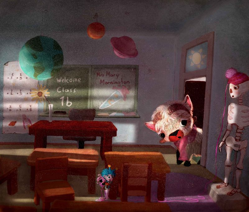
Hi, did a second version wich is a bit lighter and has slighly cooler colours. Which one do you think I should submit ? Thanks for the help

-
@Kevin-Treaccar I like the angle, with Albert looking up at the intimidating building. My first thought was that Albert was daunted by a school that is clearly going to be more challenging than a regular, non-Einsteinian elementary school. I was thinking that the sky could be less happy blue...then I realized that I was transferring my own feelings about my first days onto your illustration. In other words, I'm not sure what you are trying to convey about Albert's feelings. It's challenging because we can't see his expression.
If Albert's feelings about the first day were anything like mine used to be, the sky would be darkened and and streaked with blood-red clouds, the eye-windows would look more scary, probably the door would have huge pointy teeth, and there would be four horsemen on the horizon. And he would be wearing a thick long-sleeved shirt to protect himself from the pinches and punches of bullies.
Probably not what you are going for, but you get my drift.
I guess my question/s is/are: How does Albert feel about the first day? It's fine if we can't read his expression, but is there a way you can play around to make his surroundings reflect his feelings?
-
@Moana-Maureen My eye likes red, so I kinda prefer the color of the first...however, the neat thing is that only in the cooler version did I notice the adorable little creature with the yarn trap. So cute! So I think the cooler version is better.
Your handling of the lighting (in both versions!) in this is tremendous. Wonderful as it is, the lighting on the blackboard area competes a bit with what it going on in the foreground. How would you feel about pushing that area back/greying it down a bit, to make the triangle between adorable creature, newcomer and skeleton read better...I did a quick drawover to show what I mean.
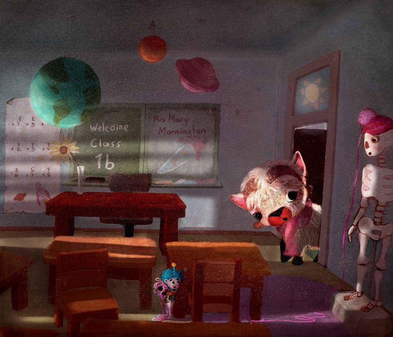 .
.Also, the sunlight by the adorable creature's feet confused me a bit...shouldn't it extend over to the skeleton's feet?
Love the story this tells and how you handled it!
-
@Moana-Maureen so cute! The cooler version would be my vote because it helps the warmer tones of your main character stand out more.
The dark shadows being lightened a bit also helps. While they're very dramatic, the darkness hampers the readability for me and I wonder why it is so dark in the classroom (of course, this is just my reaction to it).
But overall, very cute piece, and an adorable Albert!
-
@RachelArmington Hey, thankyou so much for pointing those things out. Ill make those changes bevore submitting. I totally agree with what you are saying

-
@Melissa-Bailey-0 Yeah, i feel like it is still a bit to dark too . Also the image always changes once out of photoshop. It feels darker. I will lighten it up some more. I guess I should use an extra thread next time

-
@RachelArmington Your first thought was pretty spot on for what I was going for. This place is scary. He feels like Aladdin entering the Cave of Wonders – hence why he sees it as a large face with a giant open mouth.
I like your thoughts and definitely might enter a second version (I submitted last night) with a darker and even more ominous sky. I had already started down that direction since my original sky was bright and yellow, but it blended with the building in grayscale. The blue I used was dark – compared to that – but maybe not dark enough.
[stroking goatee while deep in thought gif]
Thanks!
-
@Kevin-Treaccar I definitely saw the face in the facade!
-
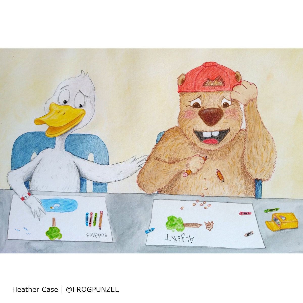
Here it is, Albert on his first day of school

-
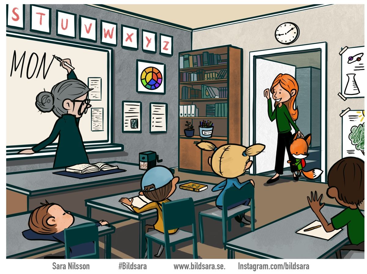
Hi here is my peace

A bit unfinished in the coloring but happy with my idea, good luck everyone
-
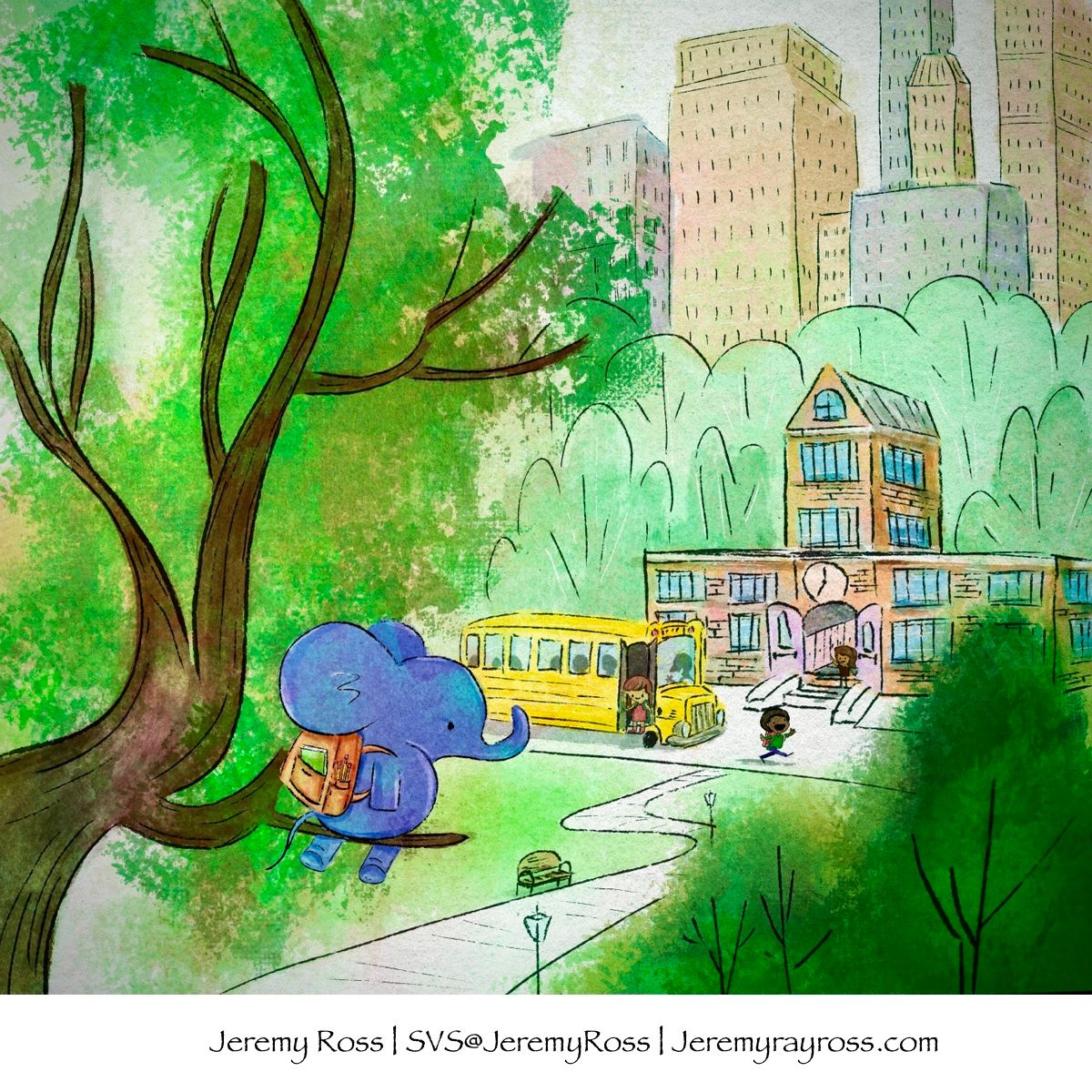
“Maybe school isn’t such a good idea after all,” Thought Albert.
-

-
@Jeremy-Ross love the POV here, scoping out the school from far away
-
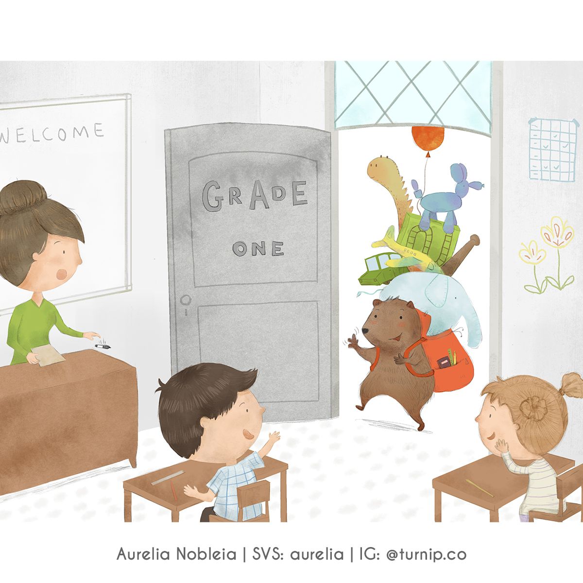
-
Love all of these!
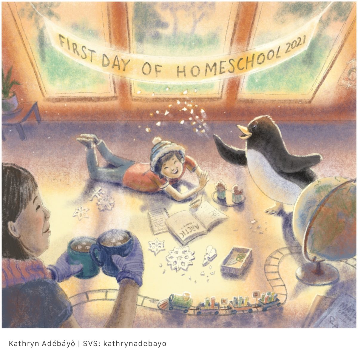
Here is mine Good luck, everyone!
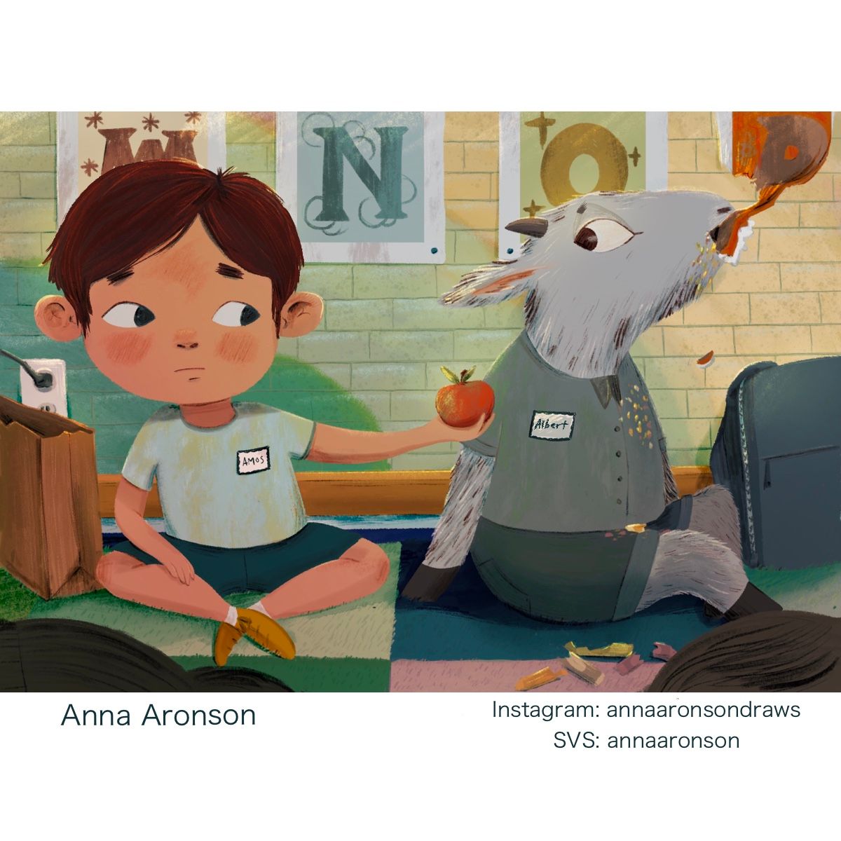
-
Wasn't sure I'd get something done this month, but here's Albert Otterman heading to school.
