Critique request for my March Entries
-
Hello everyone, I am trying to figure out what I could have done different to make it into the top 16. I really thought I was going to make it this month and I'm not sure what I should have done different with my first entry. My second entry was a little rushed and I plan on finishing it up more but I still thought at least one of them would have made it. I really just want to illustrate for the podcast! and I have been submitting pretty regularly for 2 years and only made it in twice and got bumped out early. I thought these were some of my stronger pieces since I love to design characters! Any thoughts on what I am missing. Please help.


-
I really liked your entries. They look great. Especially that 1st one. Love the design and colors.
-
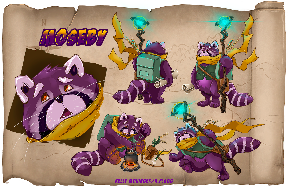
For Moseby, I think you nailed the standing and sitting poses.
I think the physics of the running pose are a little off, though. That’s a lot of lean for a moment with no twist in the torso.
Still, you’ve got two great characters. Love your color schemes and ink.
-
I dunno, I would have picked the racoon for sure. If I had a critique, I'd say there are too many hard edges and not enough soft edges on the form shadows, and you could vary the color temperature in the shadows too. I think the strength is definitely the drawing and the sense of volume and 3 dimentionality. Some cast shadows would bring this out even more.
-
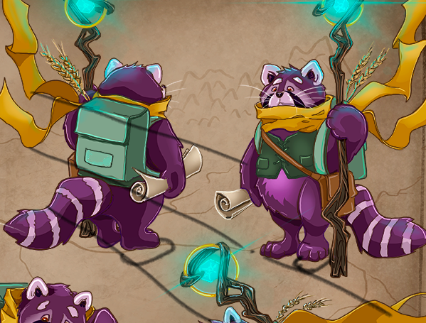
One thing I did notice, with the perspective on the standing poses, the feet could be brought down to be in line with the perspective lines, like this:

-
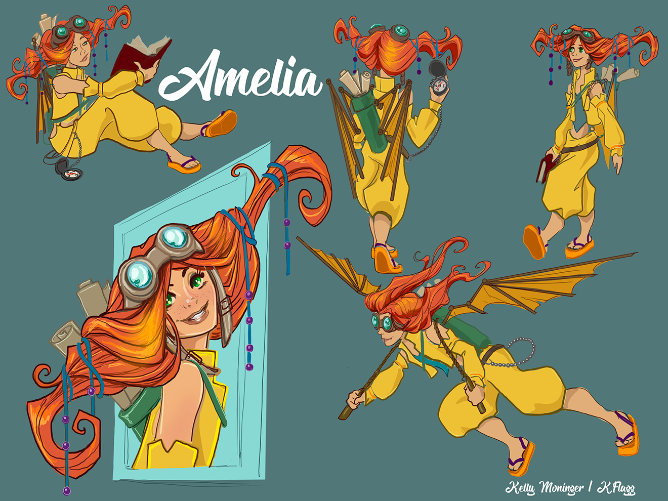
Hey @K-Flagg I think both of these are lovely. I especially like the batwing girl. The only issue I see is one of readability. Her foot almost creates a tangent with her head. I think if you had left a little more space between them it would read better. It's a little cramped. Other than that, maybe (and this is being super particular) have some variation in the color choices of her clothes. A complementary color to her hair and skin might have made her more distinct. I like the analogous colors but they kind of all run together. I think she looks way cool.
One last thing, I think her hairstyle is super cool and funky. There are a couple of places it doesn't look like it follows linear perspective, though. In her back view it looks like it curves forward but in the front view it looks like it is straight but tilts at an odd angle.
Again, these are all super picky and I wouldn't even raise them had you not asked. I really think this is a strong piece. I didn't get to hear the critique today and see what was in the top 16 or what they had to say about them, but from what I saw on the post there were some stellar entries. I think this was as good as most of what I saw. Keep up the good work!
one last edit: THere was a little inconsistency with the length of her bare space on her shoulder. In a couple of spots it looks more like a cut in her sleeve and in other instances it looks like it is completely separate.
I hope this is helpful!
-
Kelly, congratulations on having two pieces make honorable mention. Out of 100+ entries, it is two well deserved accomplishments. We can tell a lot of care went into the designs.
It’s hard to guess what a judge may be thinking. For the Moseby piece, it could simply be a technicality. Based on Jake’s comment on my piece, and the rules for April’s contest, they did not like seeing character sheets with backgrounds. To include one may have been a demotion in score.
There are some issues with anatomy. I agree with Kevintreaccar that the running pose is leaning too hard to its side. The thighs/bottom area could use editing.
For the back pose, the right hand holding the map should be corrected. It looks as though the thumb isn't wrapped around the cylinder shape.
As for the Amelia piece, you've acknowledged the piece is rushed. Had the blocking of light/mid/dark tones been more established it would have been a finished piece.
I hope what I wrote was of help. Please keep in mind the progress you've made in two years.
-
I am right there with you as far as thinking I had a pretty good chance making it in the top this round with at least one of my entries... as far as feedback and I hope you don’t take this to Heart, for your first entry the character is great but I think your color choices though complimentary were way saturated. in my opinion If you toned them down a little you’d be better off. Your second character I don’t have much to critique I really loved her and the colors, maybe again a little saturated but not as much as the first. From what I gathered the judge’s want to be surprised or intrigued by our pieces. So I think it’s safe to say I’ve been playing it safe and not being original enough with mine. Better luck to us both with next one!
-
@Matthew-Oberdier this is super helpful thank you! I really appreciate the draw over. You definitely gave me some good things to think about.
-
@chrisaakins thanks Chris! I didn’t notice how close the one foot is to the head and how it reads weird from a distance. I will try to fix that. Just FYI I noticed you weren’t there today but your second entry made top 16. It was live on YouTube so you should be able to watch it.
-
@willicreate thank you! I will definitely fix his thumb, you’re totally right. This is great feedback thank you!
-
@Kevintreaccar thank you! I will see if I can rework the running pose a little.
-
@Asyas_illos I do tend to go very saturated with my characters...I’m not really sure why I do that so much. It’s really hard for me to scale back on that (especially digitally) for some reason. I will see if I can play with that a bit.
-
@K-Flagg try going grey scale after you’ve rendered and checkout the contrast that may help you see it differently
-
I agree the run pose doesn't read as a straight run, but it doesn't bother me because it could be a sidestep move